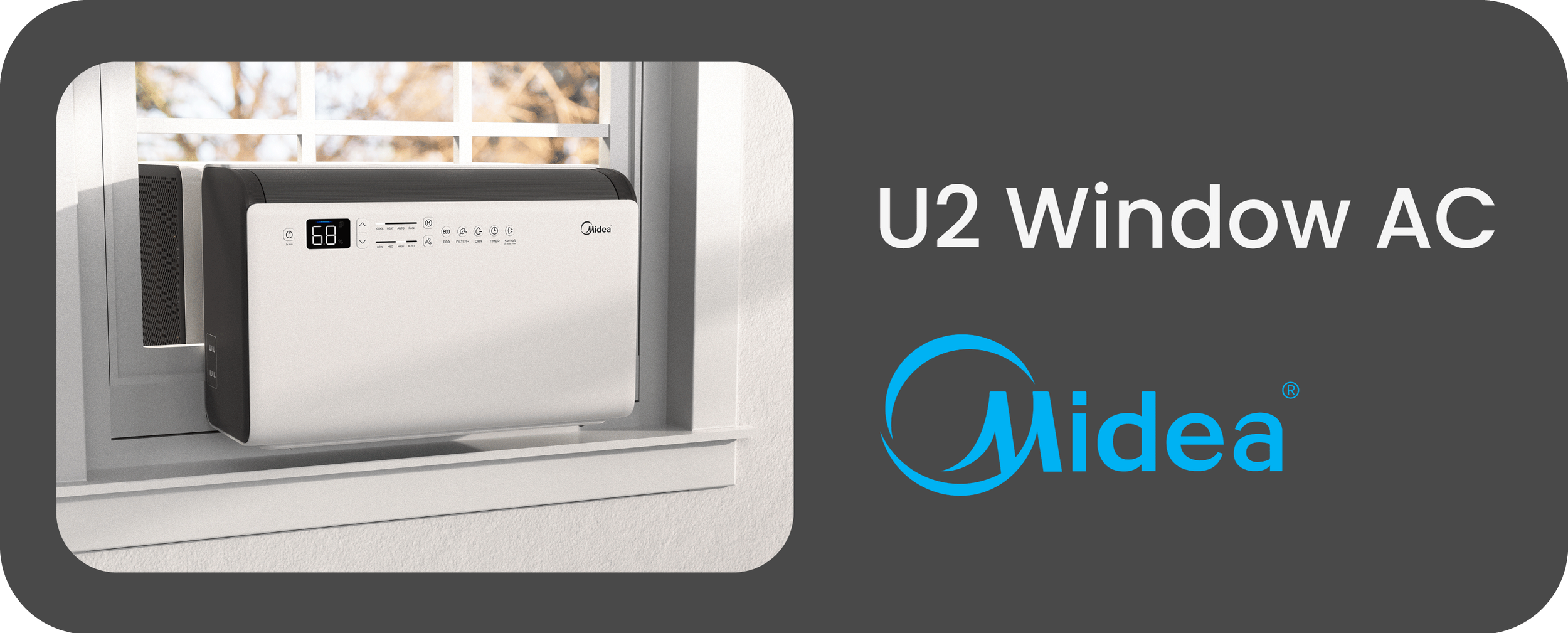
U2 Window AC
User Interface
Check Out Related Project:
At Midea American Research Center, I led the UI/UX development of the U2 Heat Pump Window Air Conditioner.
Info:
Industrial Designer Midea American R&D Center 2024 - 2025, 7 months
Supervisor/Teammate
Wyman Mastin Seth Jenkins
Lead the design of appearance, CMF, UI, and air outlet experience of the unit.
Tools:
Solidworks; Figma; 3D Printing; Model Making
Role:
Design Challenge
Create a simple user interface that provides direct access to U2’s advanced features and elevates the unit’s perceived value.
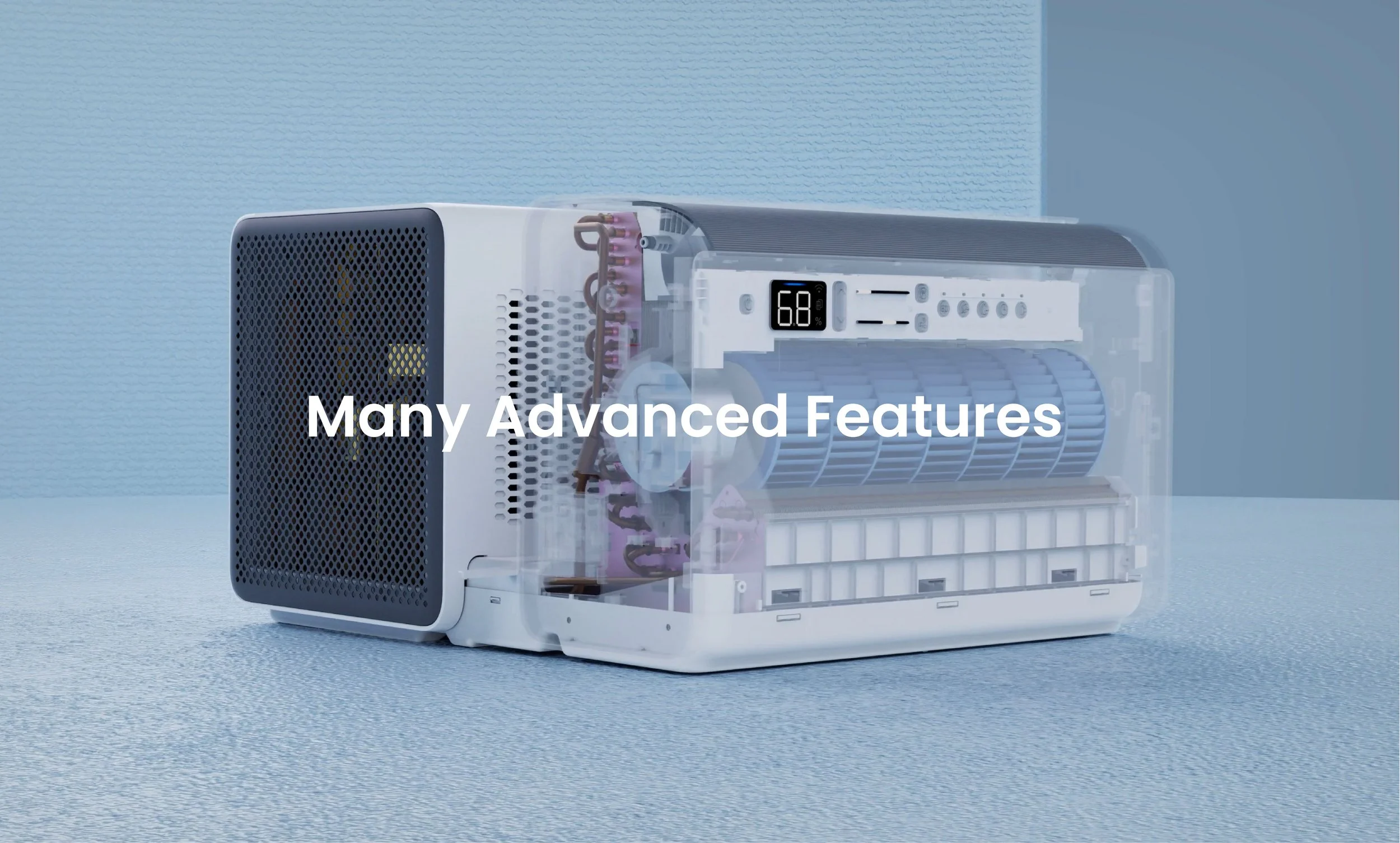
U2 is a premium product packed with features. The appearance and user experience of the interface is key in elevating its perceived value and providing a strong entry way for consumer interests on its advanced features.
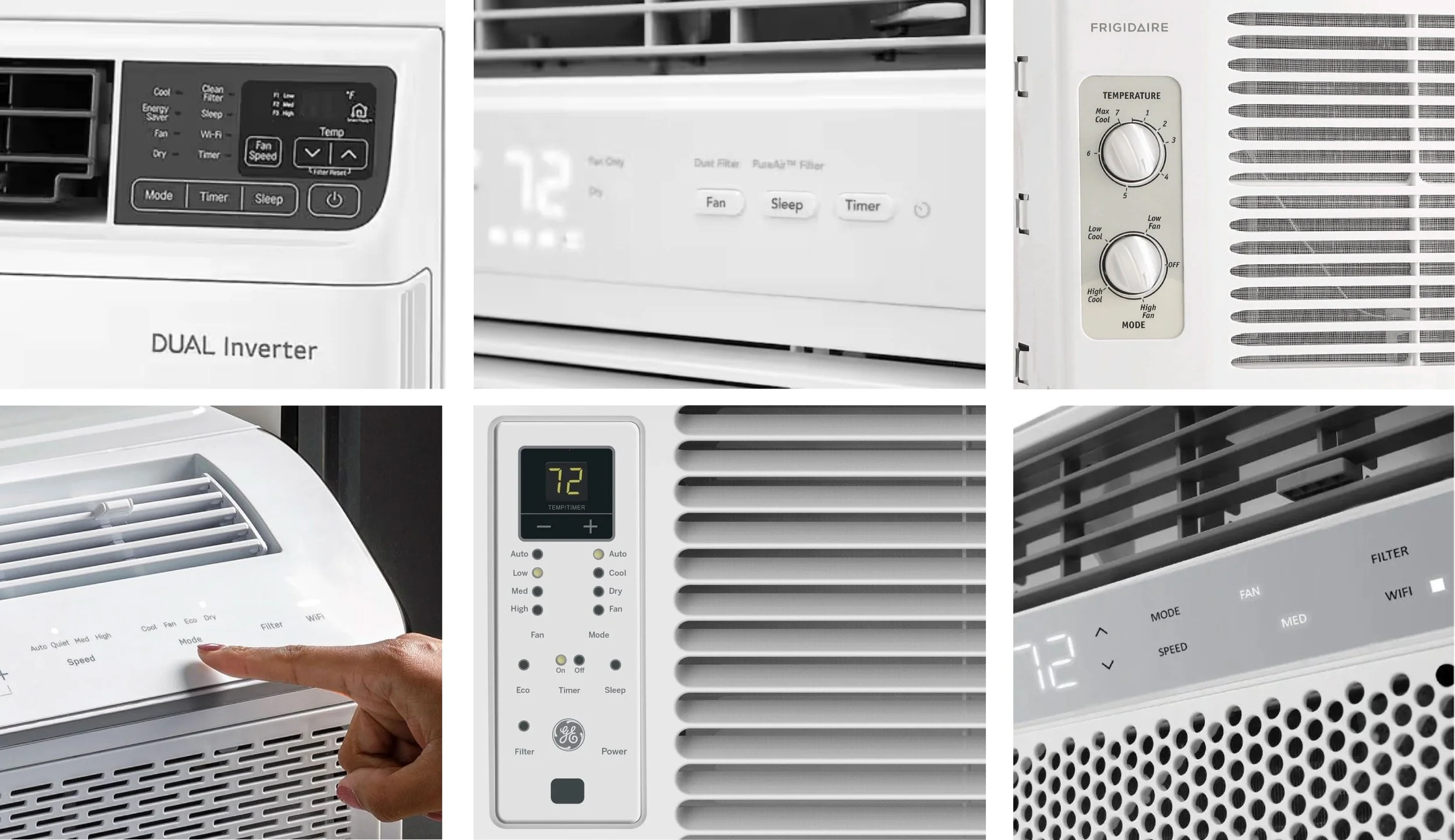
Benchmarking
Window air conditioners are highly practical and affordable products in the US. Most of them have an outdated and confusing user interface that comes with mechanical knobs, off white background, text-dominated controls, and unproportionate light indicators…
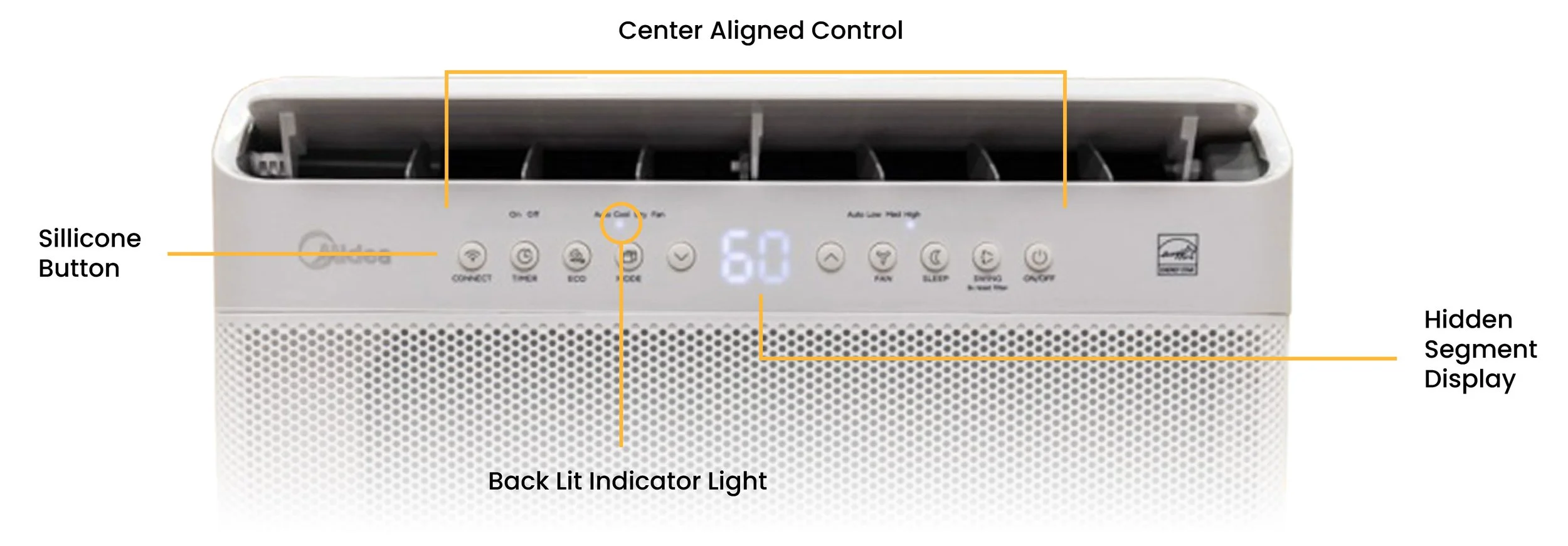
U1 Window AC has a standard center-aligned UI, with hidden segment display in the middle, navigation arrows on either side, followed by primary features (mode & fan), secondary features on each end. Through consumer feedback, we learned that its segment display has visibility issues due to thickness inconsistency of molded plastic housing.
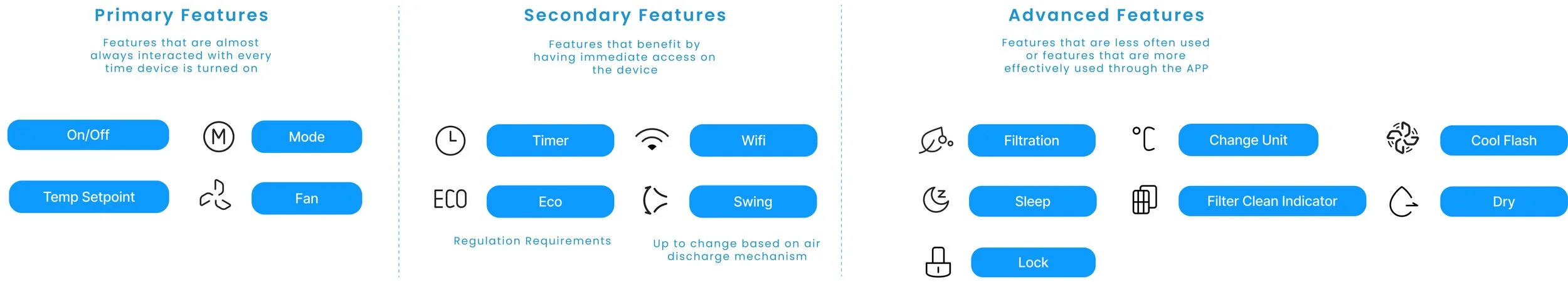
Feature Tree
During the early to mid stages of UI development, there were many uncertainties on the feasibility and availability of features. I compiled all possible features to better understand their UX logic and the design requirements for the U2 interface.
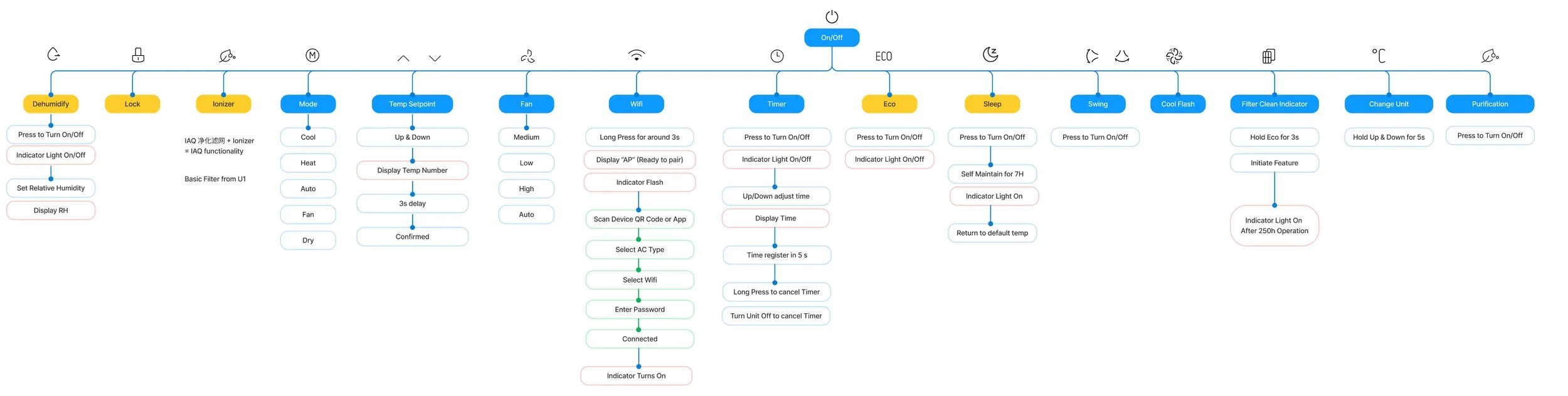
Based on the initial learnings, I grouped the available features into three categories: primary features that support the basic heating/cooling of the unit, secondary features that are frequently interacted with and require immediate access from the unit, and advanced features that could exist on the APP instead.
Approach 1
Alternative Display/Control Technology
We explored various display options that would enable more customizable contents such as texts, menus, and alerts... I compared their pros and cons in terms of cost, user experience potential, visibility, and appearance integration.
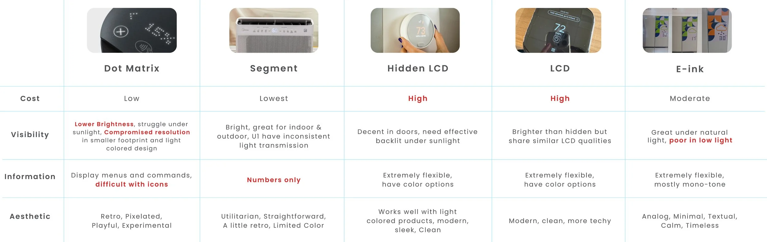
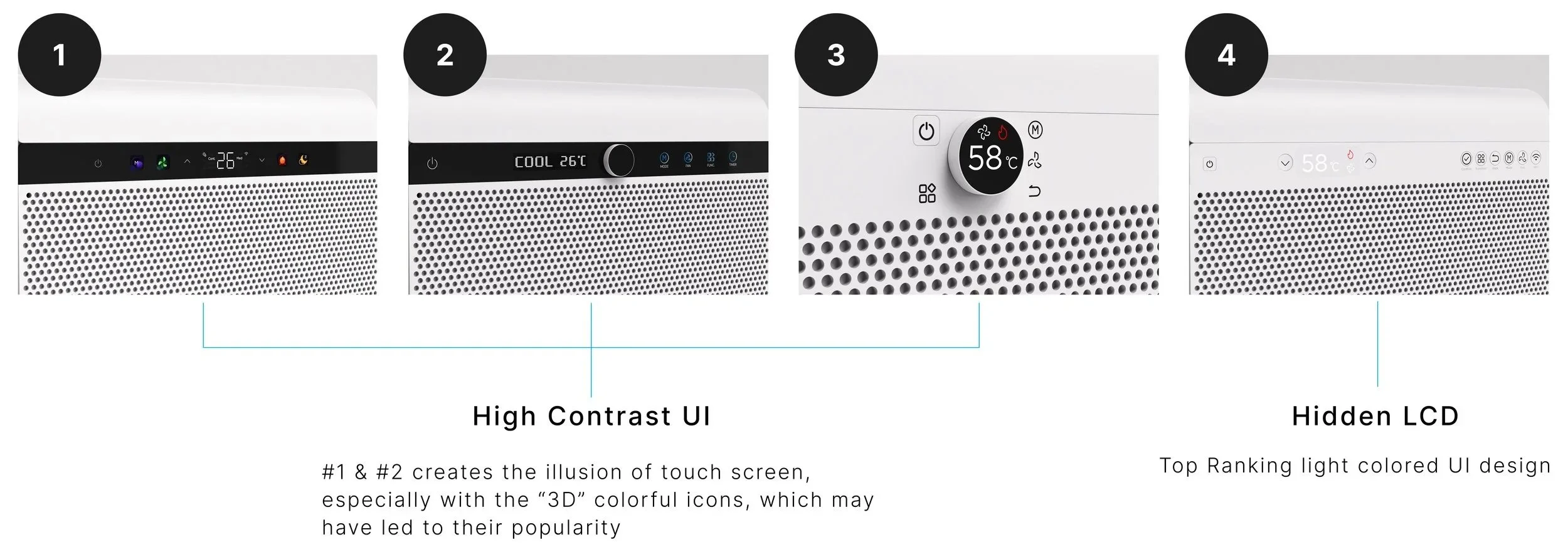
A survey was conducted to understand consumers’ perception on the appearance of different display types. I created a series of UI variations with different display and control apparatus while keeping the overall unit constant. Without going in depth on the control logic, we wanted users to decide which configurations of screen and control look more premium and easier to use?
Screen-Like Interfaces are perceived more premium than back lit displays.
Most users gravitated towards designs that assimilates a digital screen and look minimal. This also echoes with market trends for higher adoption of screens in home appliances and more responsive display .
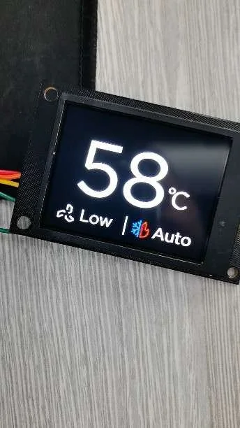
LCD screen enables a highly scalable and intuitive UI.
LCD offers a more familiar UI experience for modern users, especially for complex menu systems. The key challenge is designing a simple navigation flow with minimal clicks.
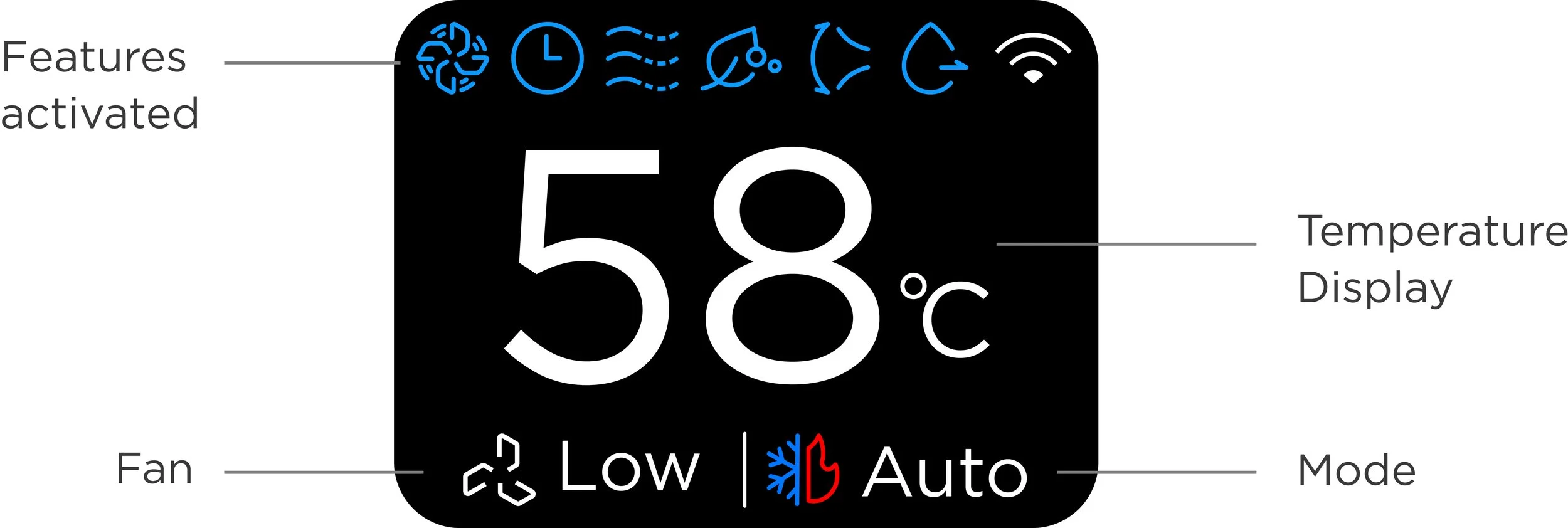
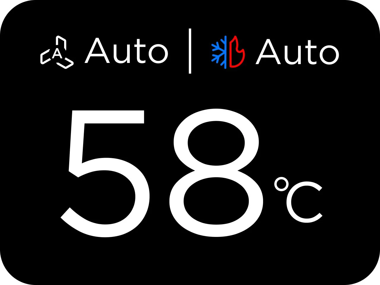
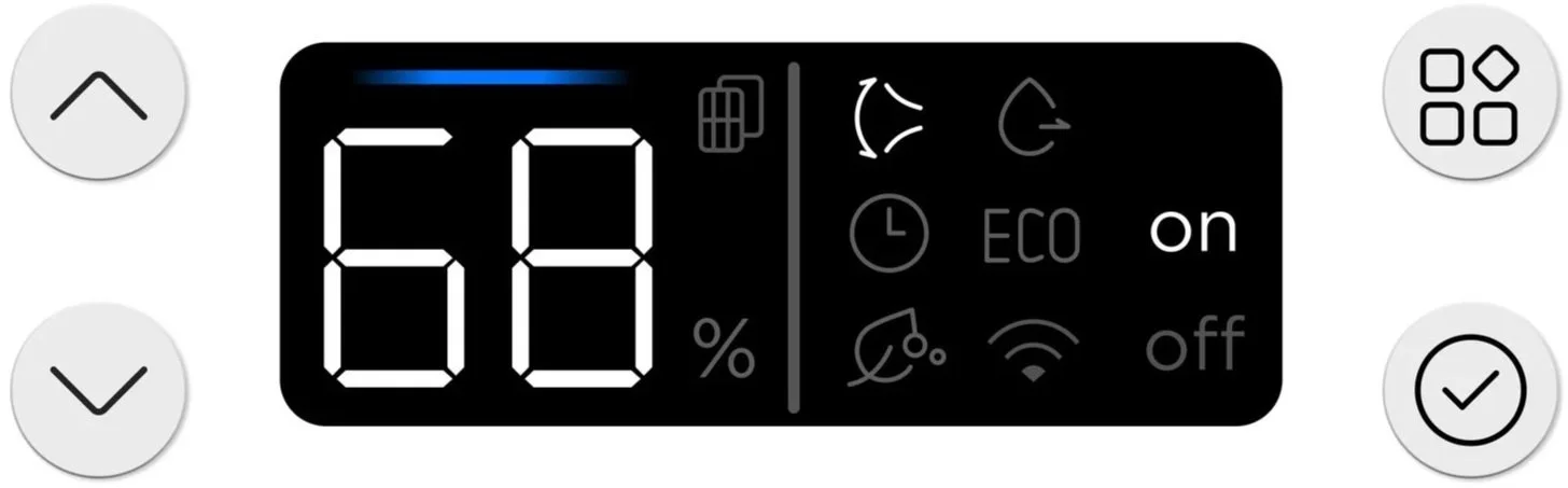
Home
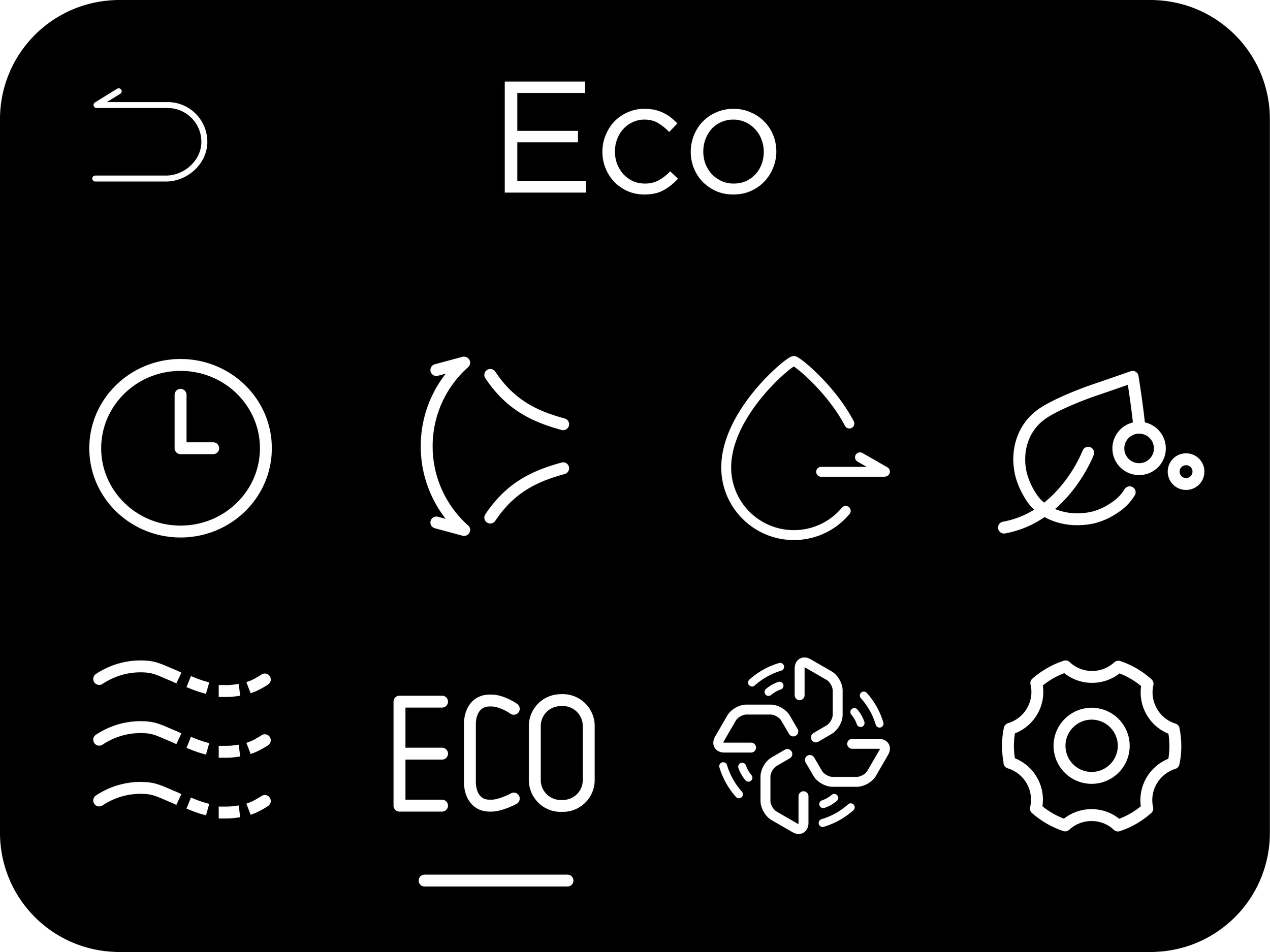
Home screen provides an immediate overview of the setpoint, mode, fan, and all the features that are currently activated.
Home (Near Screen)
Home (Farsight View)
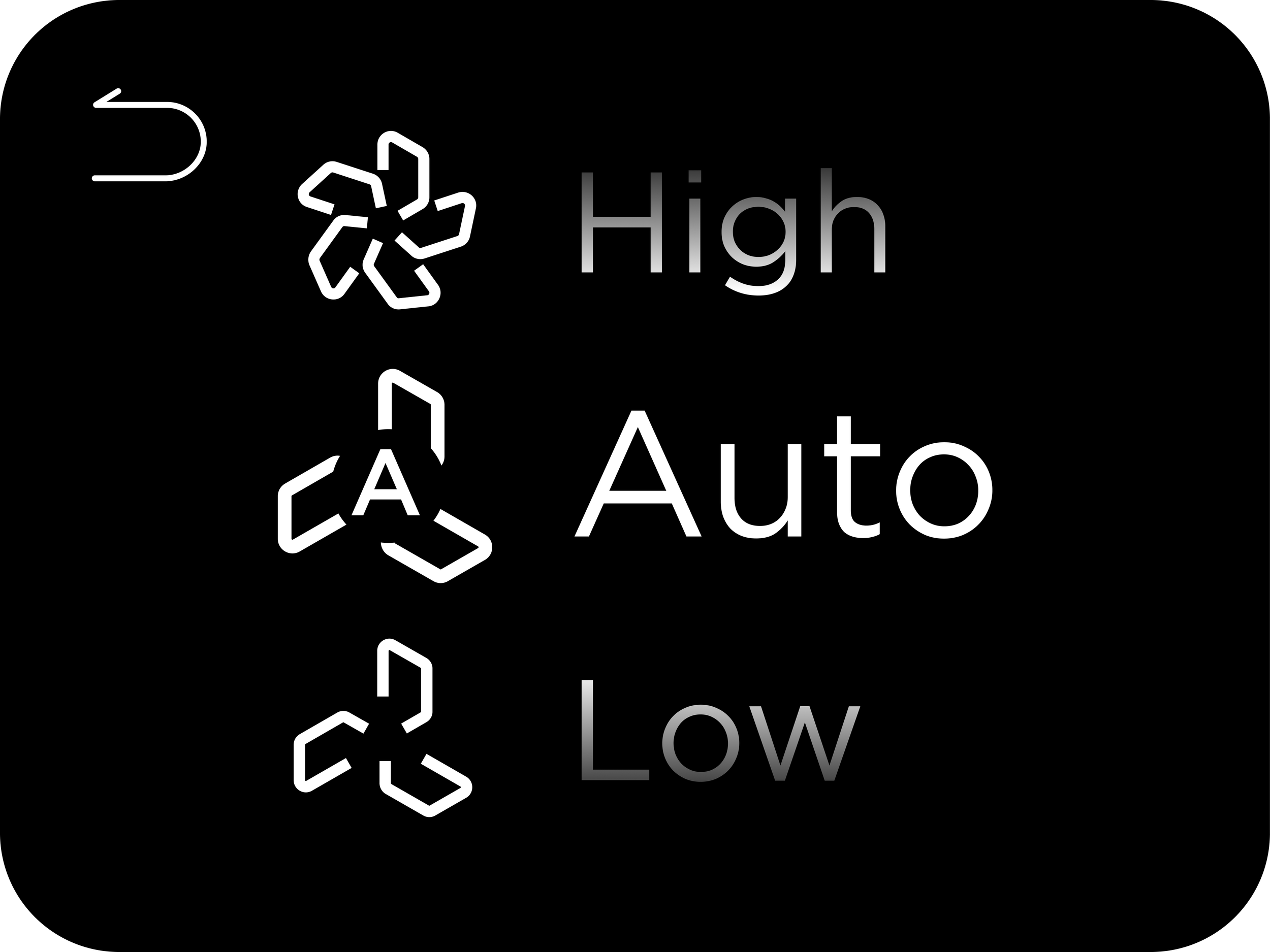
Fan Selection
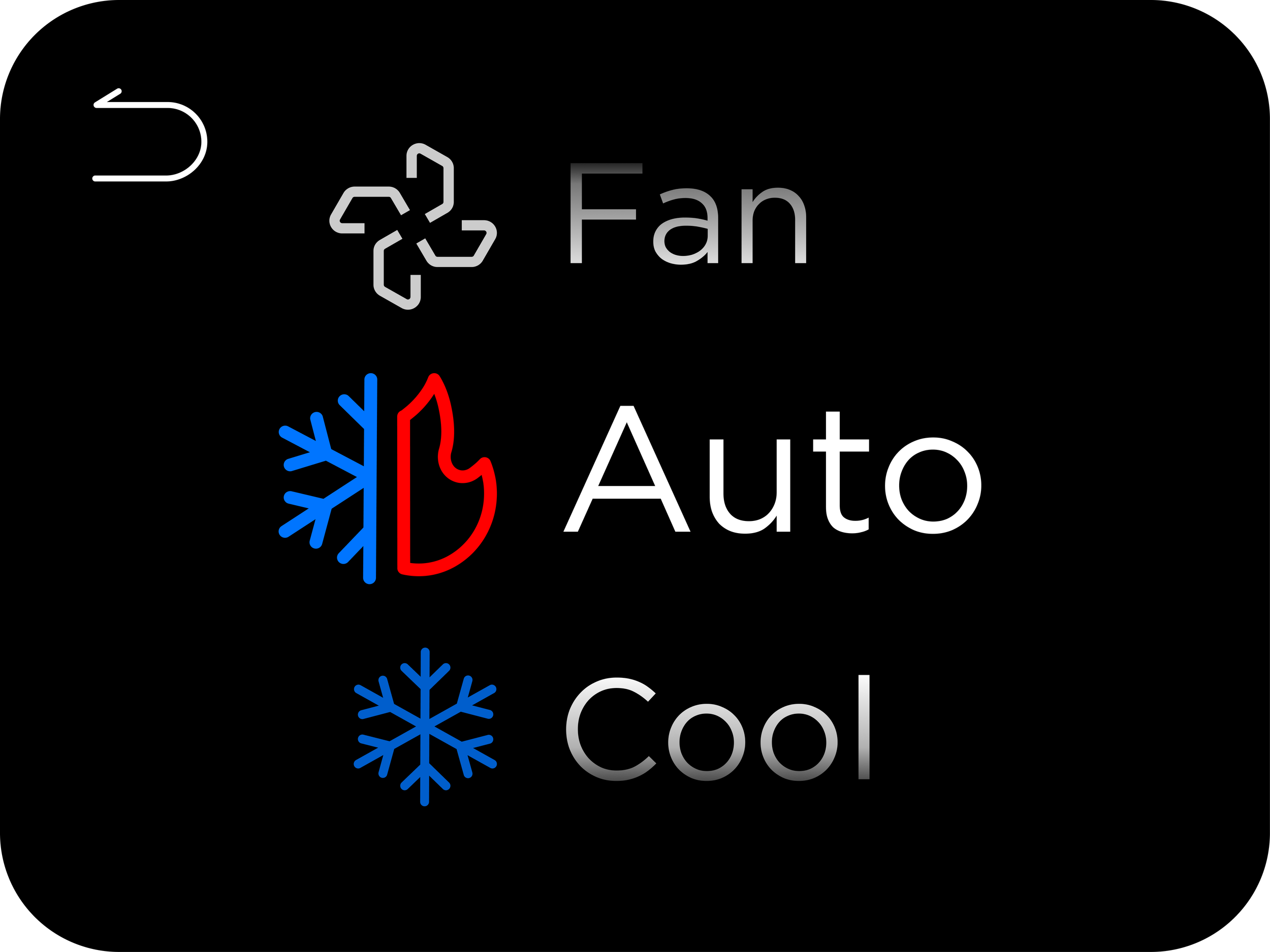
Mode Selection
Menu
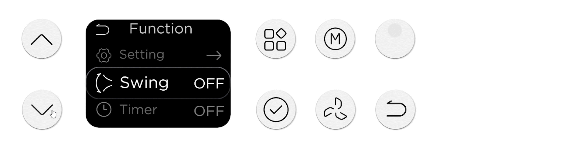
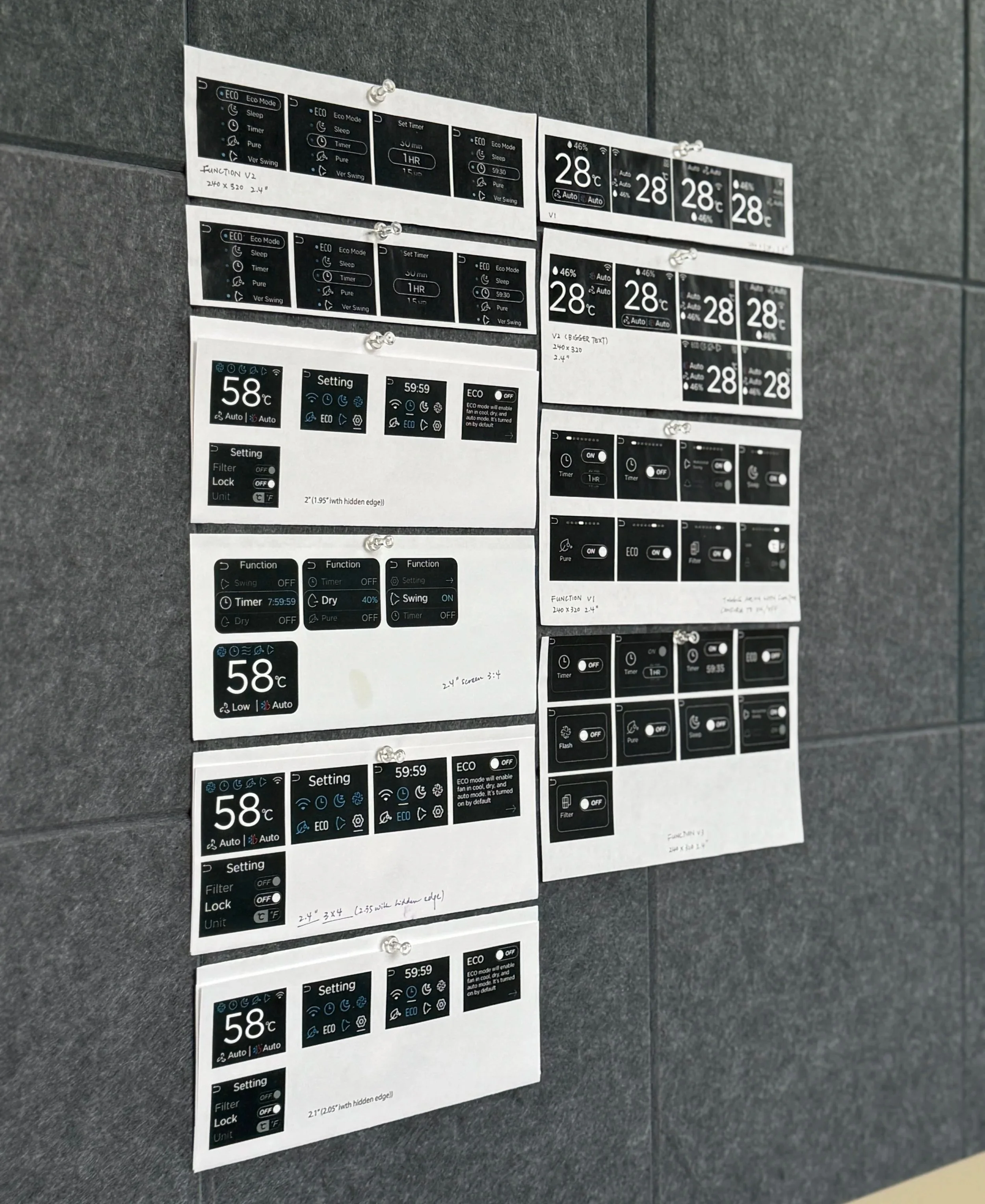
The feature menu is key to understanding the machine’s capability and status. We made design iterations that examined the relationship between physical button placement and digital navigation as well as the # of features displayed. The key was for users to easily identify the feature’s icon and state. I explored two different navigation flows, including horizontal toggle and vertical list toggle.
Menu Navigation 1
Menu Navigation 2
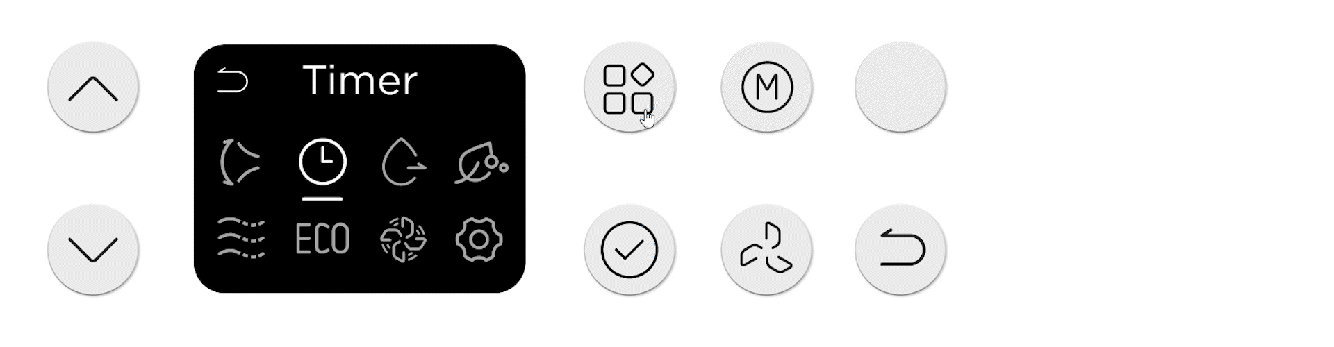
Set Up Timer 1
Set Up Timer 2
New Potential UX Feature
LCD screen enabled a highly adaptable navigation hierarchy. It allowed for more setting controls, disclaimer for unfamiliar features, initial setup flows, future functional updates without overcrowding the interface. I took advantage of this property and explored several potential applications.
Explain control logic for the unfamiliar features
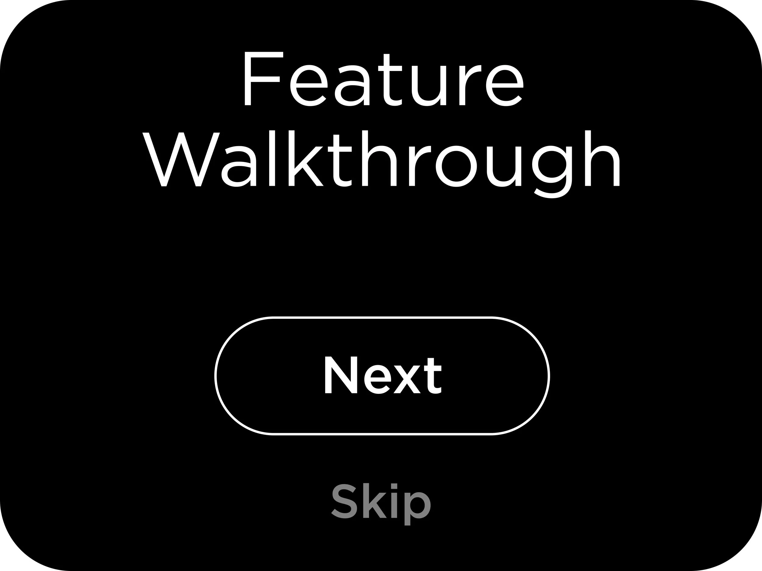
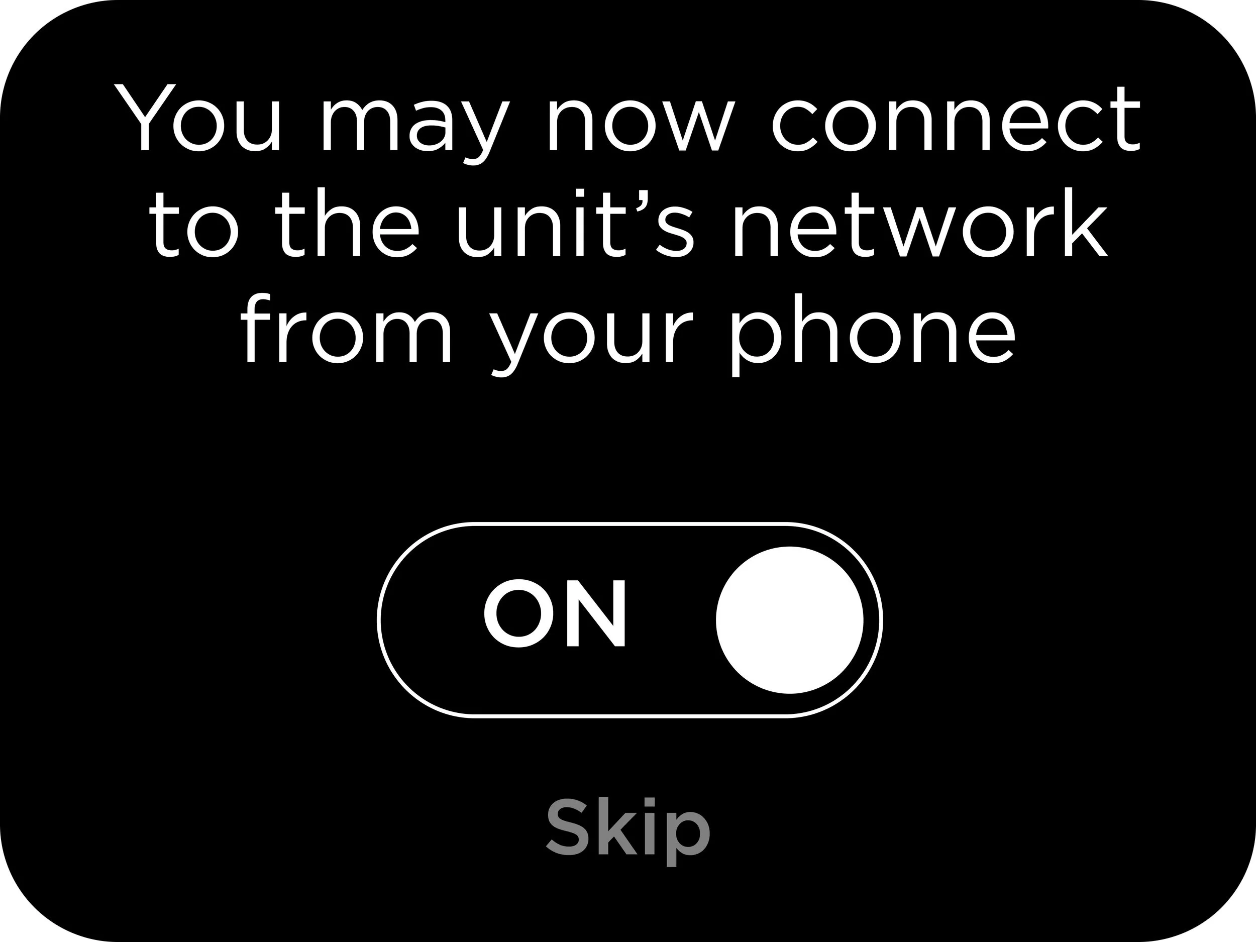
Feature walkthrough during initial setup
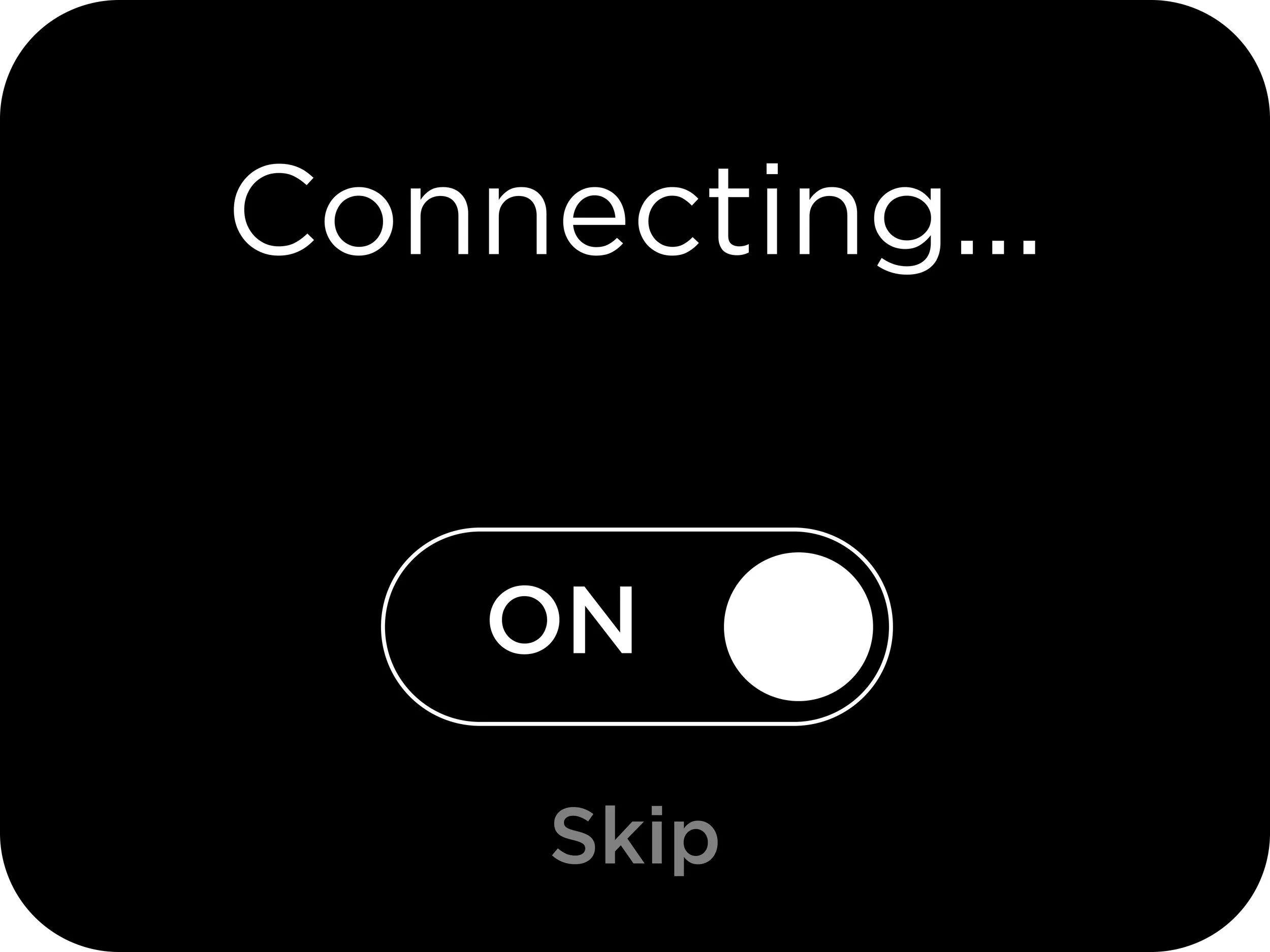
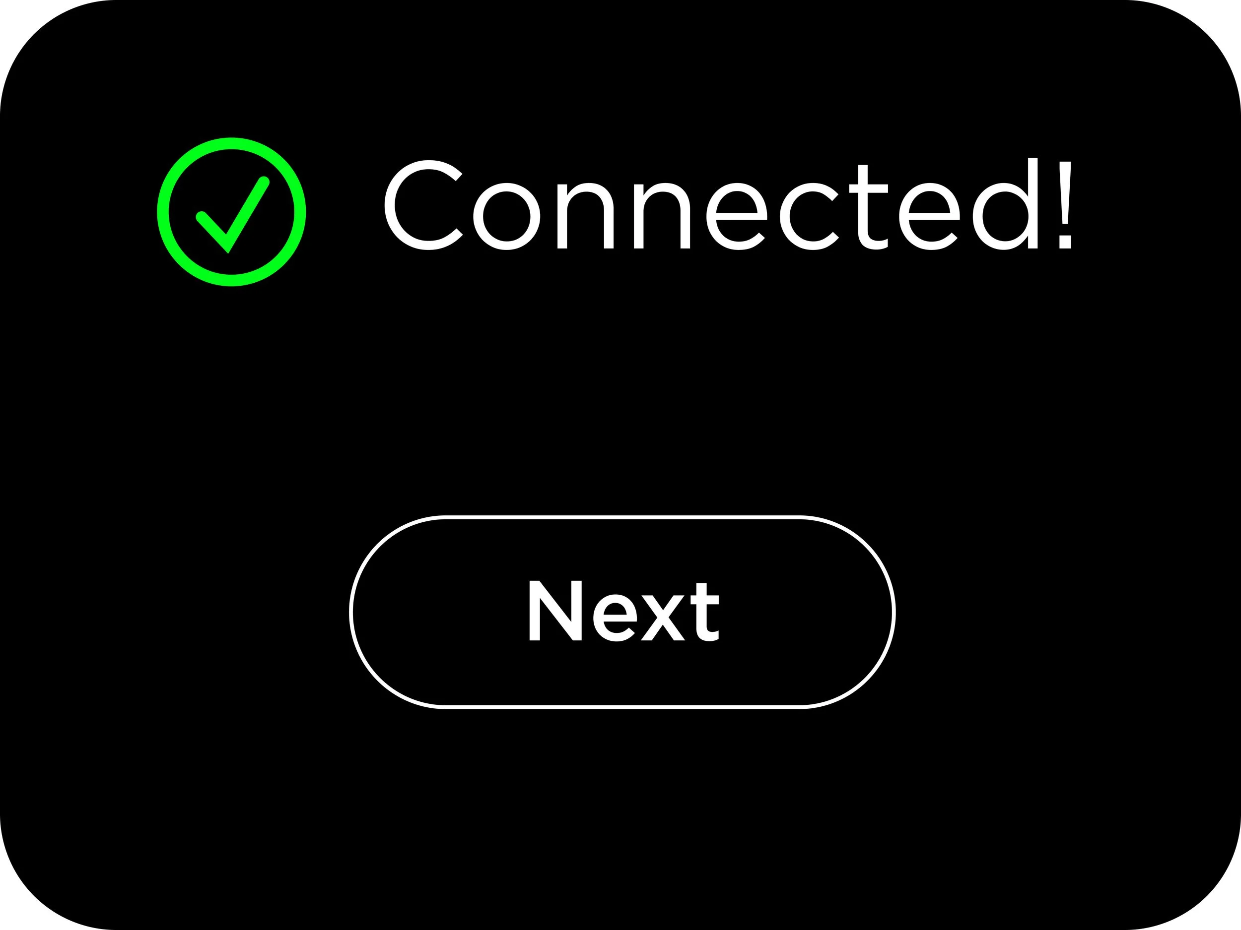
Walk users through setting up the wifi

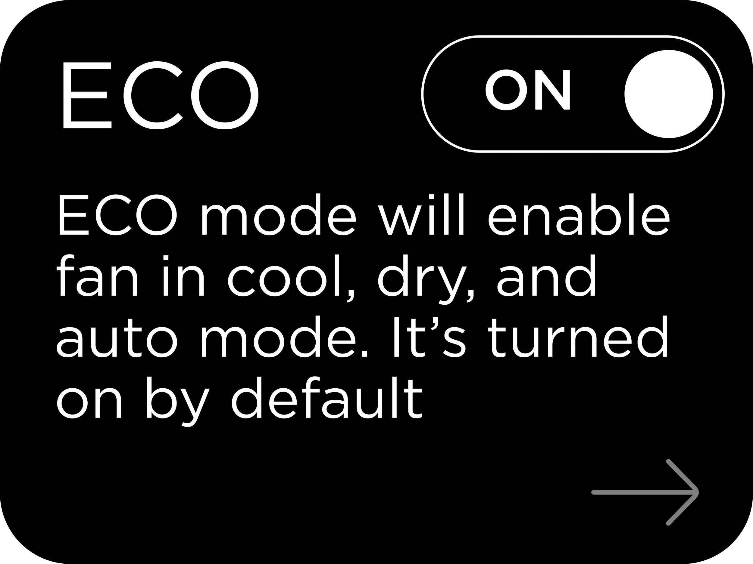
Maintenance Reminders
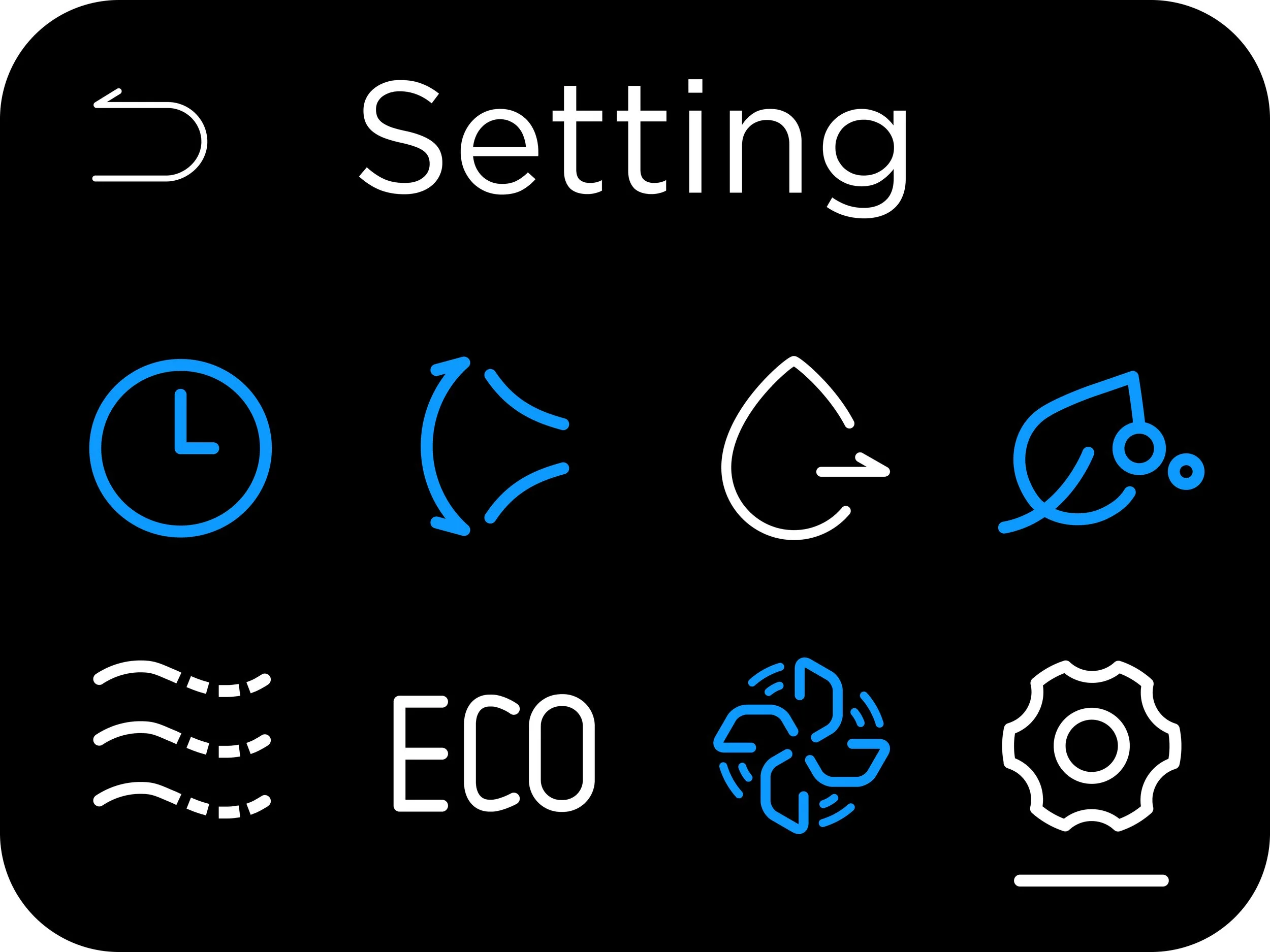
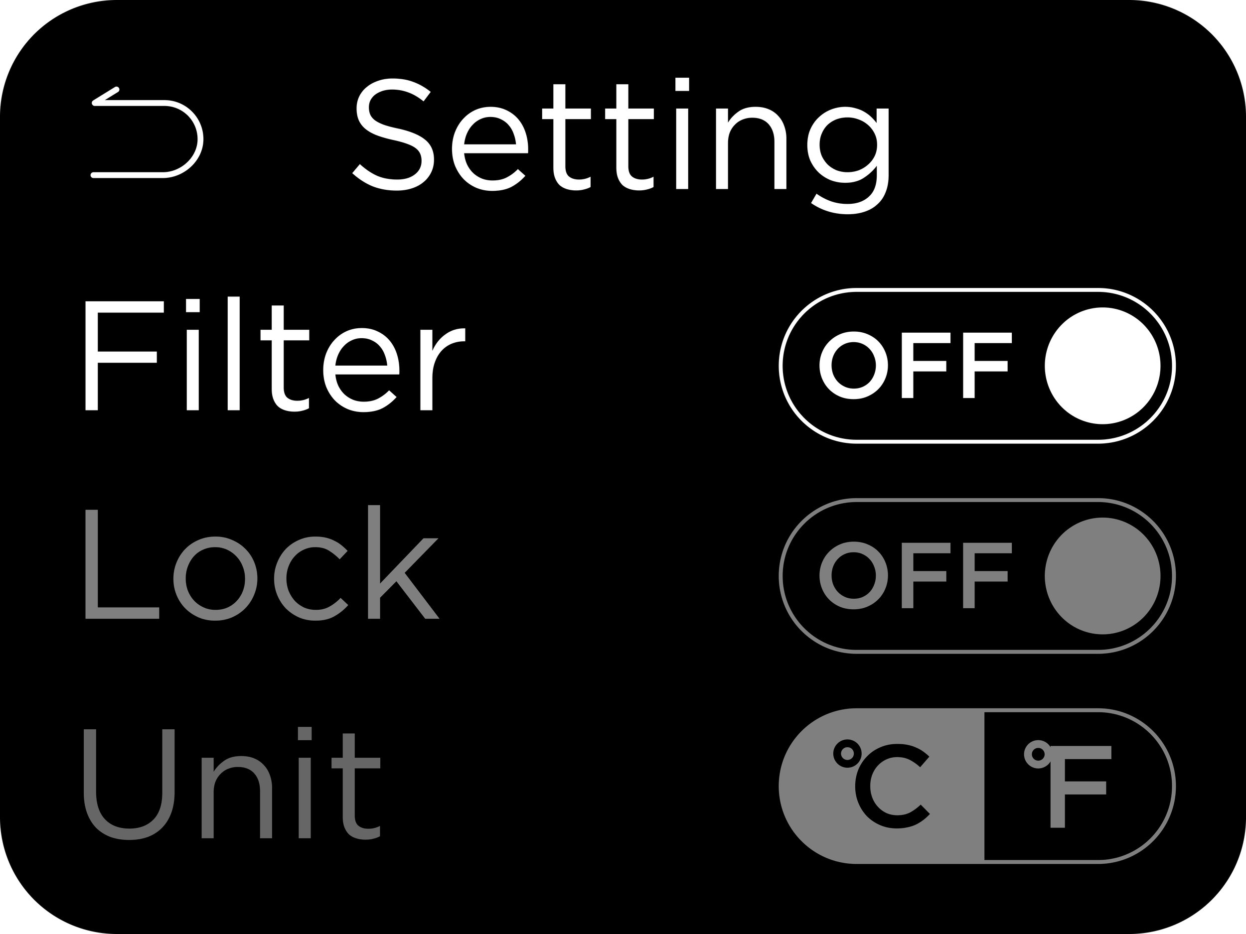
Move all low tier features to setting

Approach 2
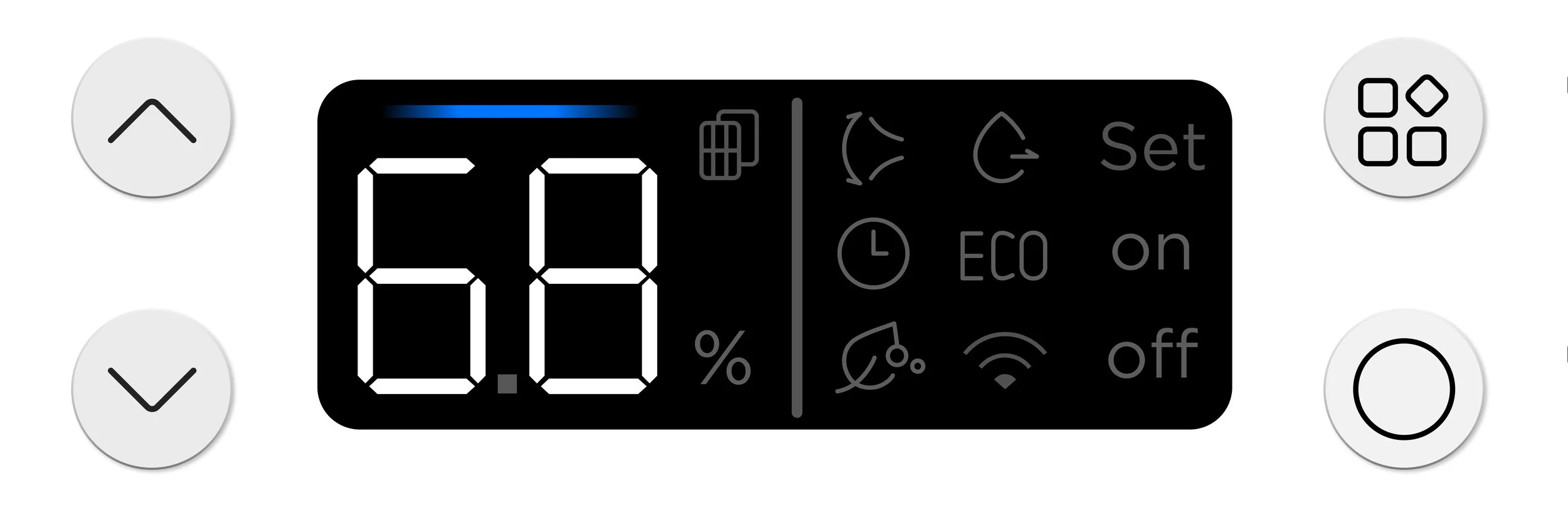
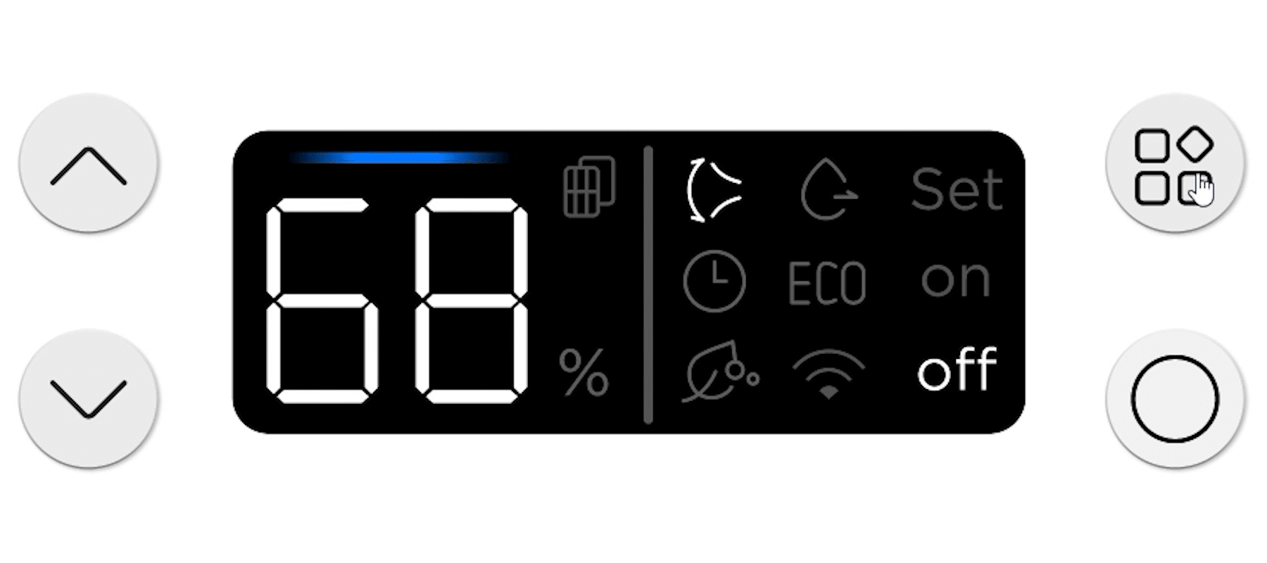
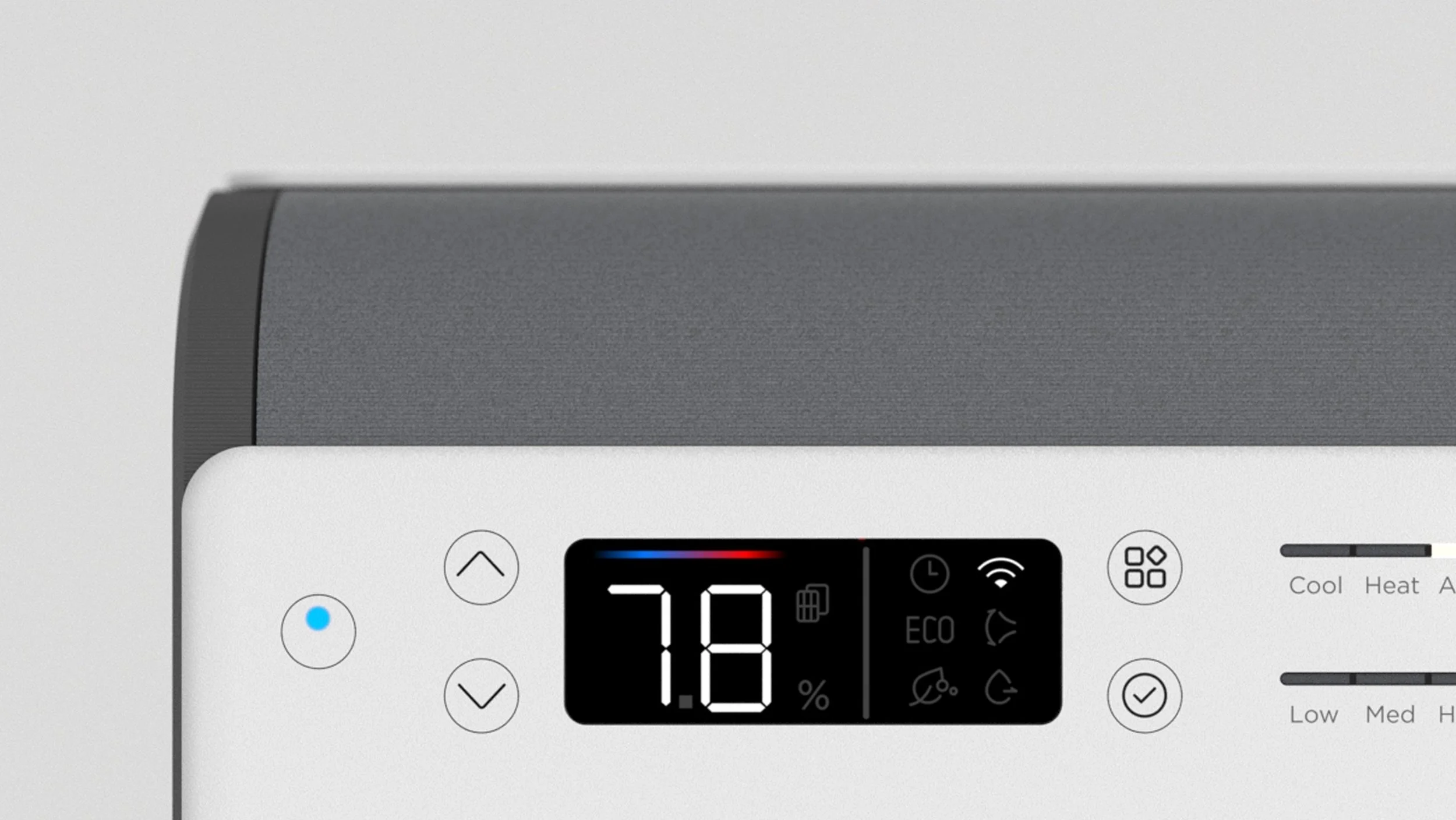
Menu For A Segment Display
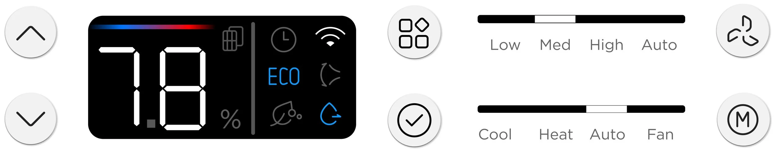
Understanding the cost constraints of LCD display, I embedded the menu navigation on a segment display. This approach offerred a screen-like appearance while ensuring a wide range of feature selection from the unit.
User Testing shows that LCD menu is a lot more intuitive than the back lit LED menu.
We broke down the experience into micro steps and went through rounds of controlled user testing. We were able to observe where the user got stuck and how they thought the interface worked from first glance. These findings led us to fine tune the icons, indicators and logic of the UI.
Design 1 : Indicator ON/OFF through LED Color change
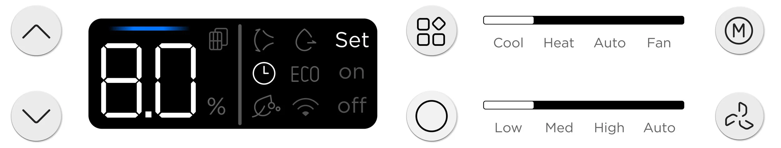
Design 2.5: add “set” to the state marker to confirm parameters for features such as timer and dehumidification
Design 2: Indicate ON/OFF through designated state marker (on right)
Design 3: Tested different icons for the confirm button that both confirms the parameter and enable/disable features.
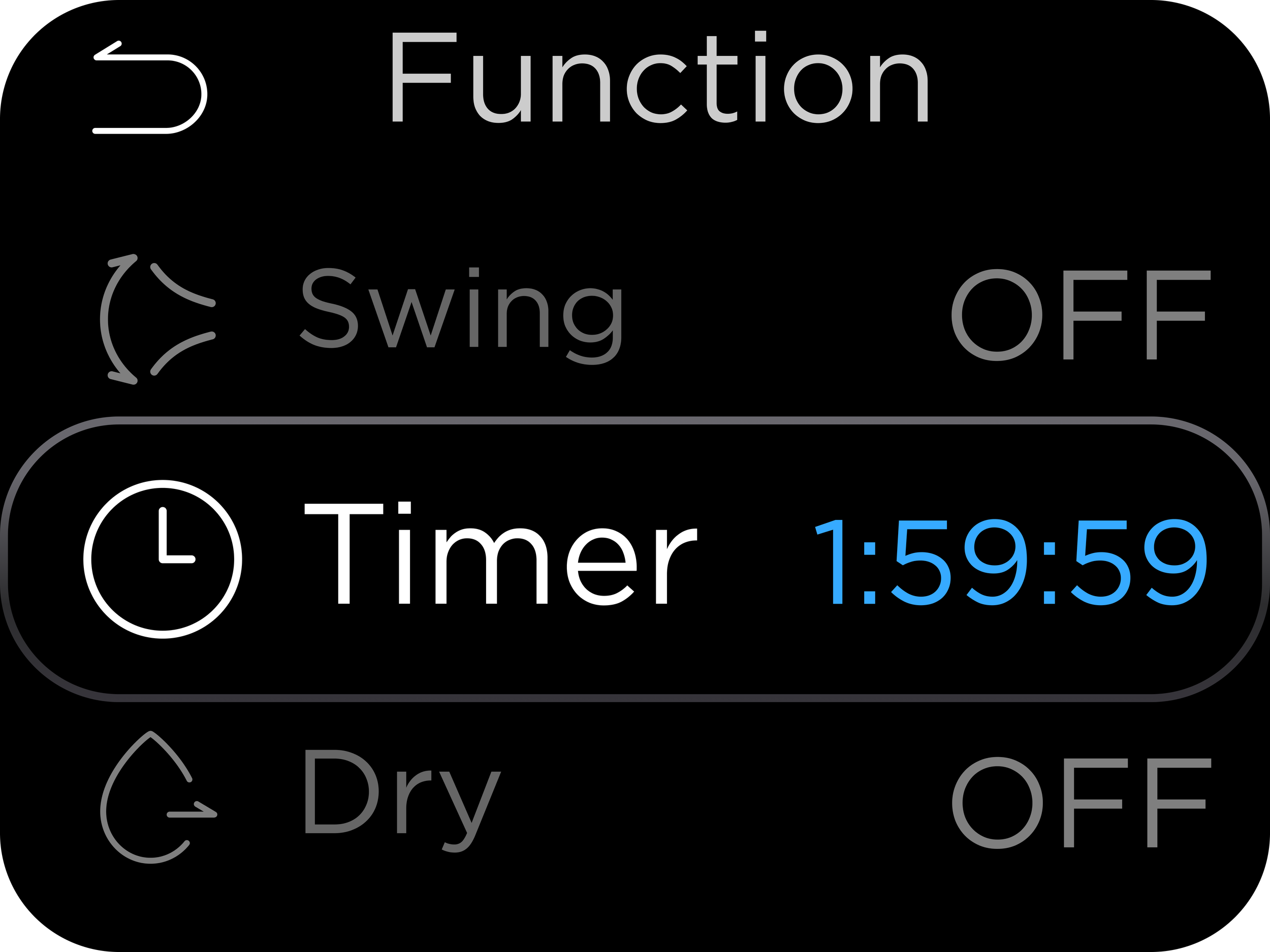
Menu Navigation
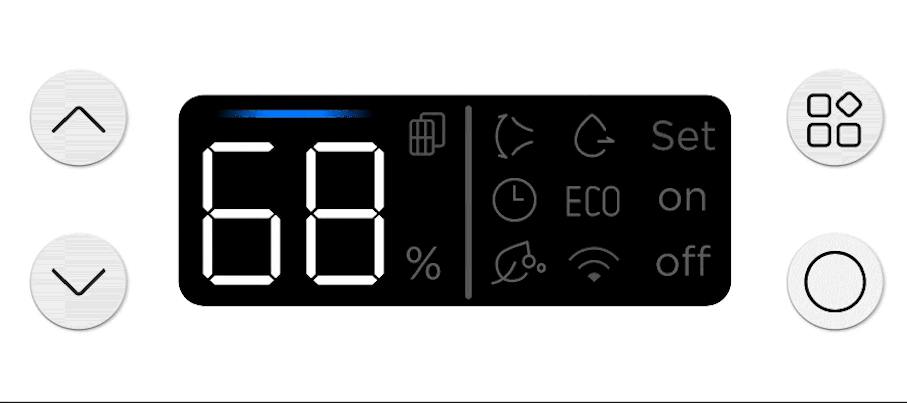
The feature (menu) button toggles the items in the menu. The selected item will light up. The right column suggests the state of the feature selected
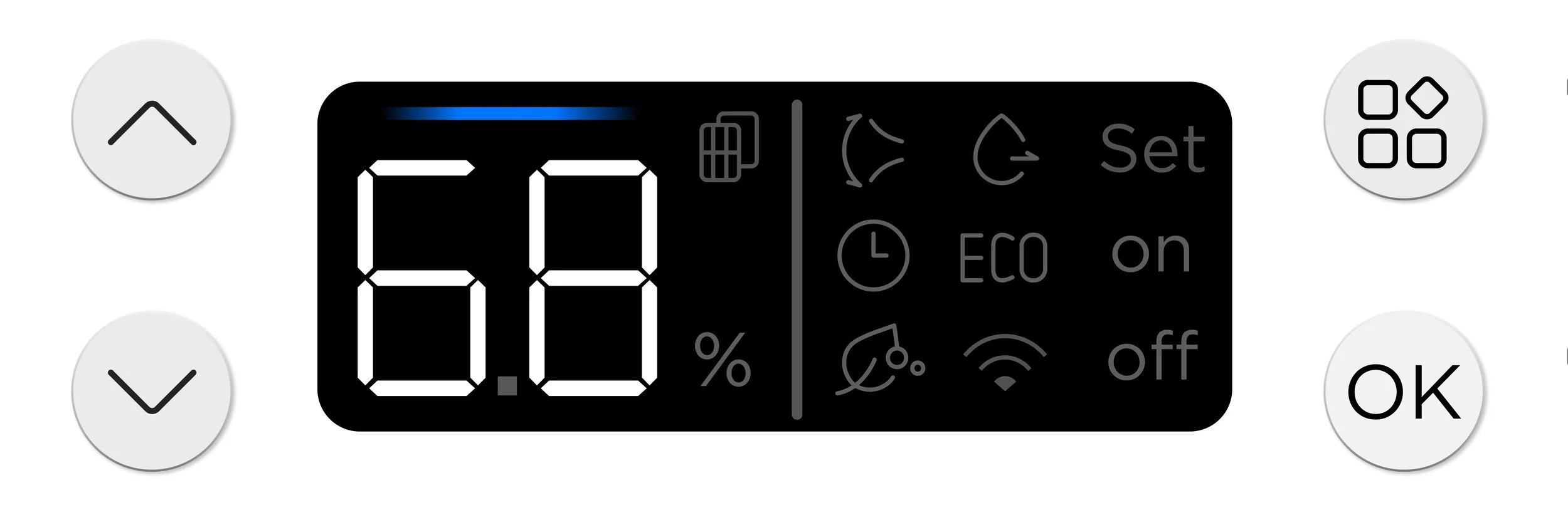
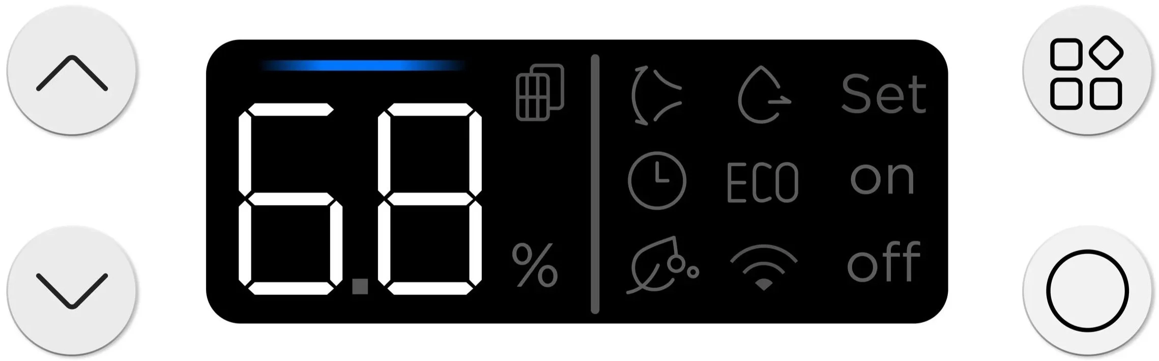
Set Up Timer
To set up features such as timer and dehumidification, toggle to feature, confirm, adjust feature parameter (timer duration), confirm again to set
Process & Validation
Online User Testing
Some Examples Of The Findings
Adding “Set” To “On / Off” : While setting up timer, some users fail to notice the number display on the left that allows them to set up timer duration. Many also are inclined to press checkmark after adjusting the timer duration, only to find that it turned the timer feature off.
Vertical Navigation : Particularly in the screen design, users were more confused on how to move through the menu without up/down. We modified the design to have vertical navigation rather than horizontal (in 2 rows)
User Testing
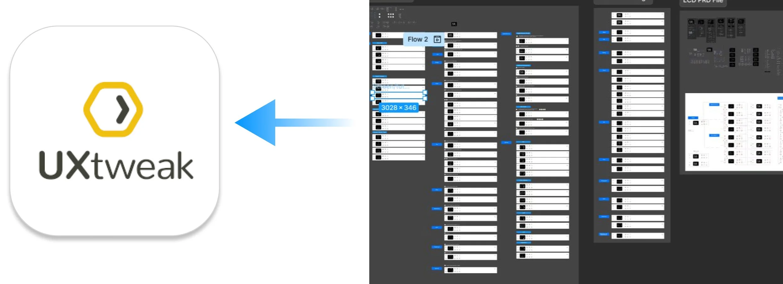
We created clickable prototypes and performed online user testing through a platform called UXTweak. We went through multiple rounds of controlled testing. We asked the users to perform a series of tasks with varying complexity. We were able to observe where the user got stuck and how they thought the interface worked from first glance. These experiments helped guide/validate our design hypothesis and fine tune the user experience.


Process & Validation
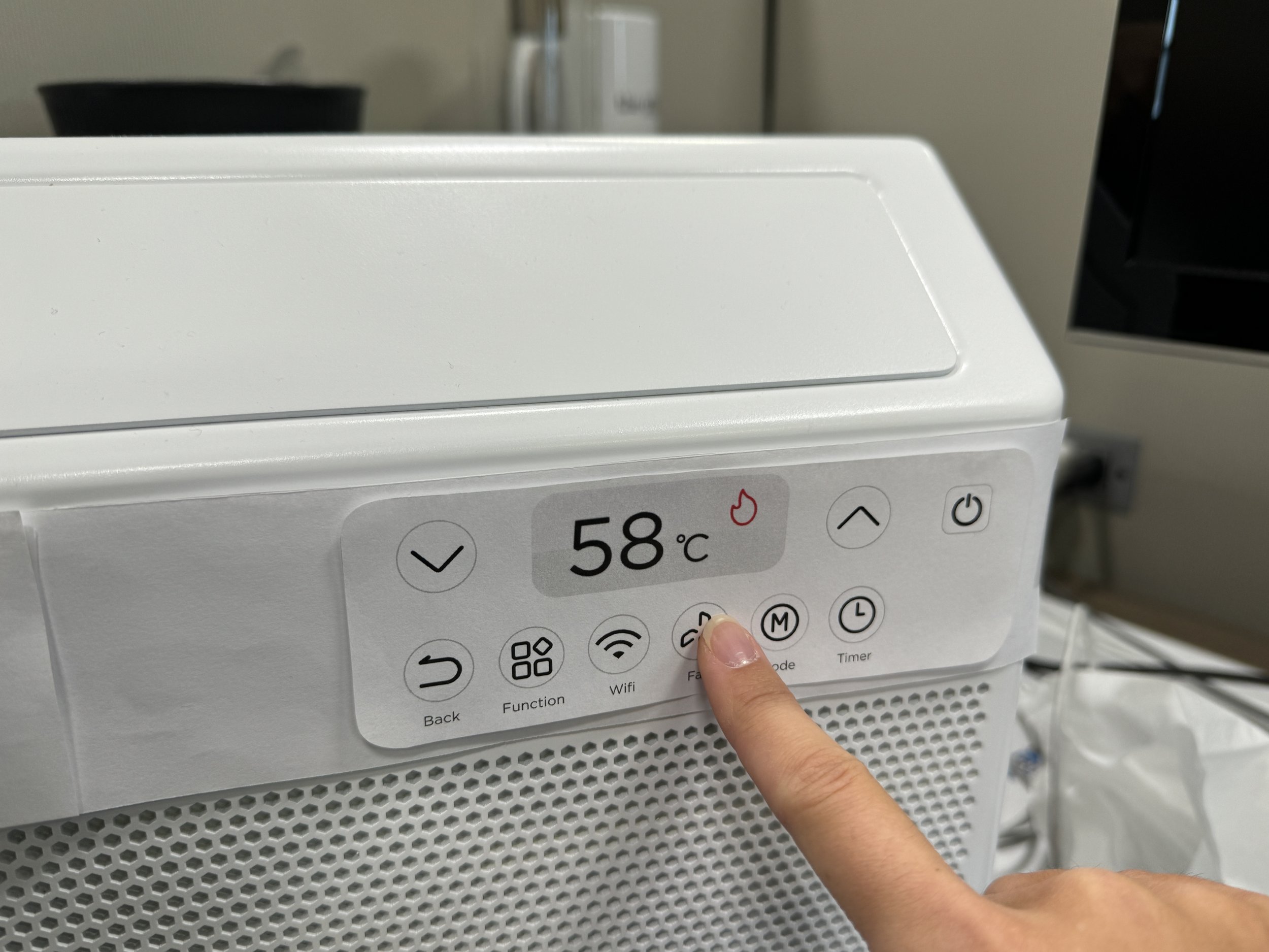
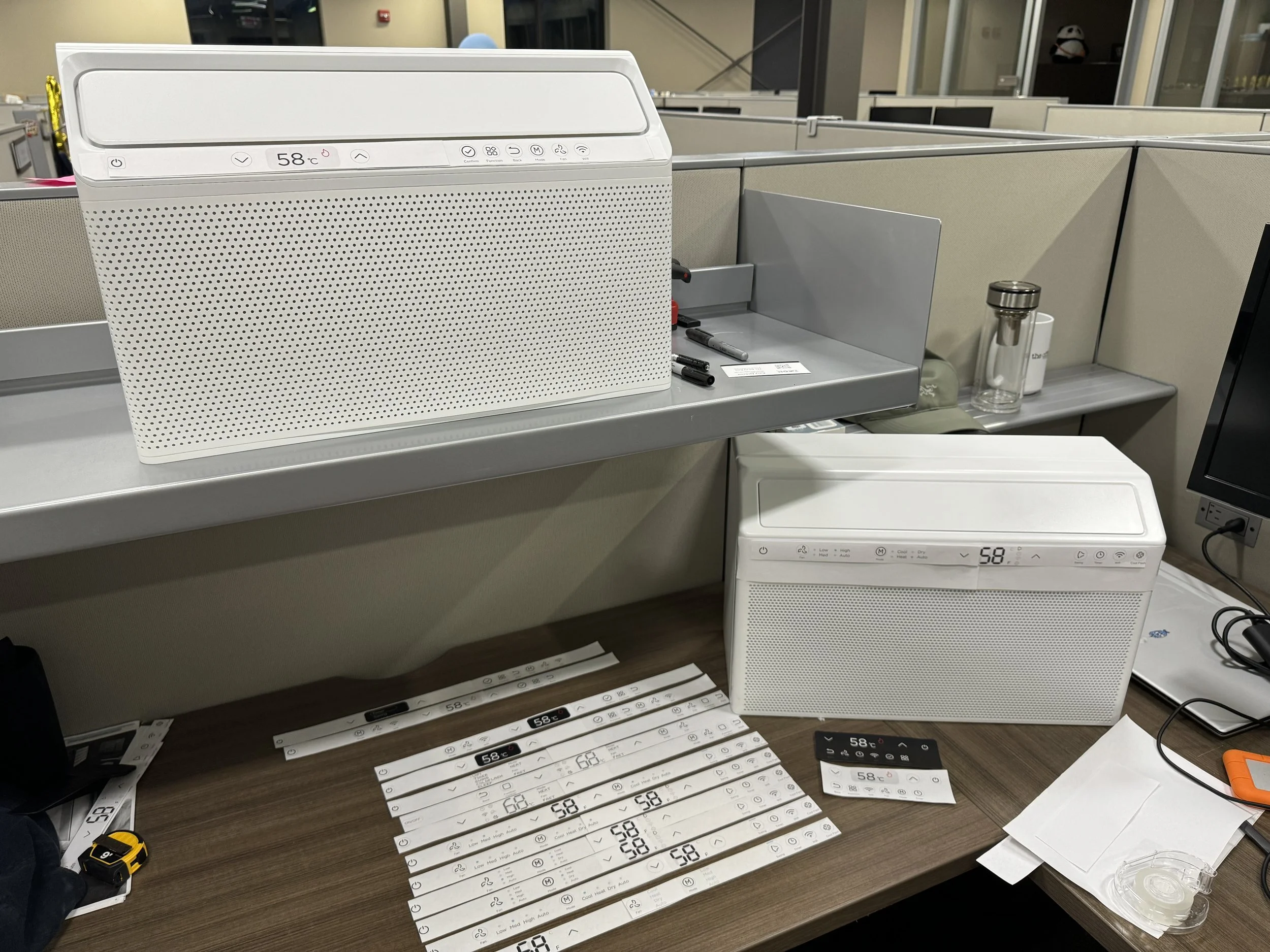
Physical Testing
From an early stage of UI development, I was constantly printing out concepts to scale, placing them on the initial appearance models to test button/display sizing and their compatibility with different form concepts.
During later refinement of the LCD display, I used the same method to narrow down the most optimum screen size that would support the UX functionalities and provide adequate visibility.

Approach 3
Feature Presets
One button that streamlines experience for both entry level and advanced users
After exploring many avenues of expanding the feature offerings, one question remains: Are we overengineering the design?
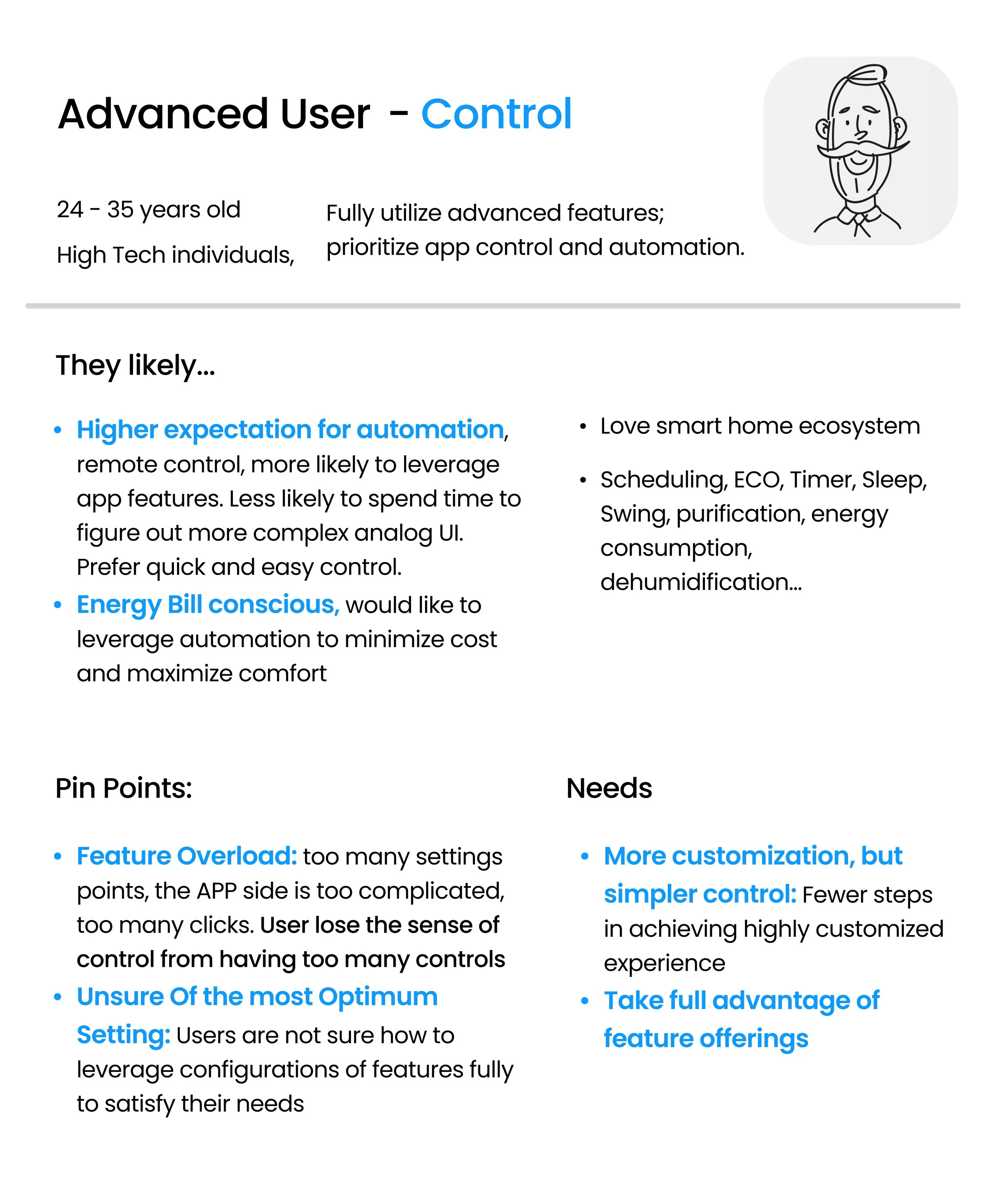
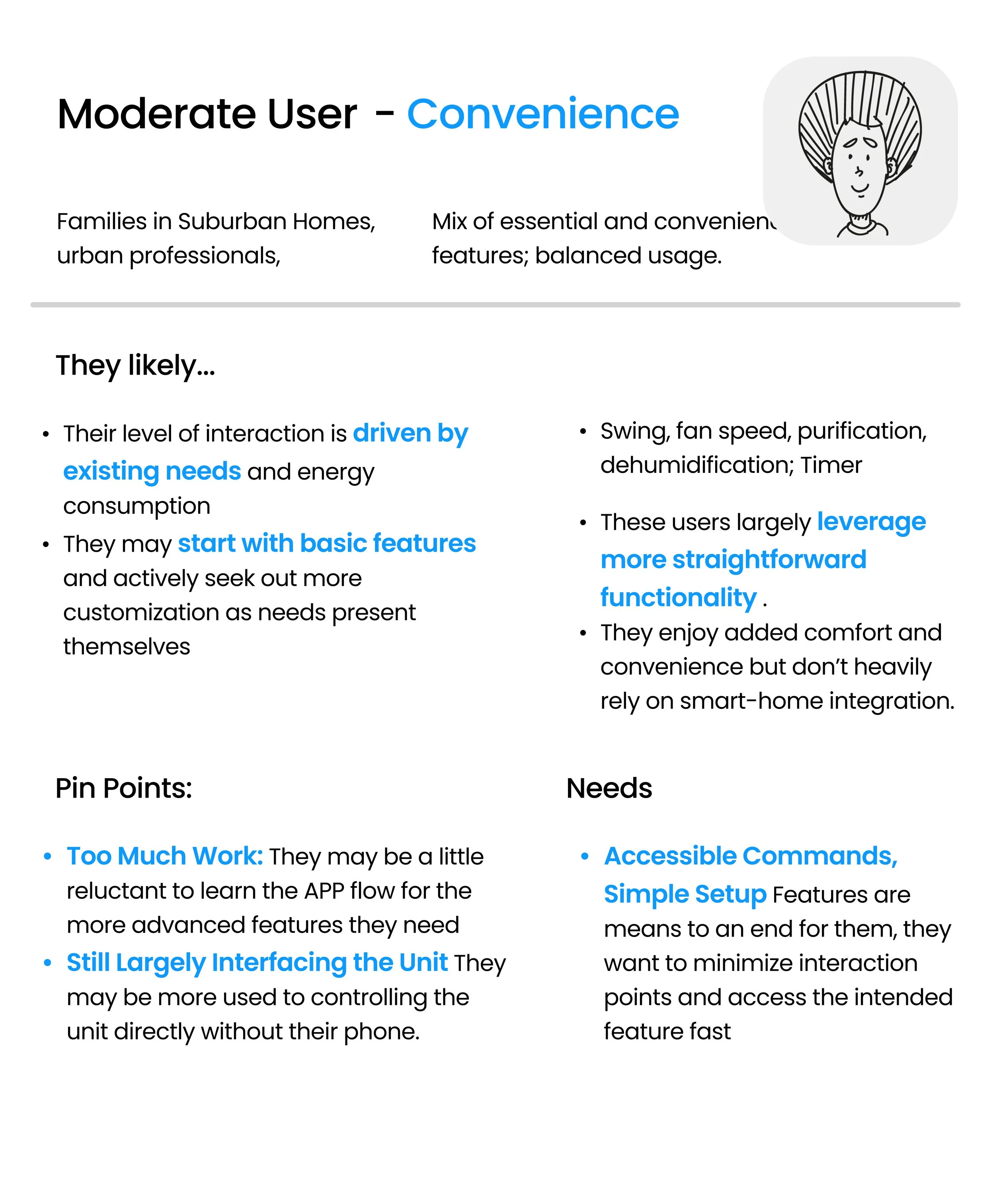
Power User Vs Casual User
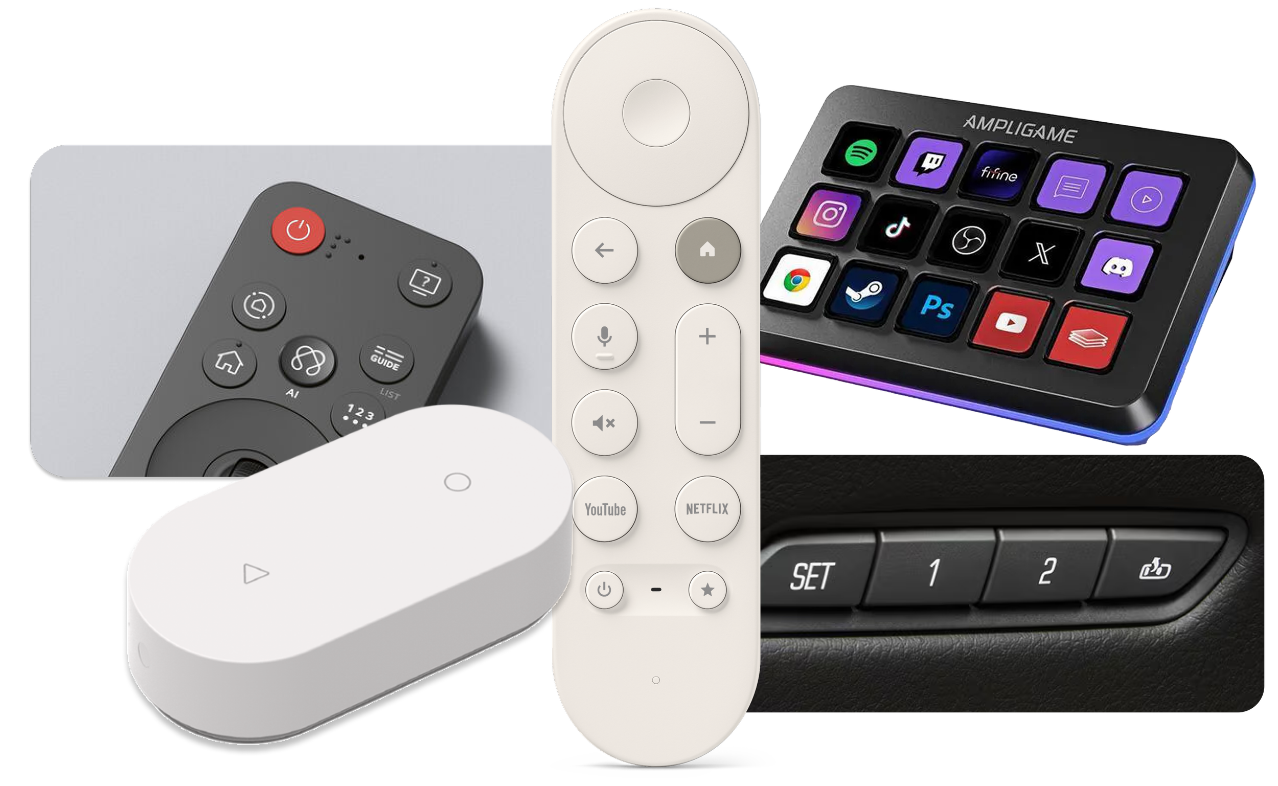
Trend for Simplified UI, Shortcuts, and Presets
We have observed a growing trend of physical smart home controls that offer simple, customizable presets, along with similar features available in our smart home app, such as “scenes” and “favorites’.
Smart Button Logic
A feature preset button allows users to capture and store a preset configurations on the unit. Or toggle existing presets from their “favorite” list.
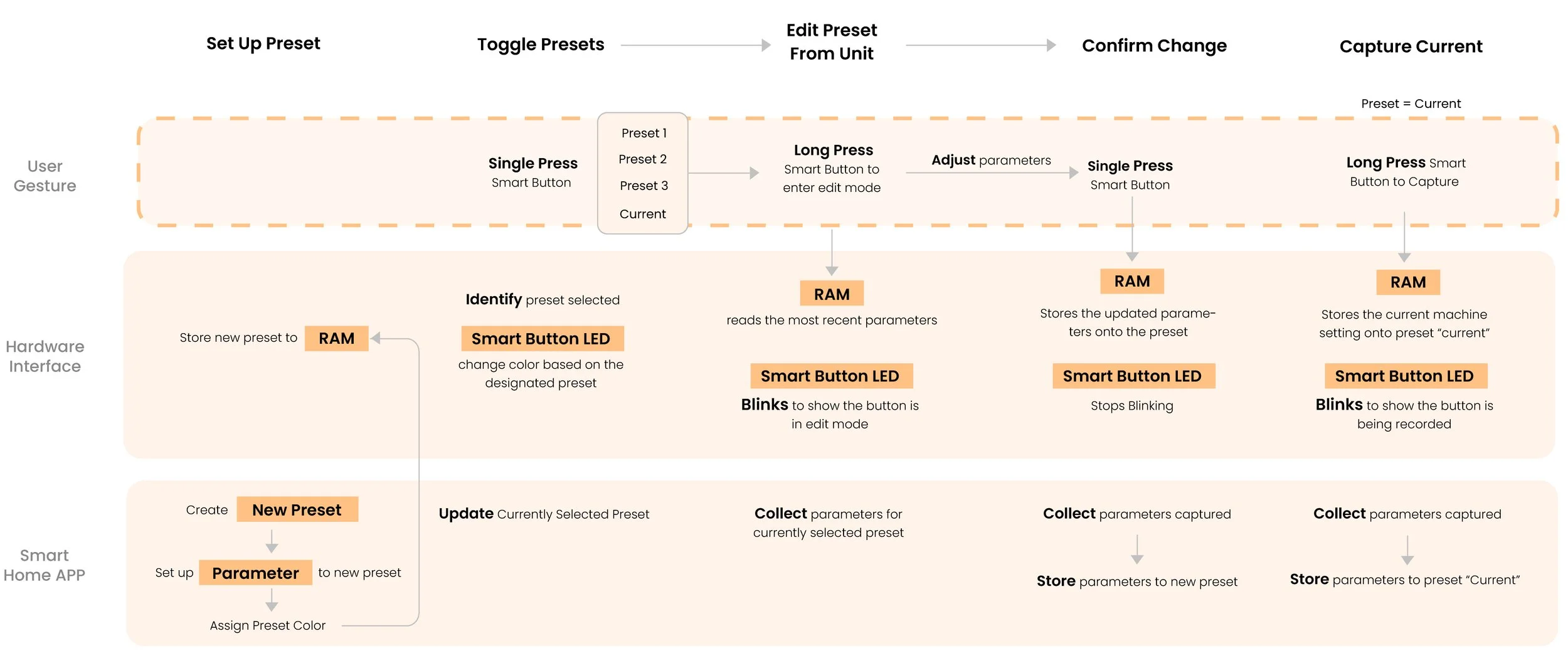
Toggle Between Multiple Presets
LCD Screen Select Preset
Segment Display Screen Select Preset
Edit/Capture Preset
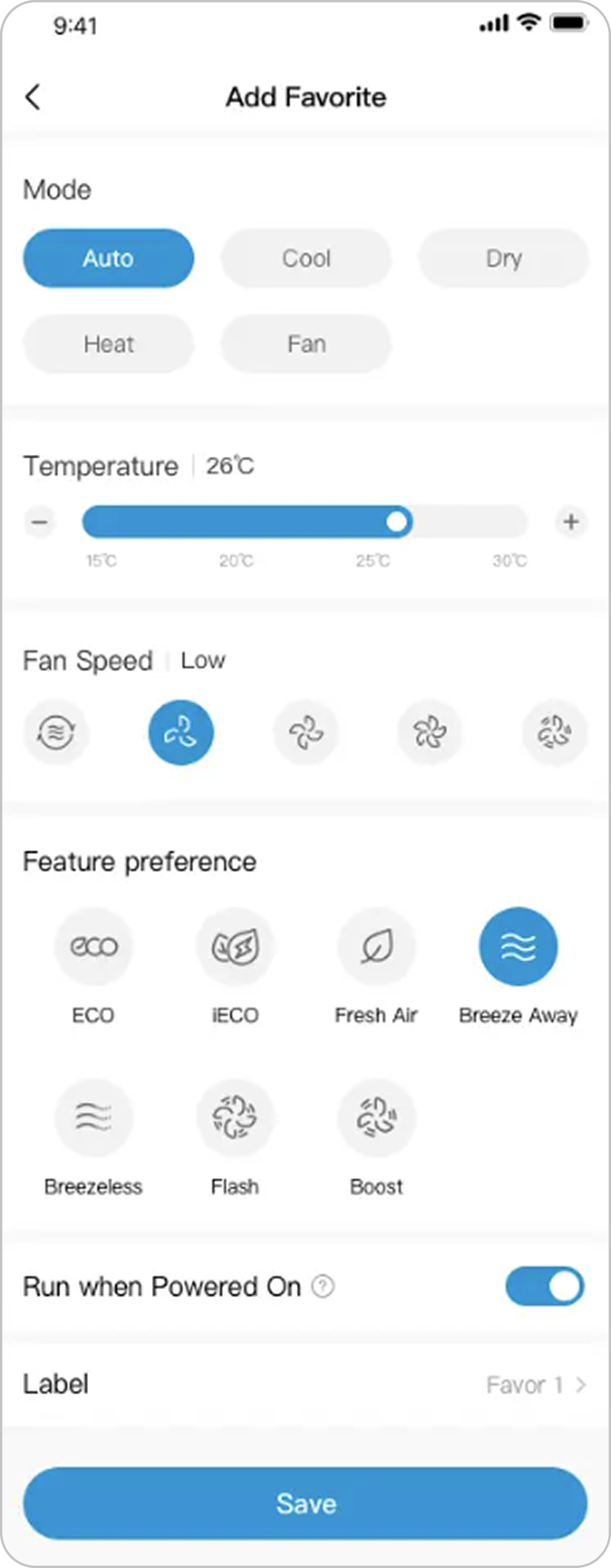
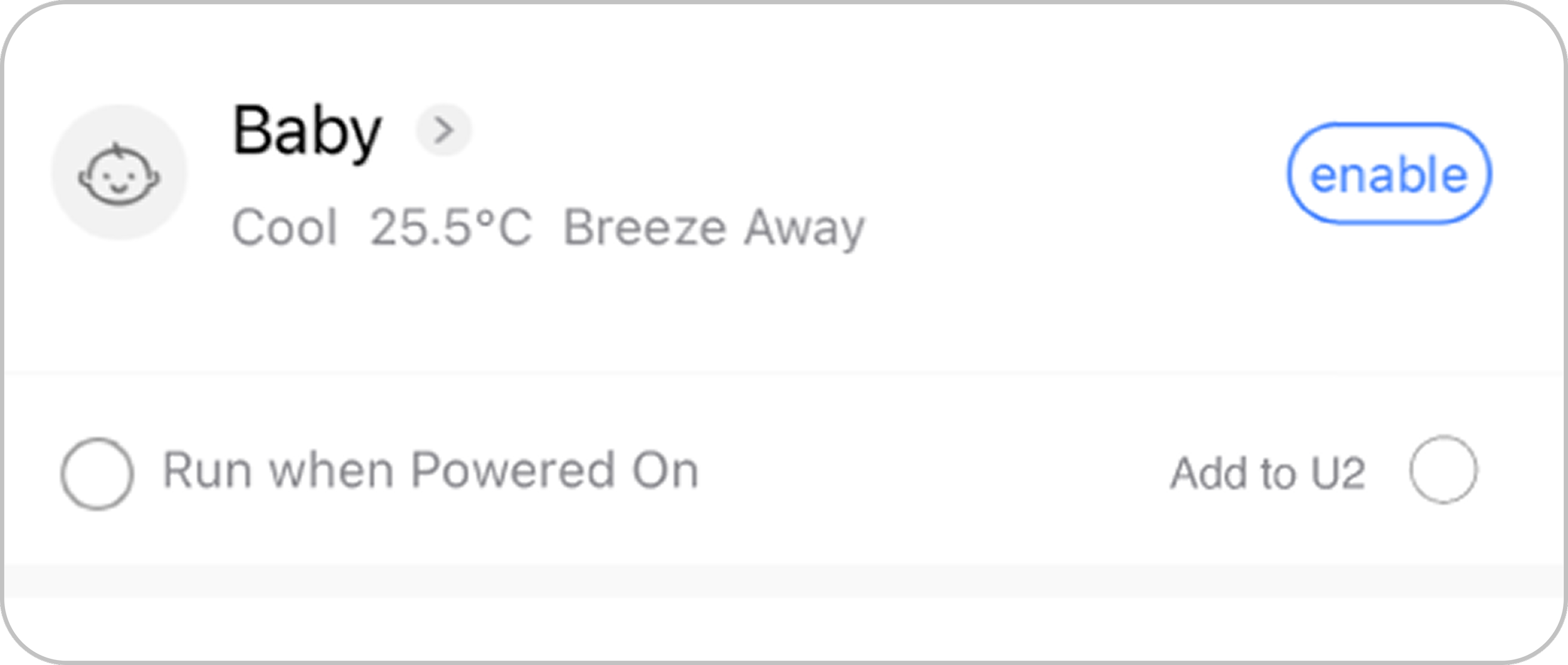
APP Implementation
The smart button feature can be easily integrated with the Midea Smart Home App. Midea already has “Favorite” feature which allows user to save their preferred setting and access with a button. However, in the span of this project, we were not able to fully implement this feature due to time constraints.
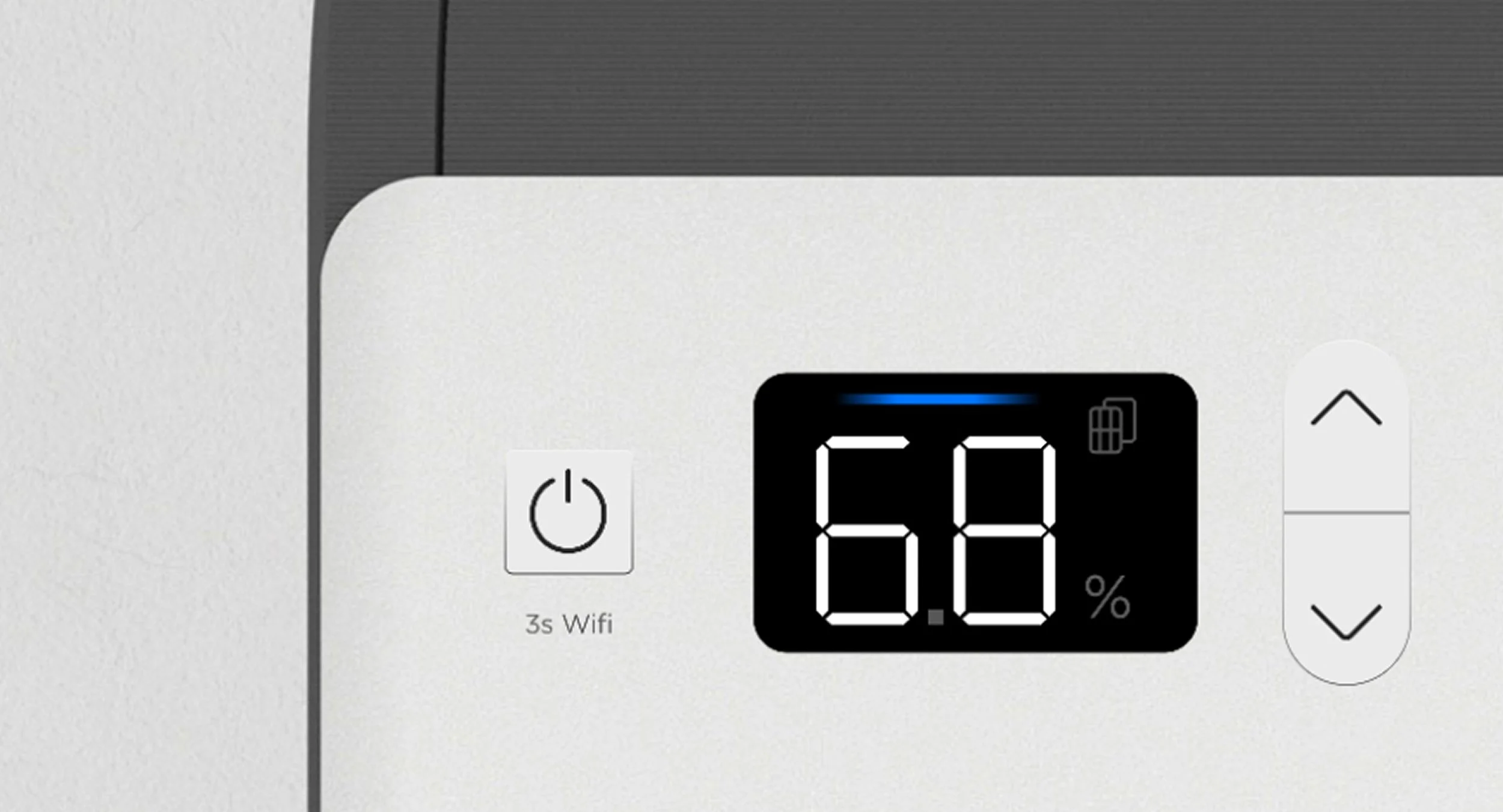
Final Design
Prioritize & Simplify
The high cost of LCD screen and the logistical complexity of smart button integration led us to re-evaluate our strategy, is there a short term solution that ensures simple and premium design and satisfies the functional needs of most Window AC users?
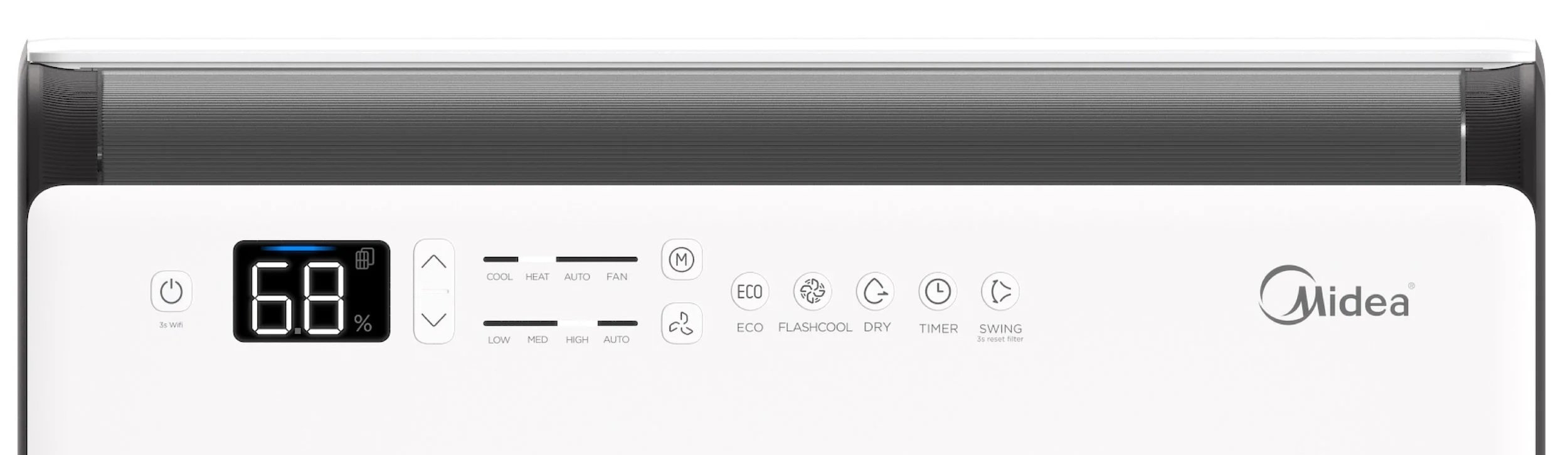
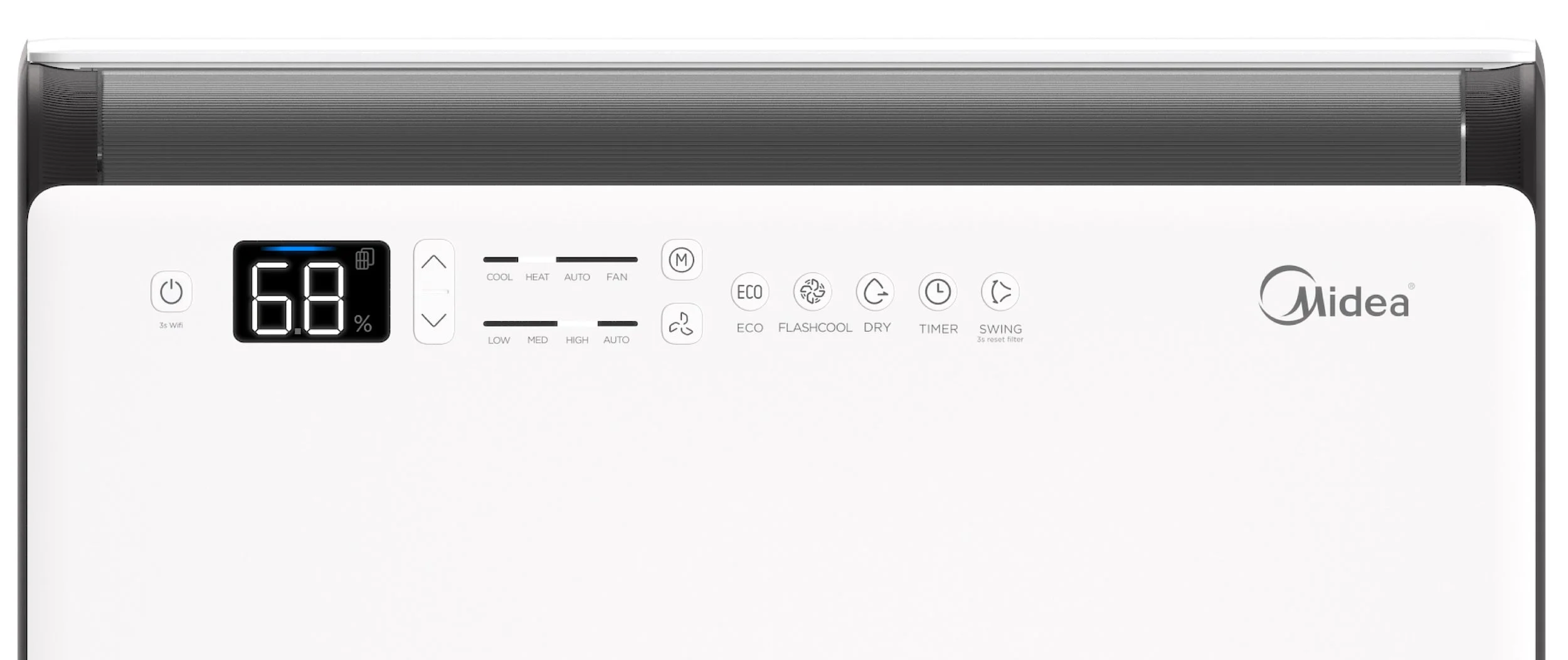
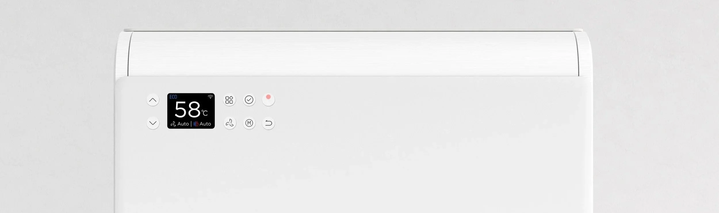
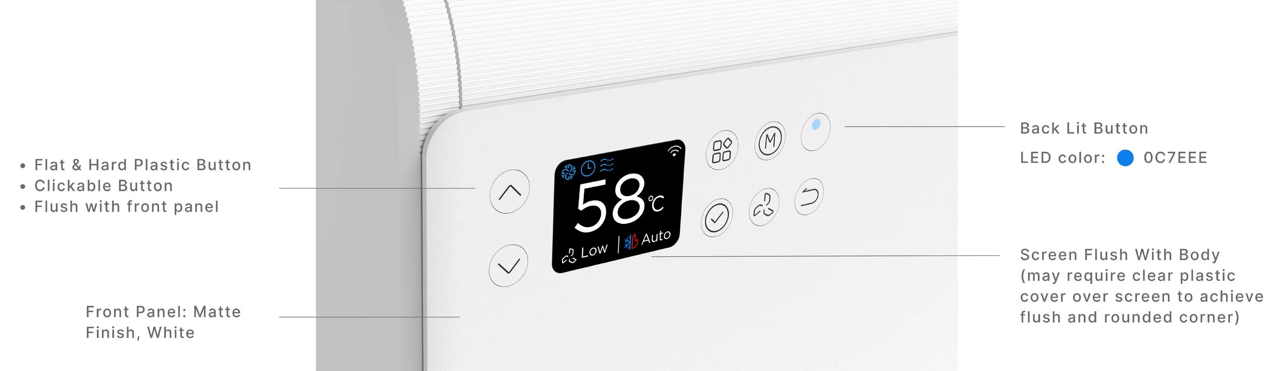
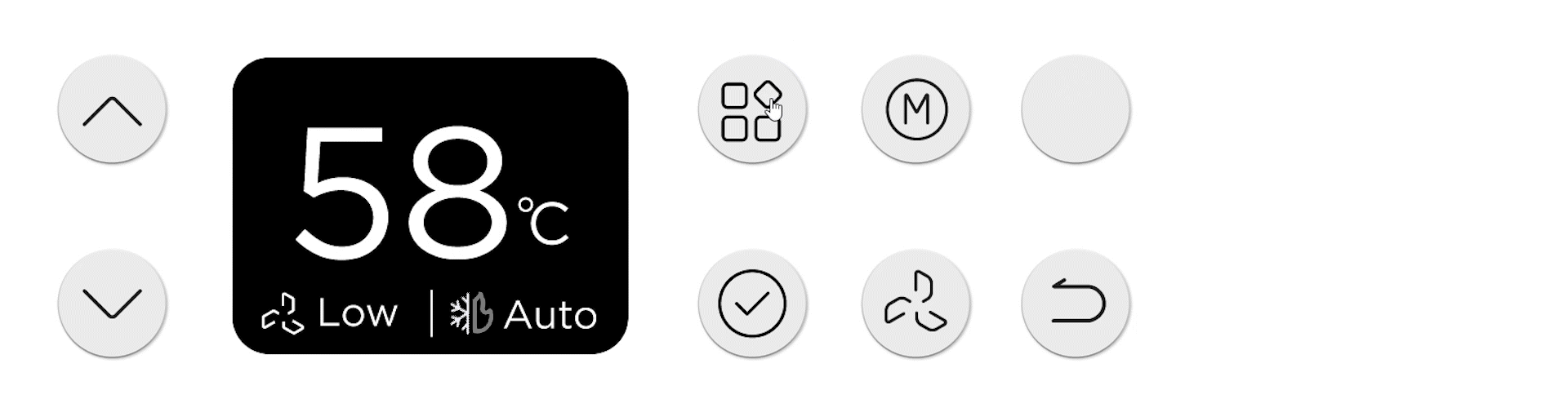
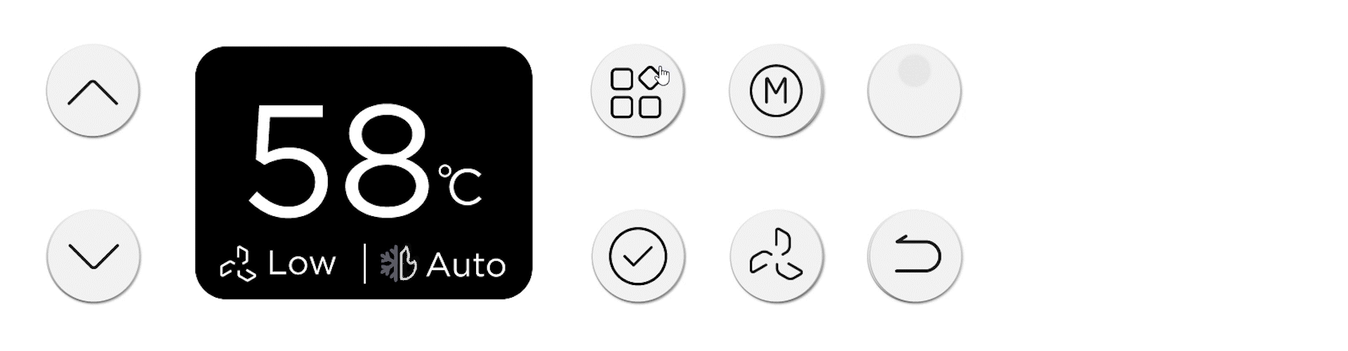
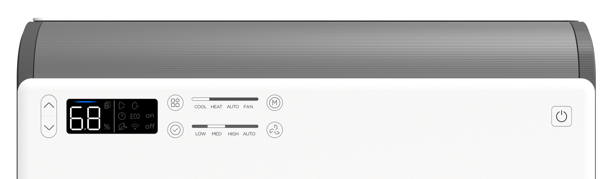
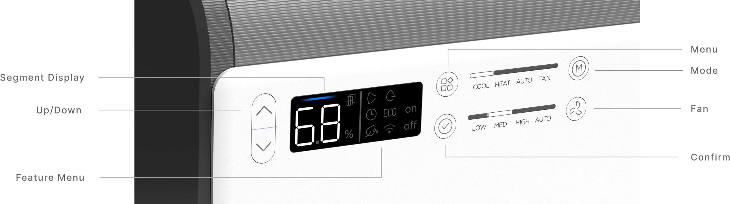
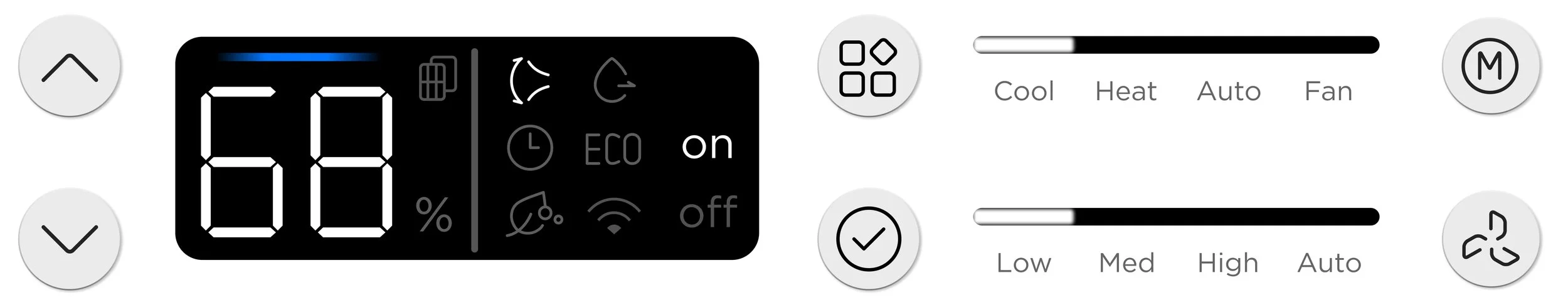
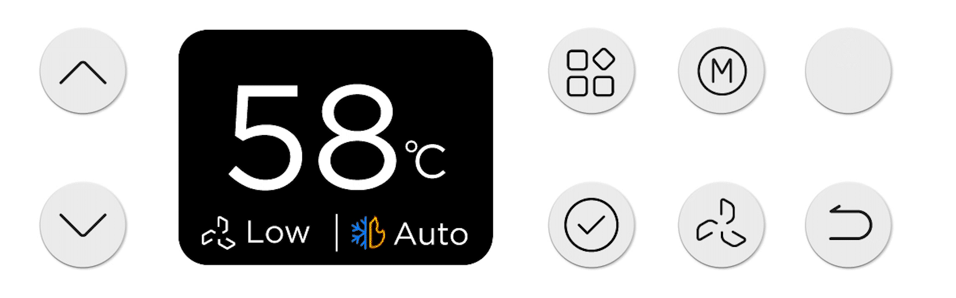
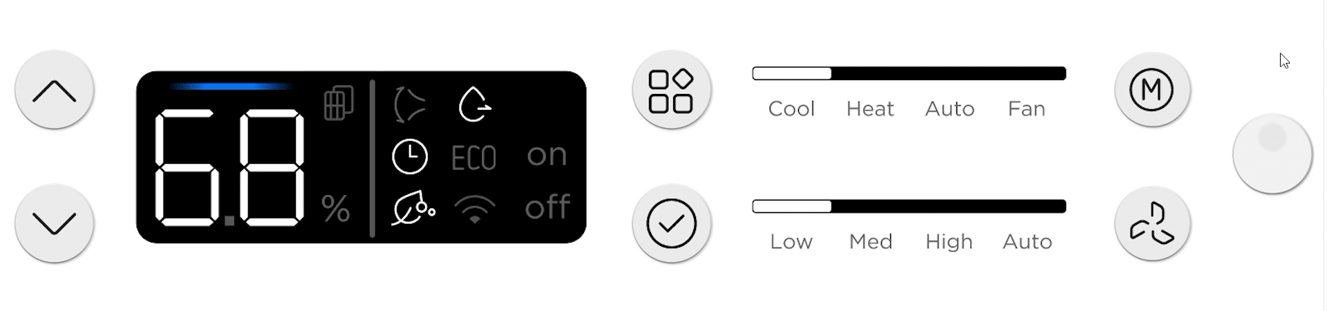
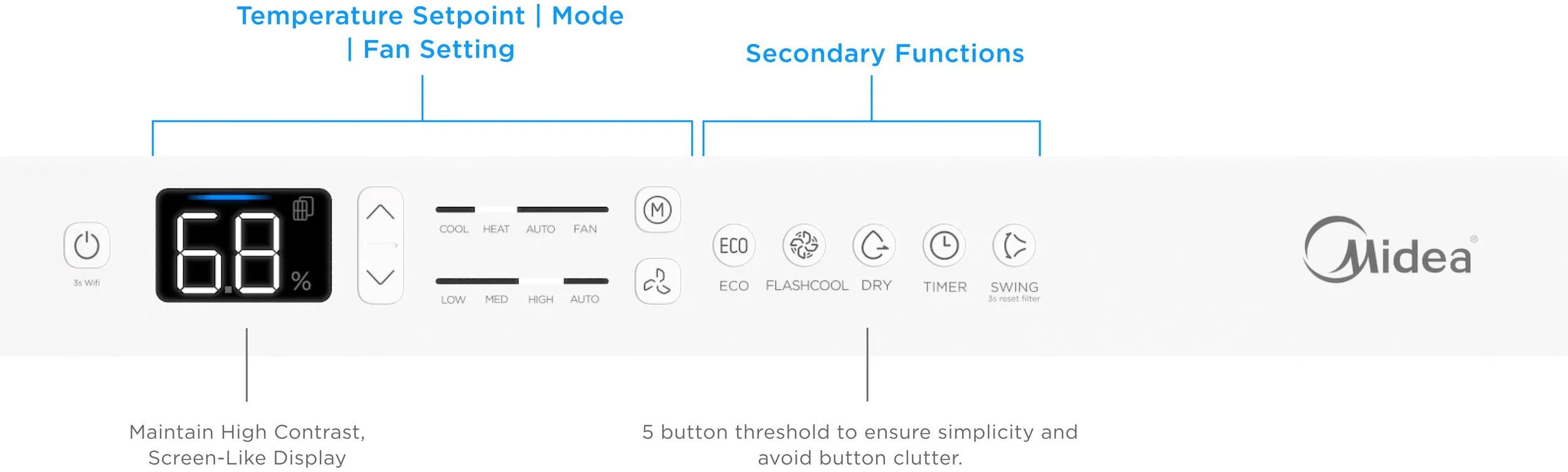
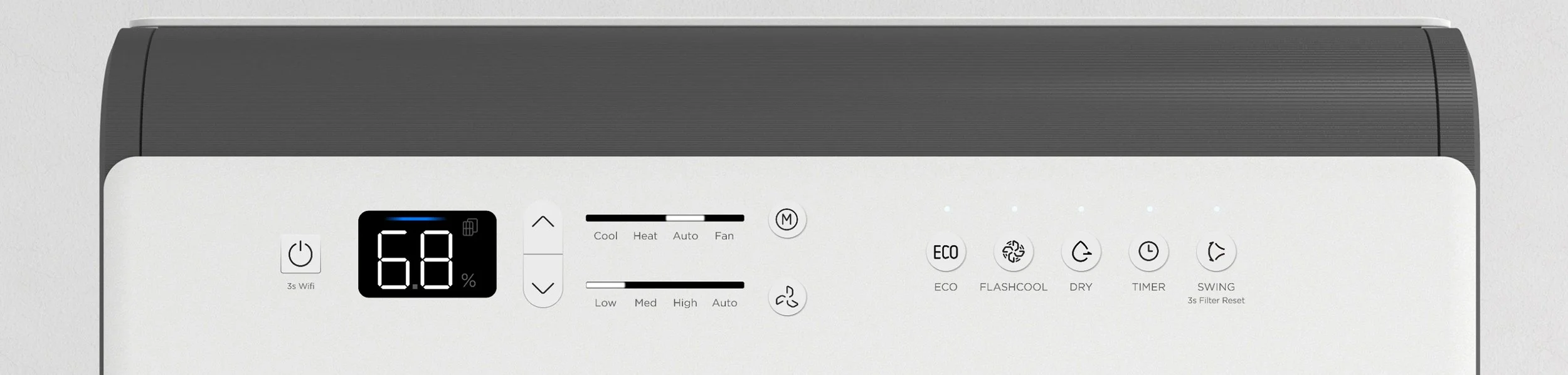
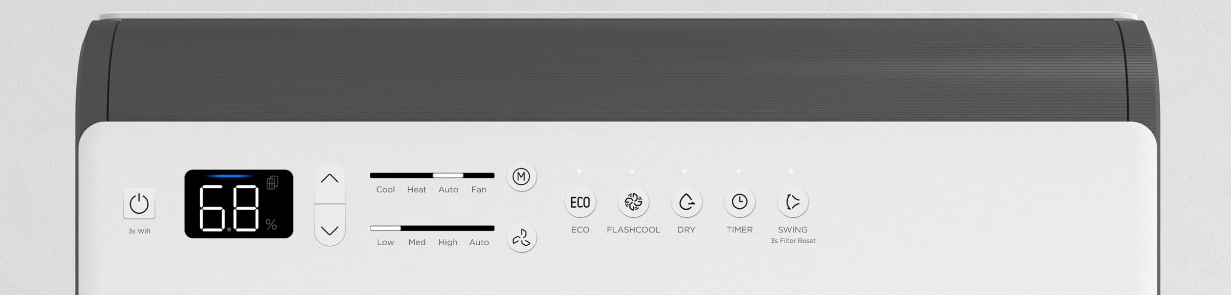
The button layout follows the unit’s order of operation: power on, adjust setpoint, select mode and fan, then activate secondary features. The goal is fast, intuitive setup. The design keeps the high-contrast display and replaces the toggle menu with single-press feature buttons.
Overall Design Testing
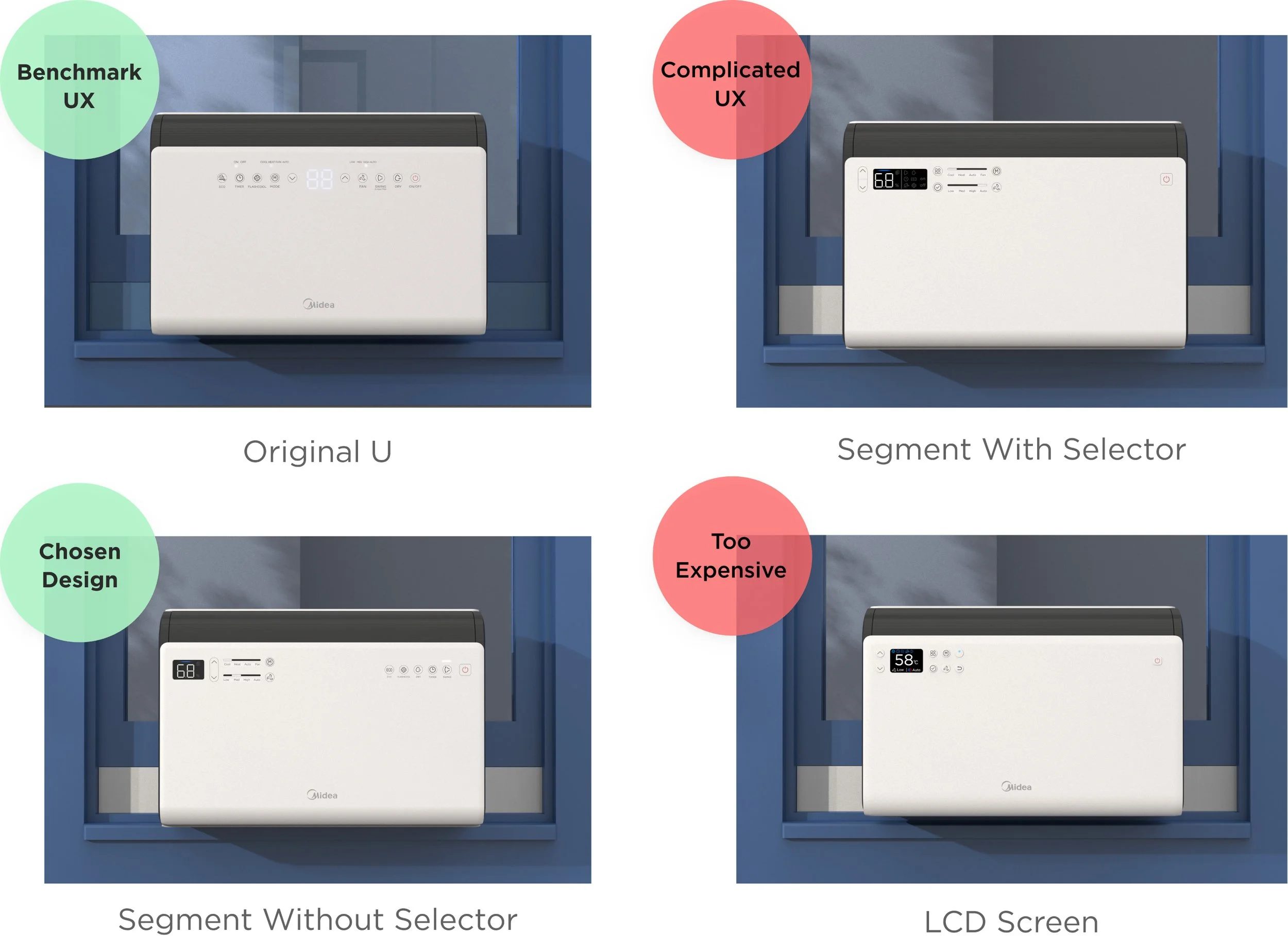
Users preferred one-button press over menu because of its simplicity.
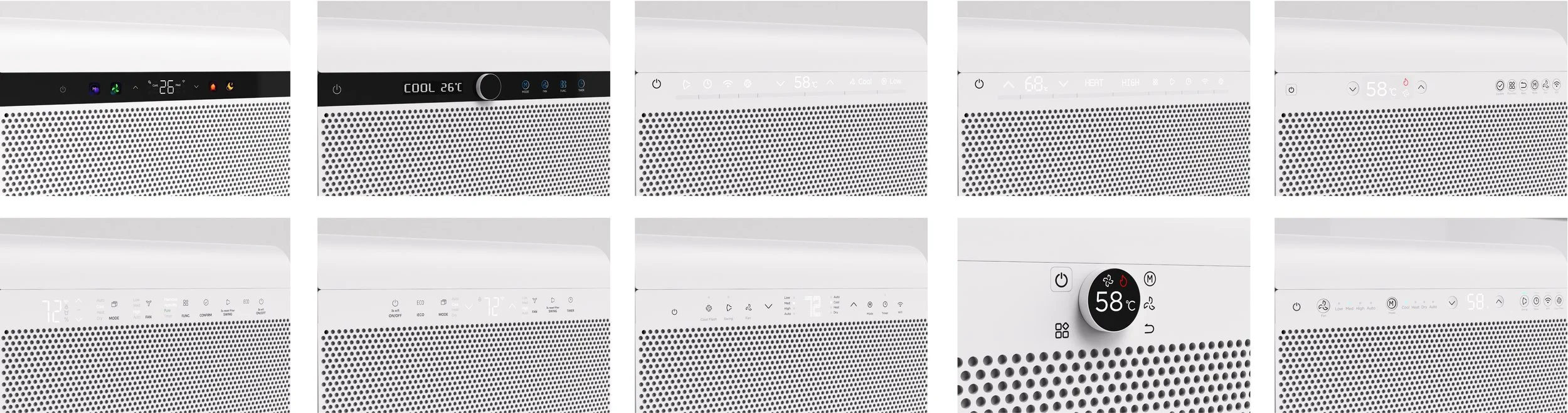
We tested the top designs (including the original U) to the users. It was evident that although people loved the premium appearance of the LCD design, the one -button press from the original U was preferred for its straightforward interaction.
Design Iteration


After returning to one-click button, I worked to find the most optimum UI composition.
I showed the 4 designs to 11 people around the office with varying degrees of familiarity to the product and collected their reactions to the concepts.


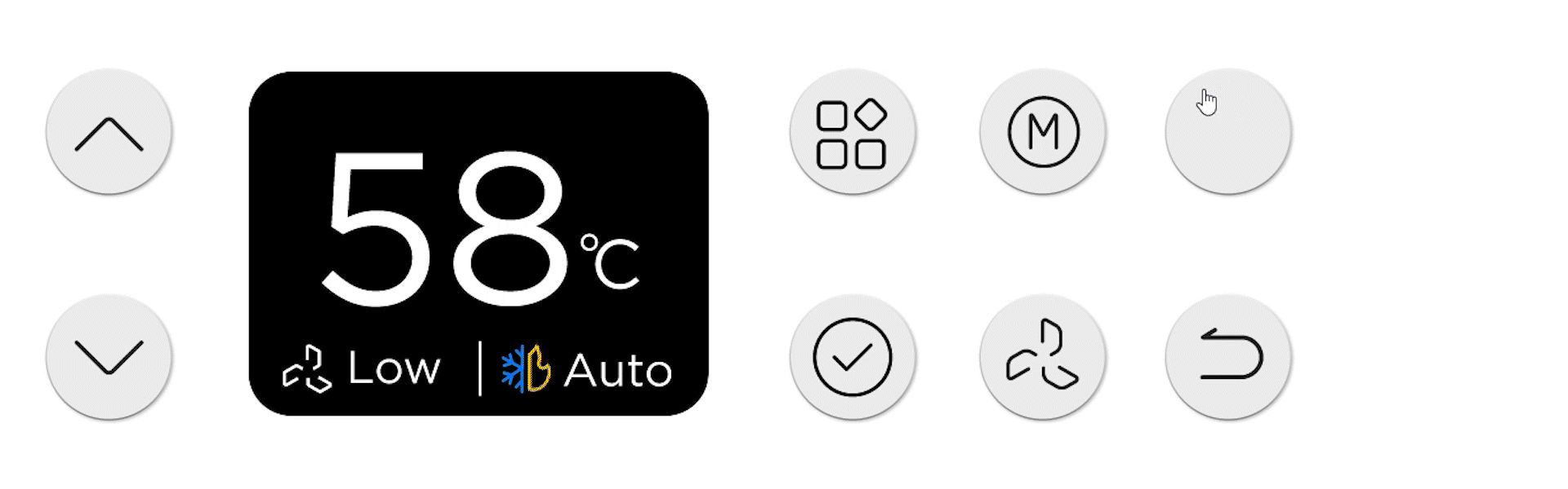
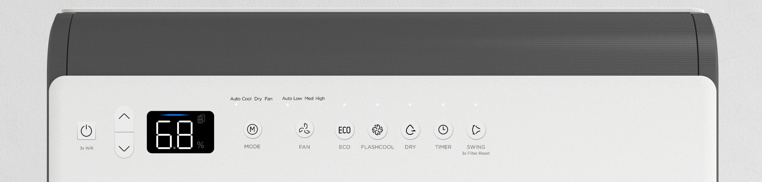
Almost everyone gravitated towards 3 and 4 because of the button grouping. Participants expressed that they can clearly see the correlation between the buttons and the display, and it looks very intuitive to use.

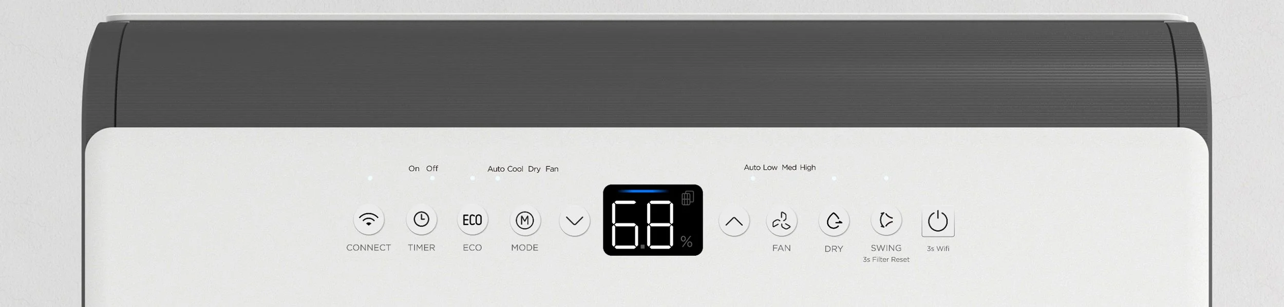
Design 2 felt too similar to the original U and was seen as generic. Despite its familiar, symmetrical layout, the UI was perceived as unintuitive, with unclear button relationships and confusing indicator lights.
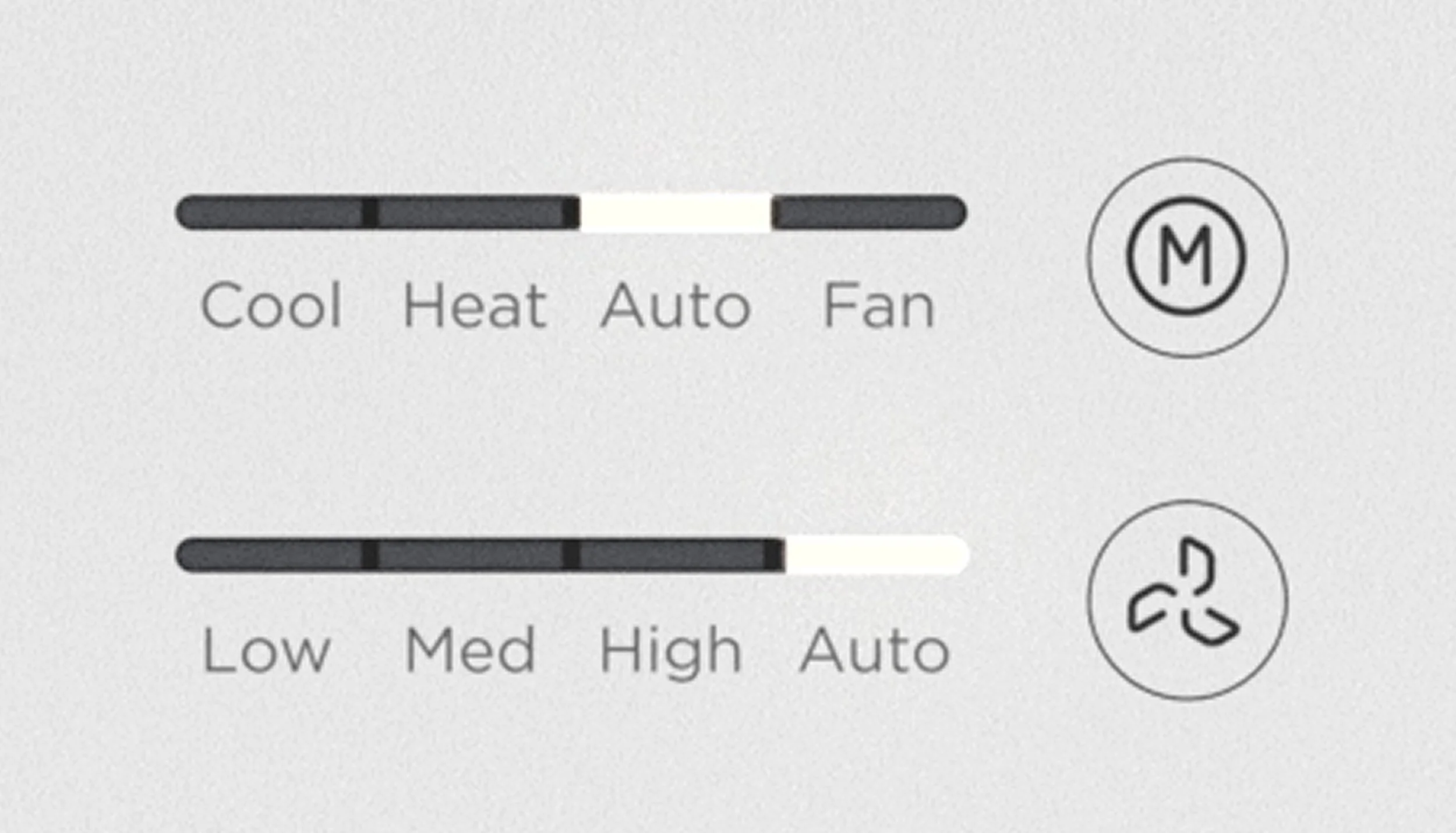
Most users preferred the high-contrast progress bar for Mode and Fan over a hidden display. They felt it echoed the main display, added clarity to button functions, and avoided the arbitrary feel of hidden LED indicators.
Many people mentioned they strongly prefer up and down buttons to be on the same side of the screen, feels easier to use and looks better.
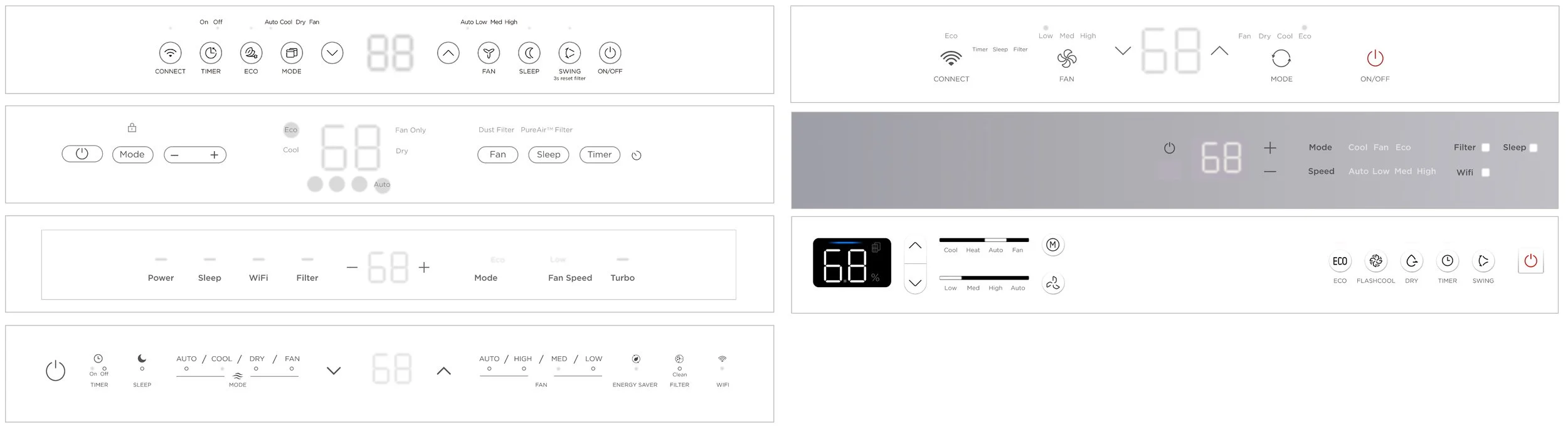
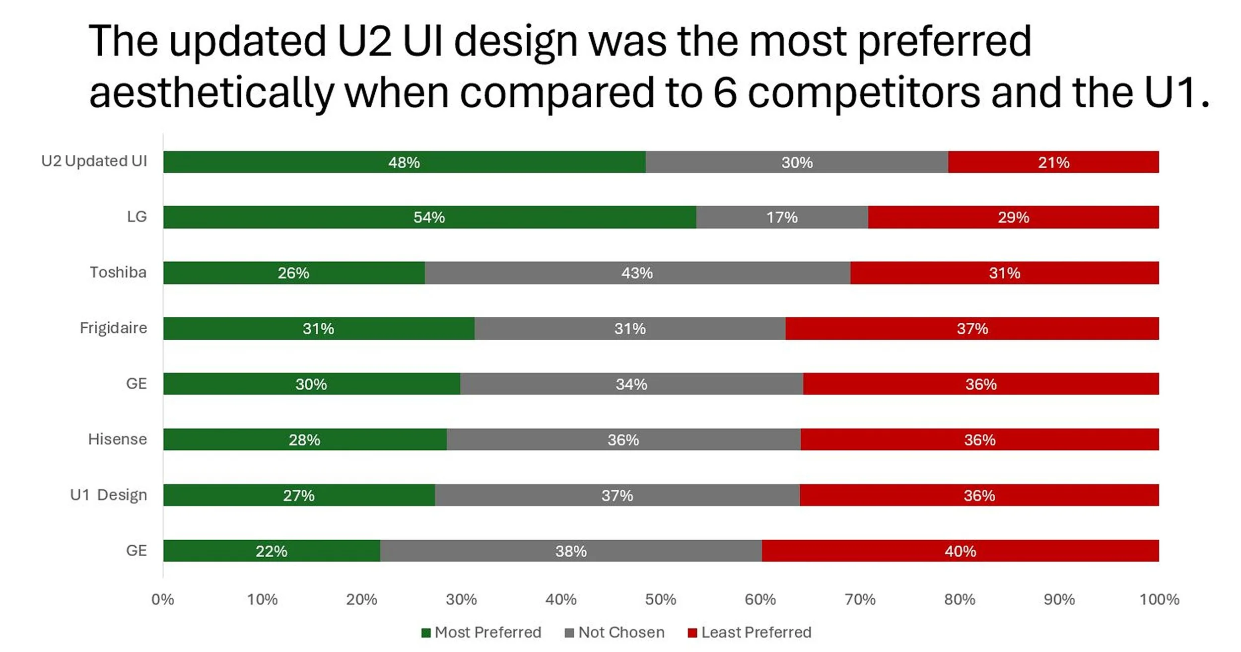
Final Benchmarking Test
We tested the final design against competitor window ACs and the original U to validate the improvements in usability and clarity from a high level glance. Most users found the final U2’s design to be easy to understand, modern, and high quality. Though LG’s UI design was also well liked, it had more polarizing opinions. Respondents had positive and negative feelings towards U1 where it looked efficient , however, the button layout seems to be smushed together.