
ST Lite Thermostat
At Midea American Research Center, I led the UI/UX development of the ST Lite thermostat. It is a low cost version of Midea’s first touch screen smart thermostat ST1.
Info:
Industrial Designer Midea American R&D Center 2024 - 2025, 7 months
Supervisor/Teammate
Wyman Mastin Seth Jenkins
Lead the design of the user interface, conduct user testing
Tools:
Figma; Adobe Illustrator
Role:
Project Context
Prior to ST lite, Midea North America offered two models of thermostats: 120N and ST1.
120N was Midea (North America)’s long standing control solution for whole home HVAC systems. Originally designed for the Asia market, it was deployed globally with minimal regional customization.
Launched in early 2025, ST1 was the first North American regional thermostat. It had competitive features, modern appearance, intuitive navigation flow, and easy market entry through the Midea’s central air ecosystem.
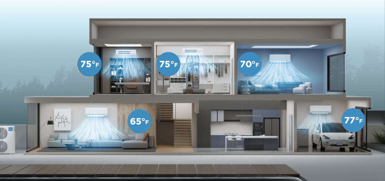
The initiation of ST Lite was motivated by the goal of zone control to accessorize thermostat for not only central but also ductless products. there is a need to reduce cost and simplify feature offerings
Initial Challenge
When I first jumped on the project, the main challenge is
how do we translate the navigation flow and features of the ST1 to a cap-touch controlled interface?
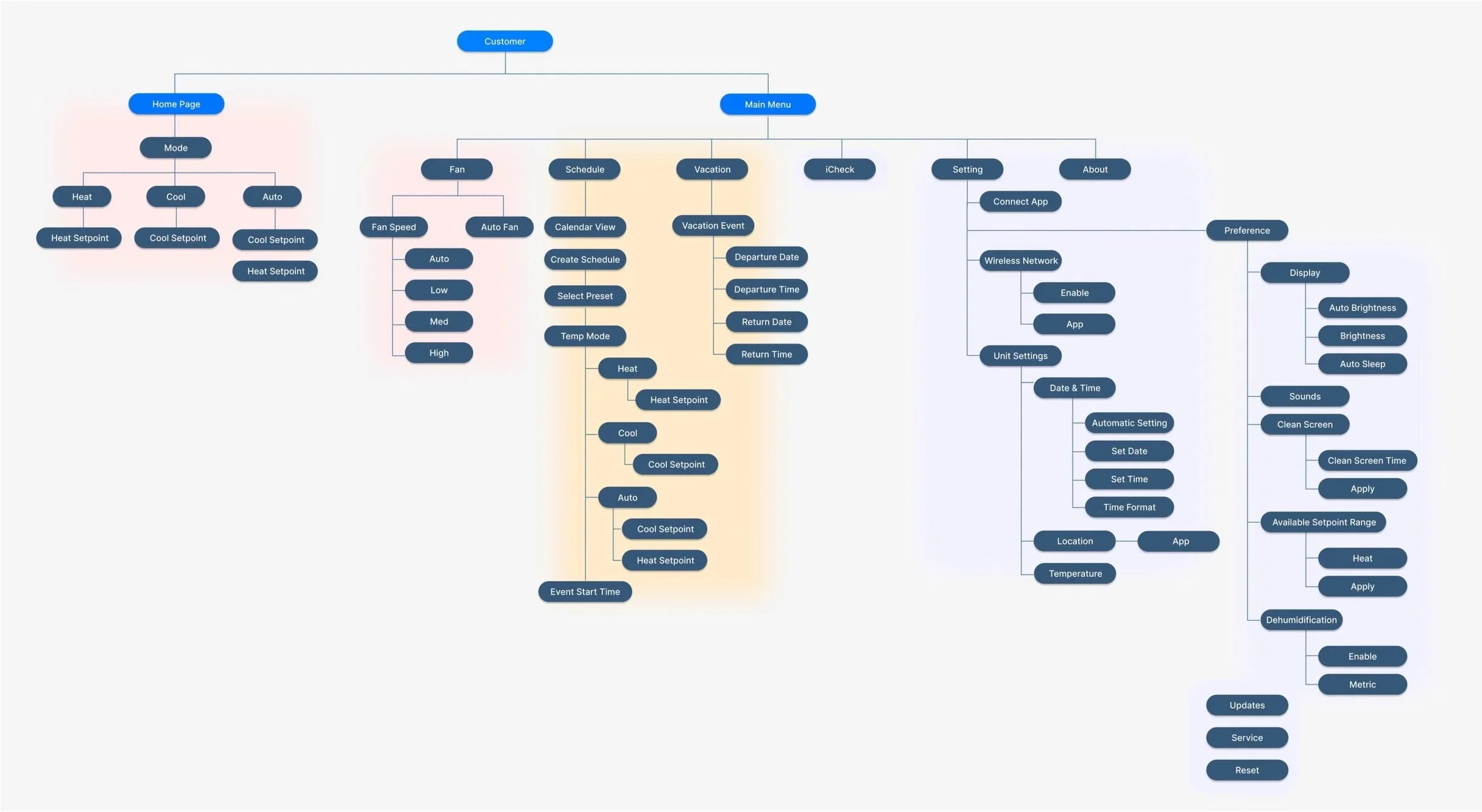
Information Architecture
To better understand the features and potential workflow of ST Lite, I created a preliminary information architecture, referencing the UX flow of ST-1. In this diagram, I outlined the feature priorities, focusing on the most commonly interacted functions. I also identified sections of the interface that may be more complex to navigate to and from, such as setting up a schedule/vacation and toggling through a menu.
Approach 1
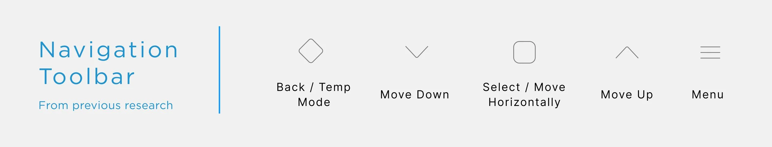
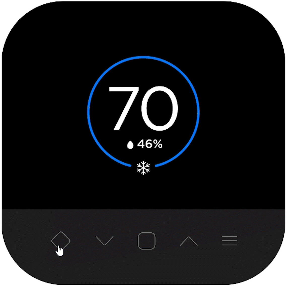
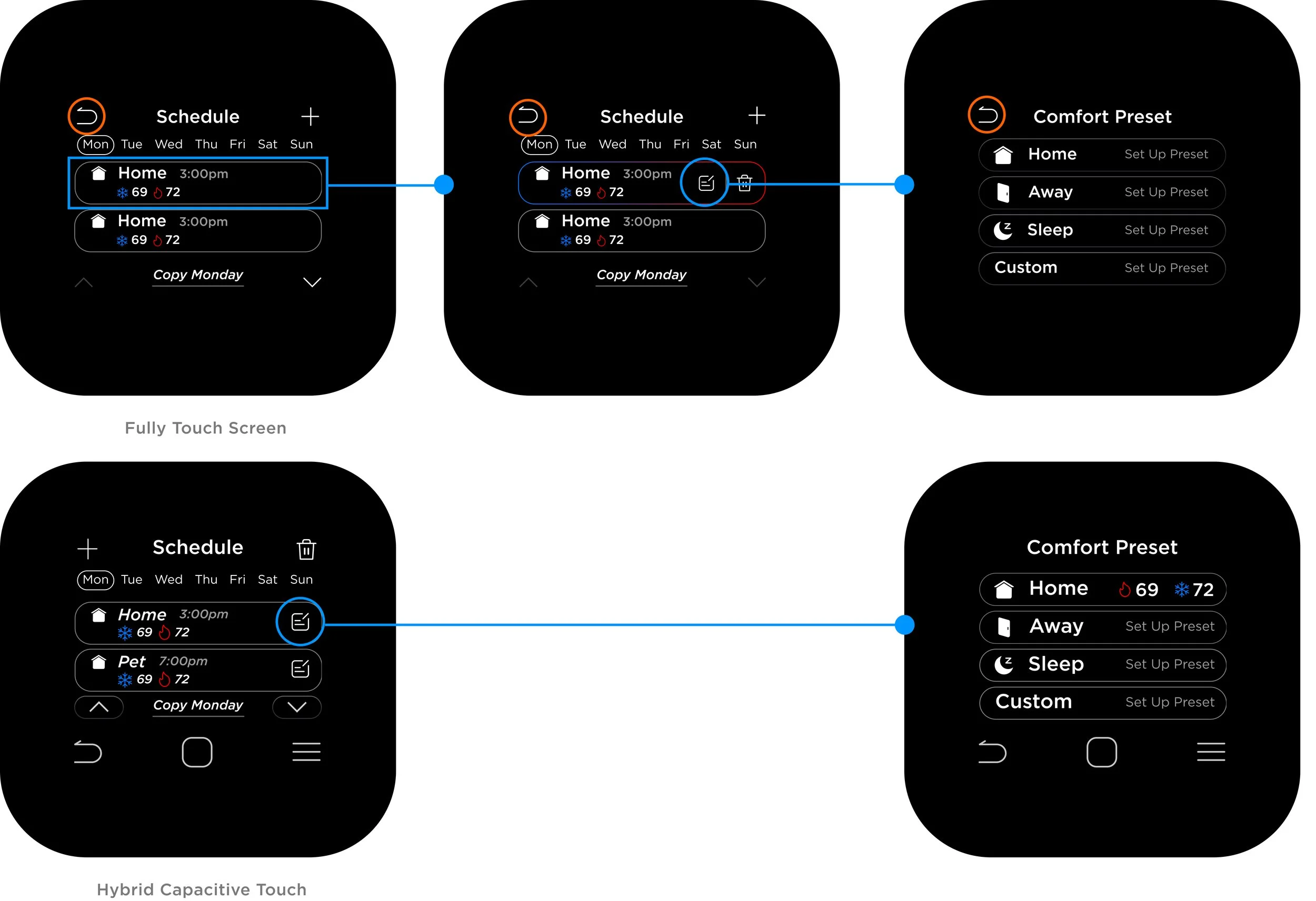
Capacitive Touch Buttons
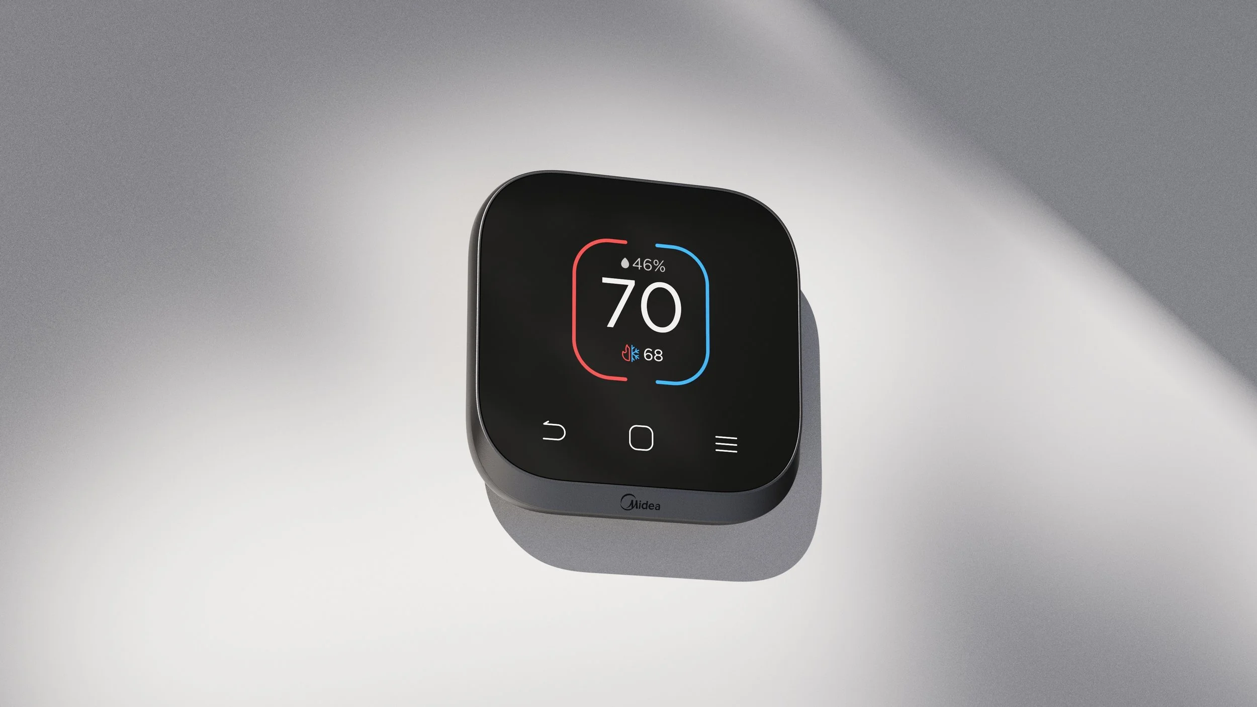
There were prior works done that tested the feasibility of different numbers of navigation buttons, UI positioning, and their usage patterns. Based on early testing, the design converged on five capacitive touch buttons positioned below the screen.
Create an intuitive navigation flow that minimizes complexity and simplifies UI features
From high priority features such as temperature setpoints and modes to toggling through menu structures, I brainstormed different navigation logic that would accommodate all types of interactions needed in this thermostat.
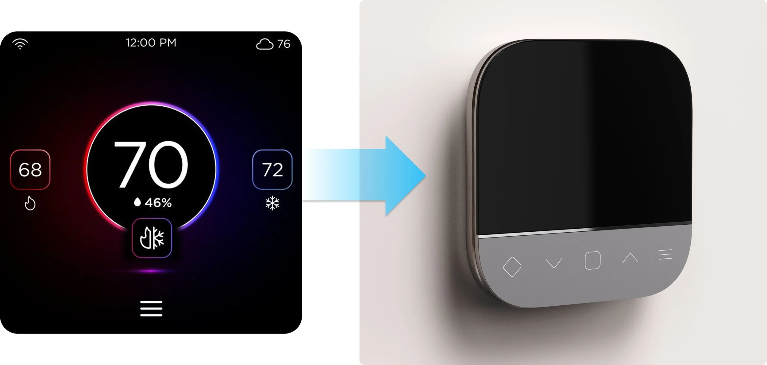
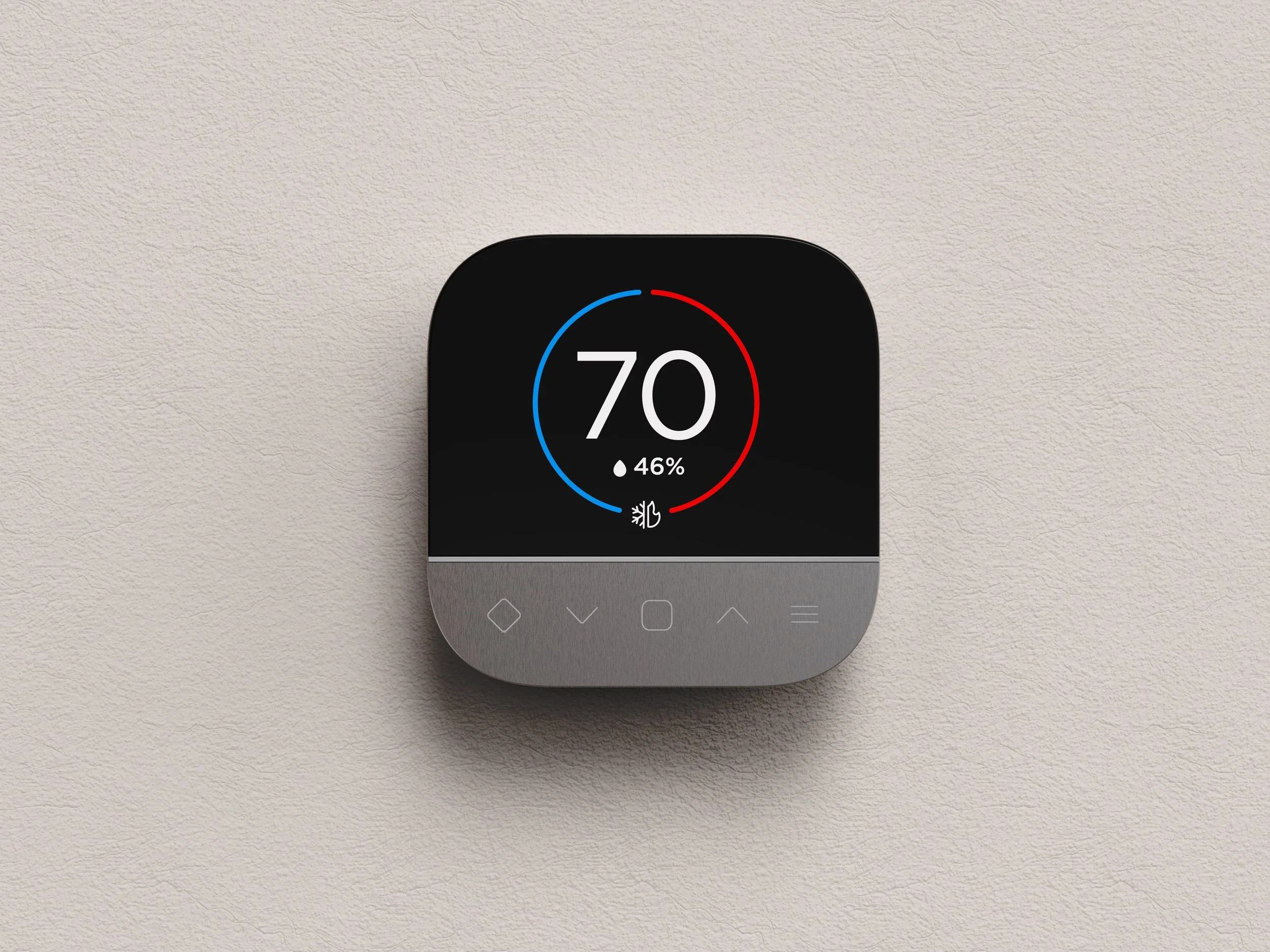
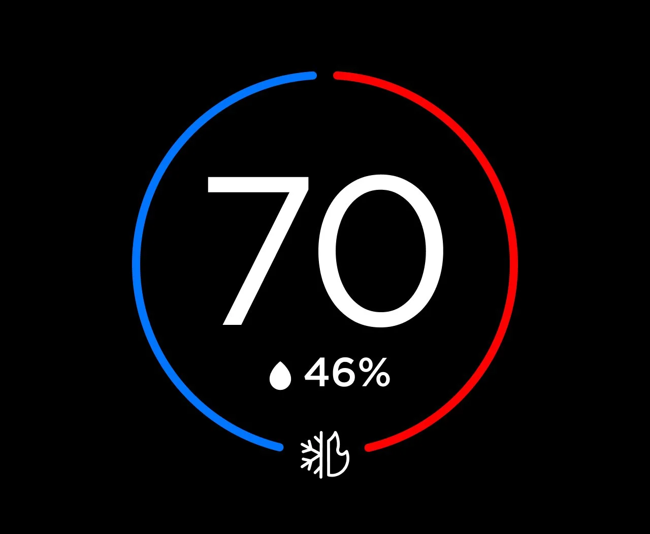
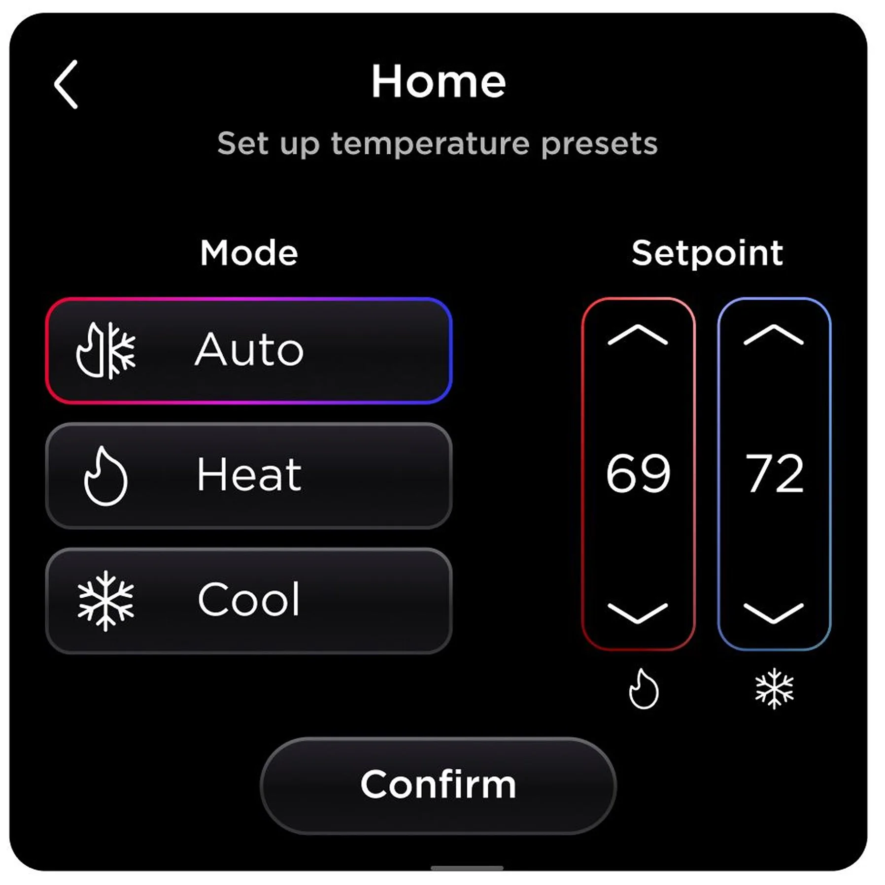
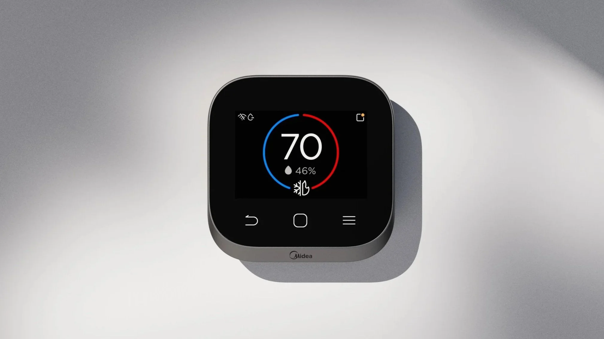
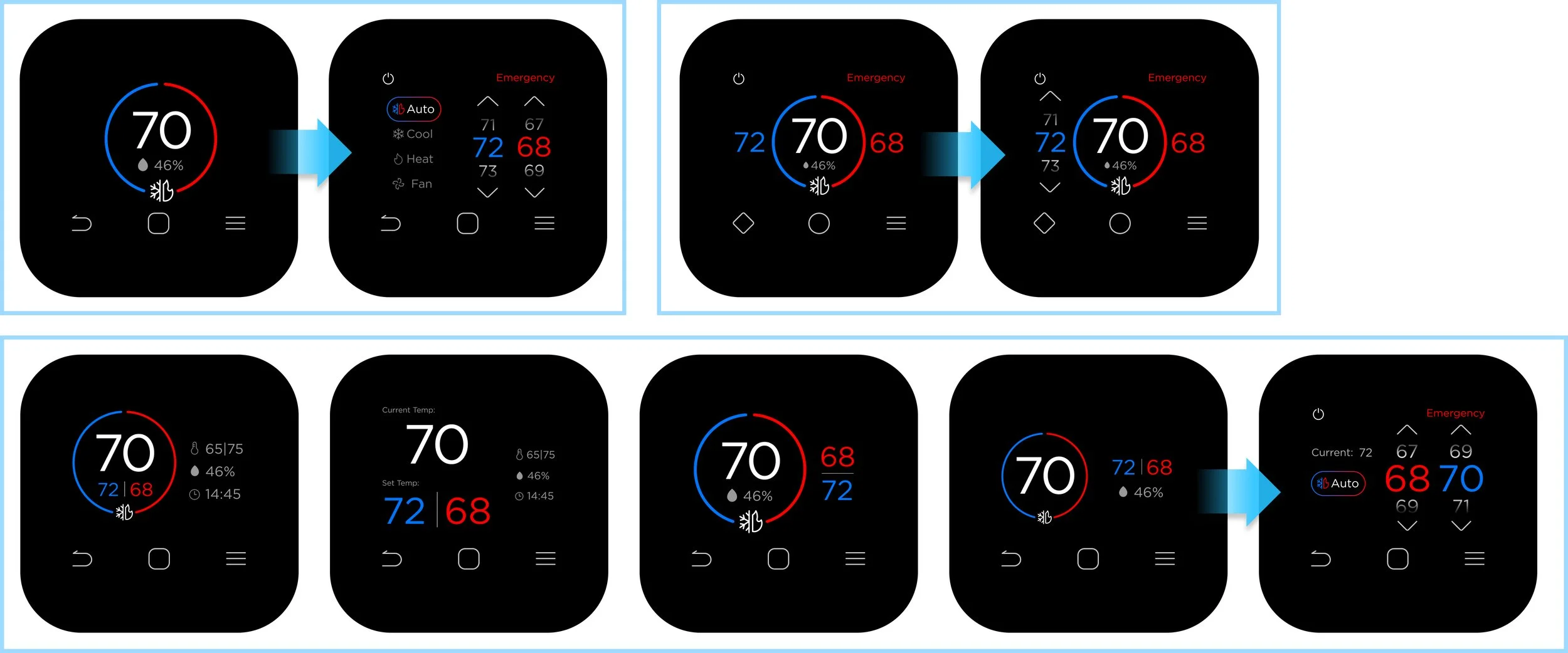
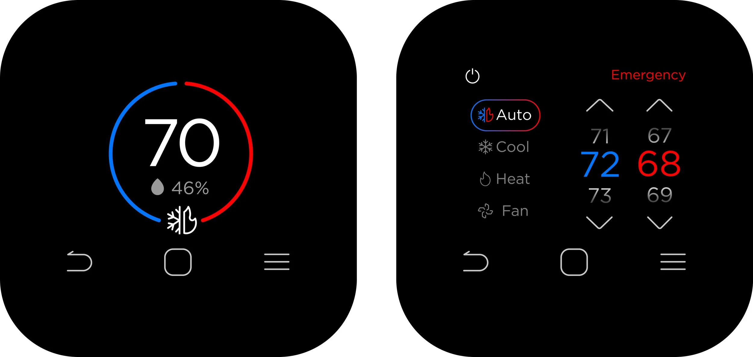
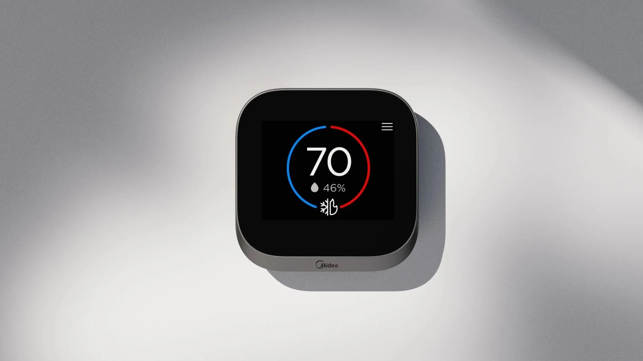
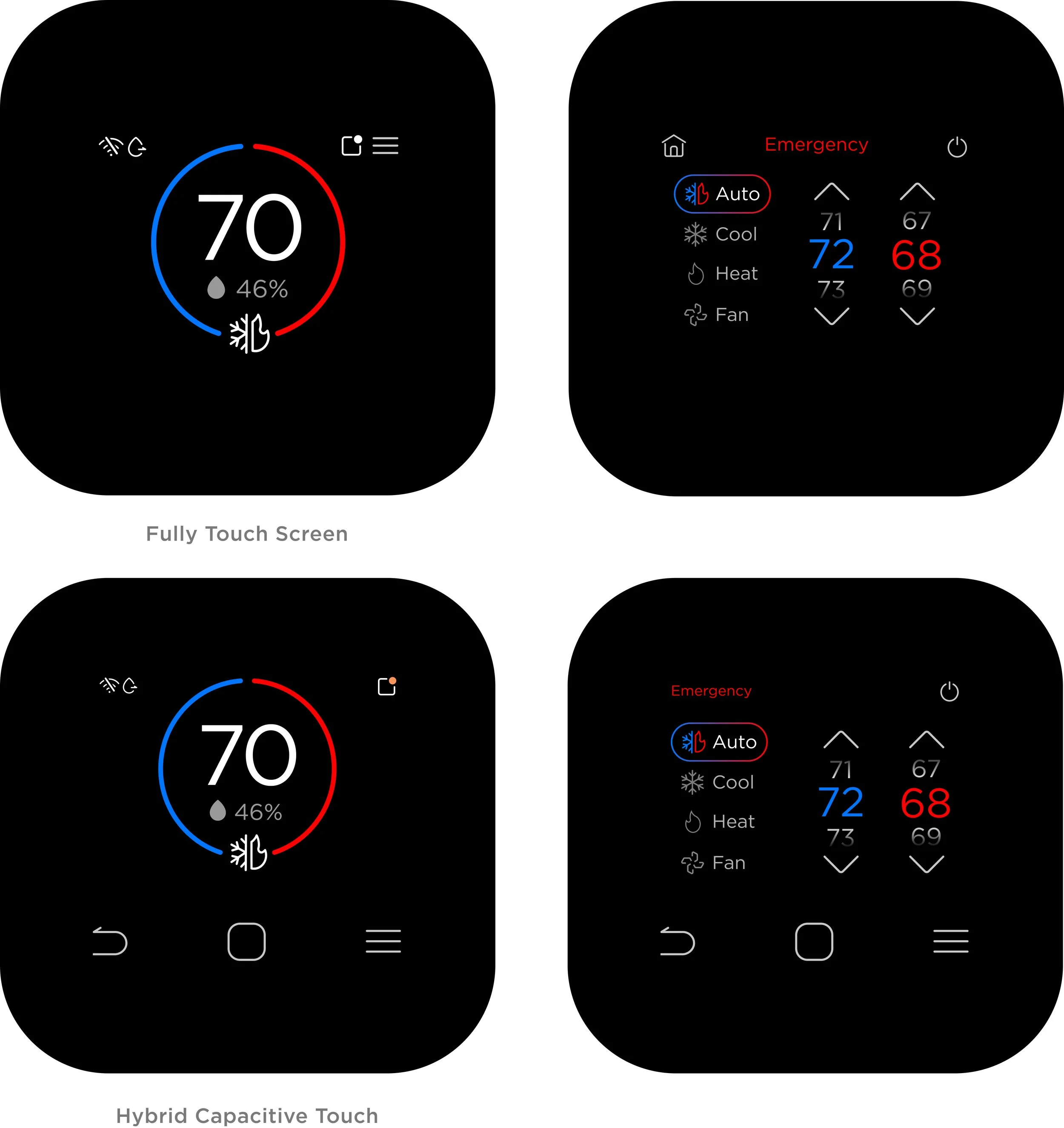
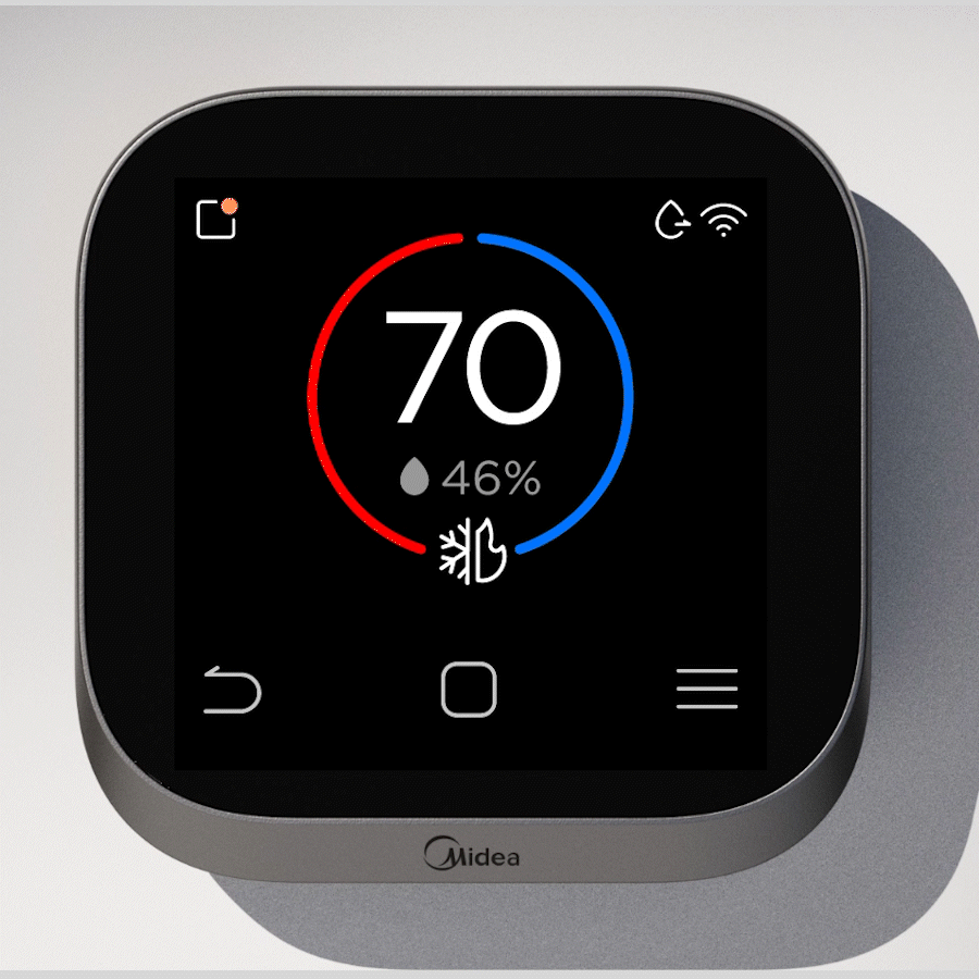
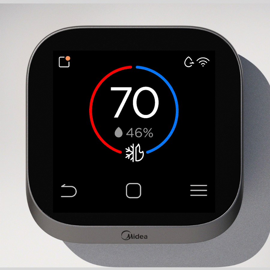
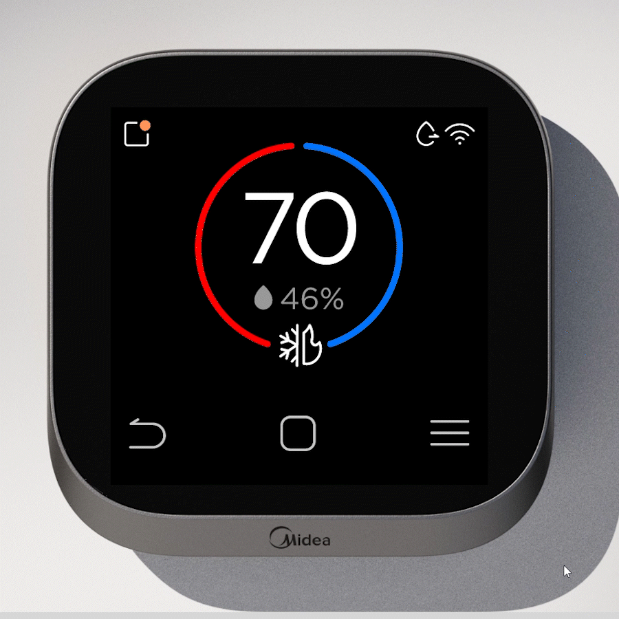
Home Page
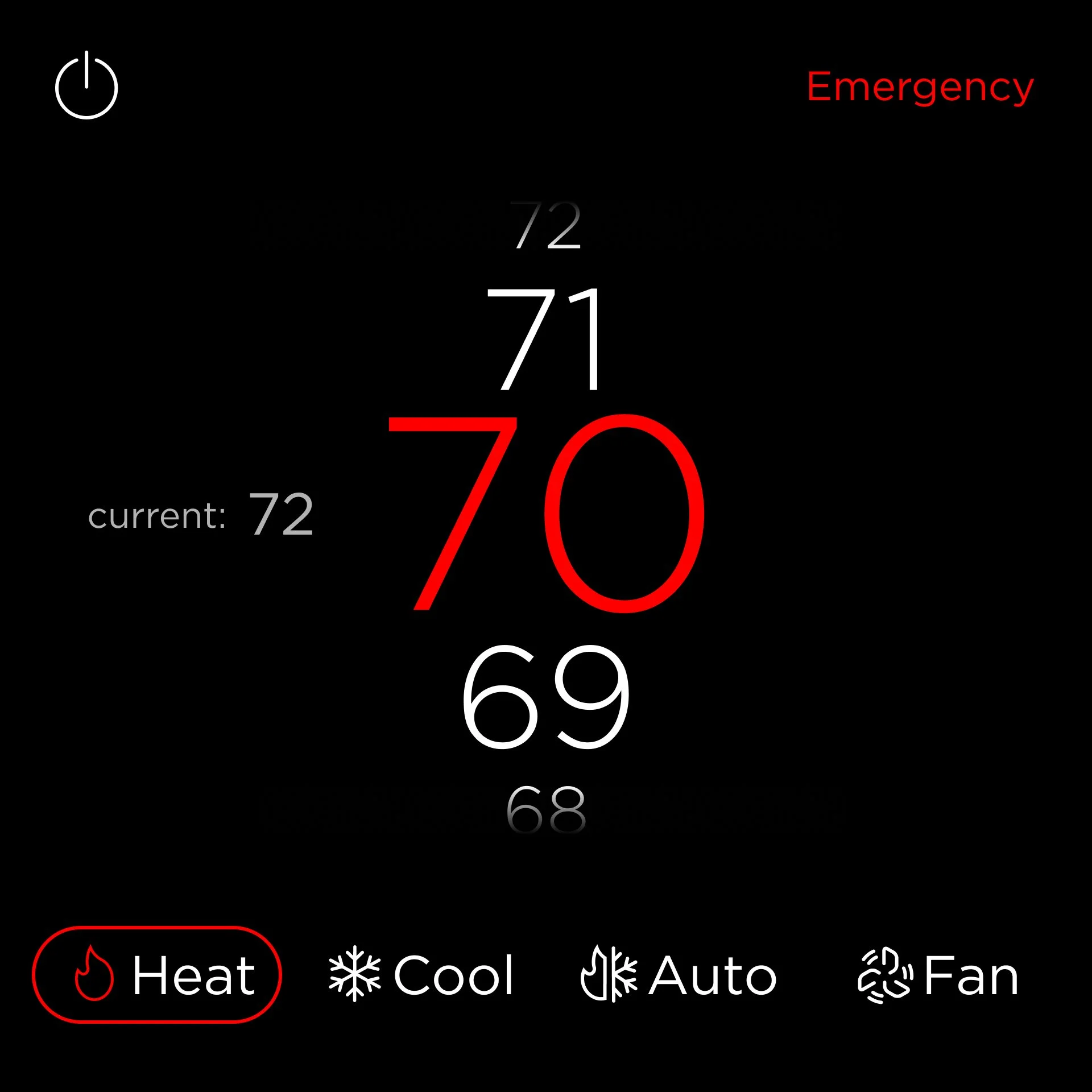
ST1’s home page featured a central circle displaying current temperature, mode, setpoints, and humidity. Tapping the circle brought users to a secondary page to edit setpoints, and exiting required tapping empty space on the screen.
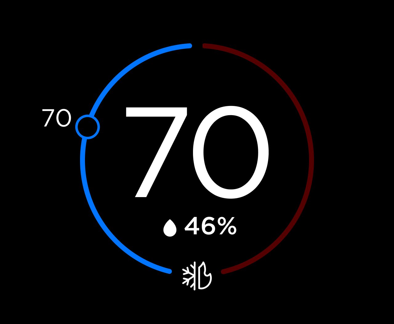
Cool Setpoint
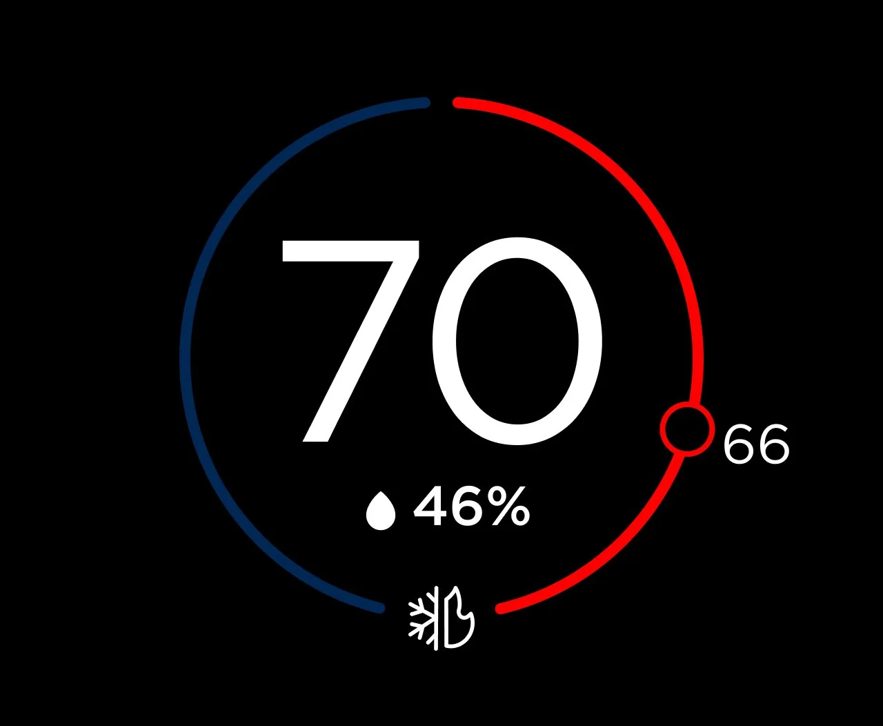
Heat Setpoint
To simplify the experience, I retained ST1’s outline motif and used the dedicated mode button in the toolbar. The mode button cycles through all four modes directly from the home page. Setpoints are viewed or adjusted by pressing confirm and using the up/down arrows in the toolbar.
Confirm
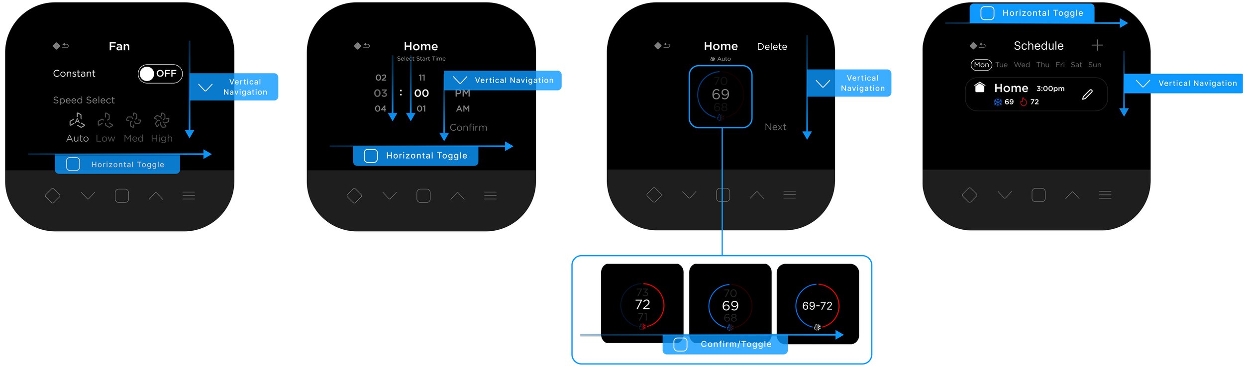
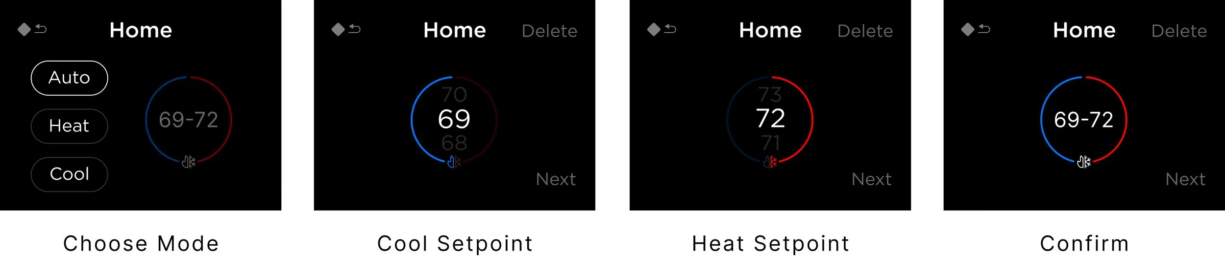
Navigation Logic
I maintained consistent navigation logic across different UI compositions as users toggle through states and navigate commands spatially. Users would press up and down arrows to move vertically, and the confirm button to toggle horizontally between options or columns.
Simplify Features
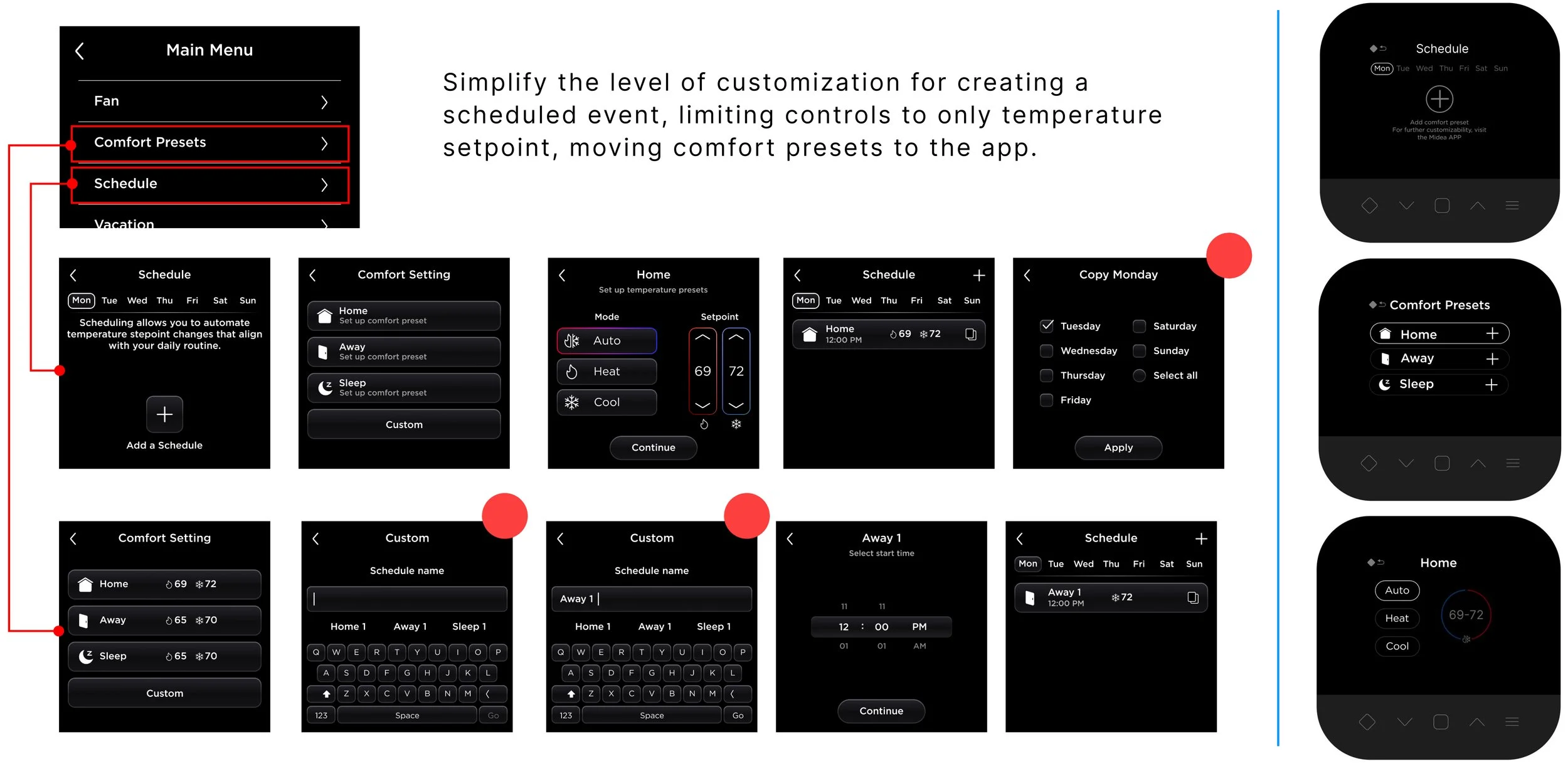
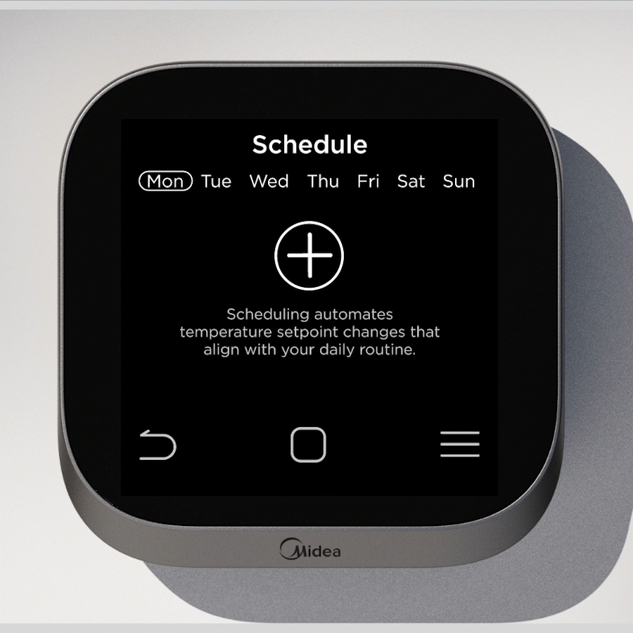
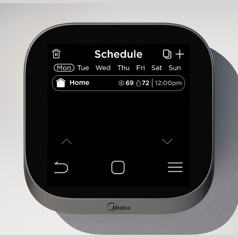
During prototyping, some features were simplified and shifted to the app to maintain a clear and straightforward navigation experience.
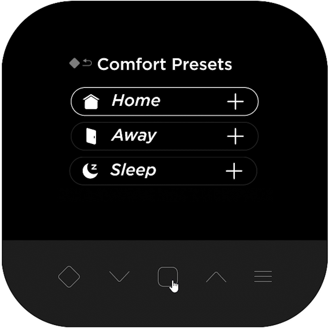
For example, creating a schedule requires selecting the day, a comfort preset, adjusting setpoints and a start time. To reduce complexity on the device, I limited the selection to existing comfort presets with adjustable temperature and start time, moving deeper customization to the app.
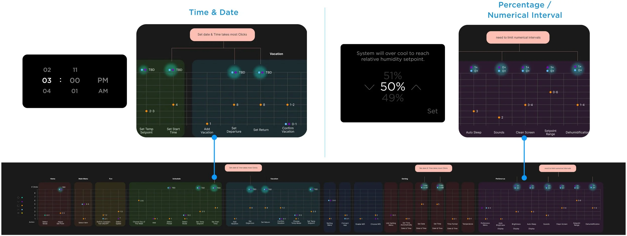
Break Down A Complex Page

Click Statistics
To assess app complexity and user effort, I analyzed the number of clicks required to access different features. This revealed that tasks involving precise time, date, and percentage inputs required the most interactions, helping identify features better suited to live exclusively in the app.
Approach 2
Hybrid CAP Touch & Touchscreen
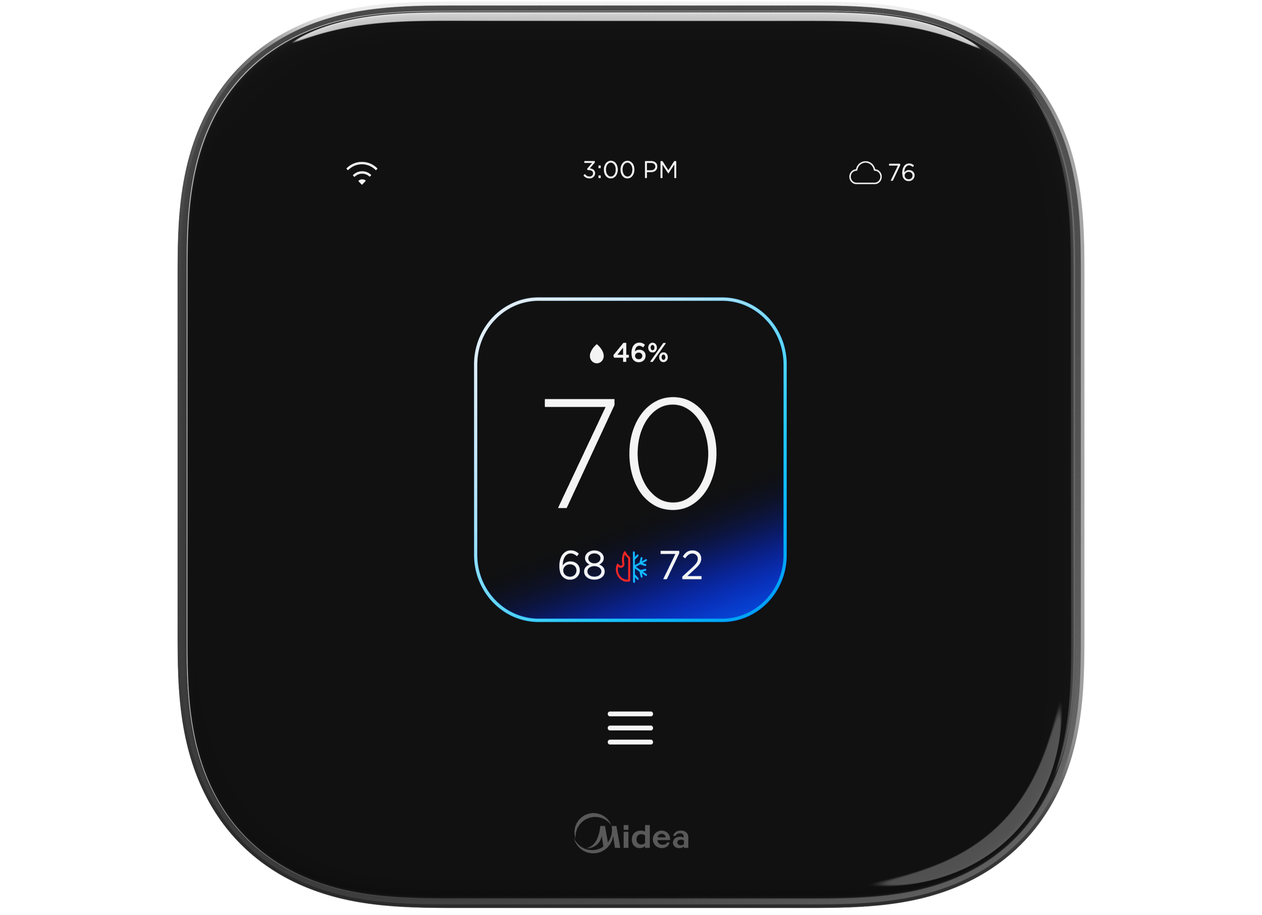
During the development of this project, Midea China team was able to source a touch screen economical enough for ST Lite application. It had certain limitations such as lagging during swipe actions, less pixel density (the viewable area: 480*360) and smaller screen than ST1. However, it helped simplify many actions.
The hybrid CAP touch and touch screen enables a more accessible and space efficient interface.
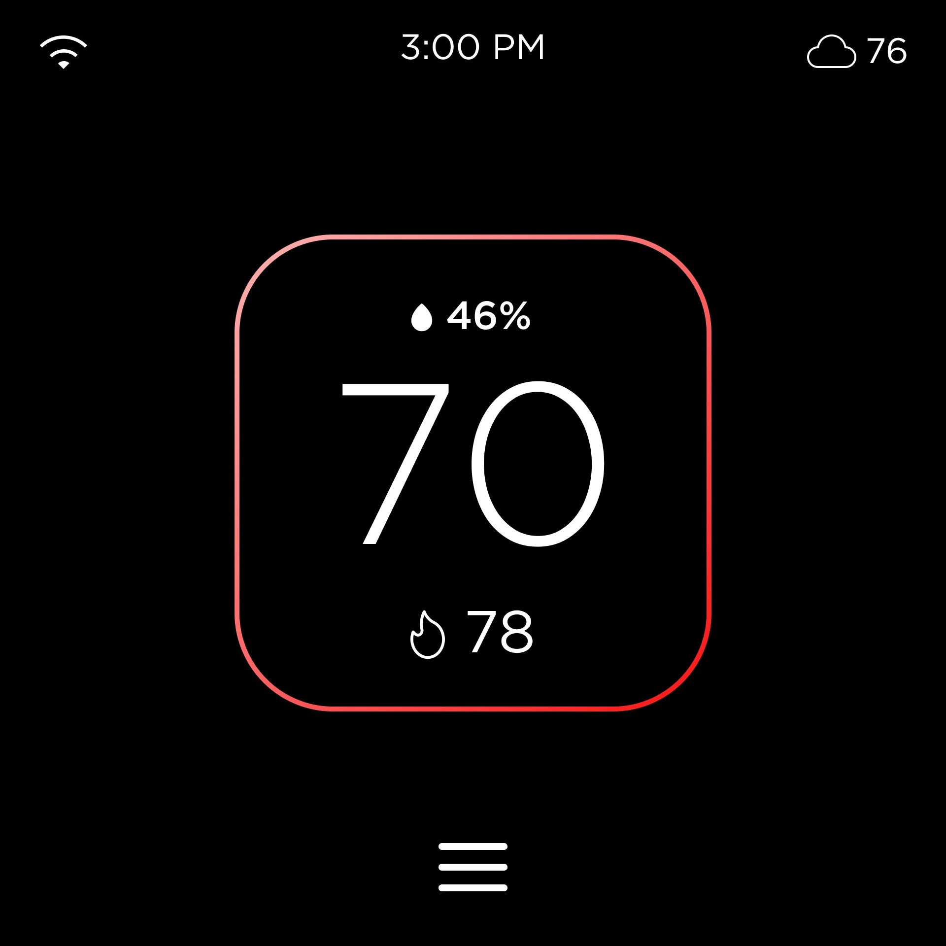
Home Page
With the touchscreen capabilities, I wanted to find a simpler home page with more customizable information and a convenient setpoint page that correlates to the ST1.
Alternative Action To Scrolling
The touch screen has significant lagging during scrolling or swiping actions, this required me to rethink the design and format of menus, lists, number wheels, and text heavy pages.
Quick Access Page
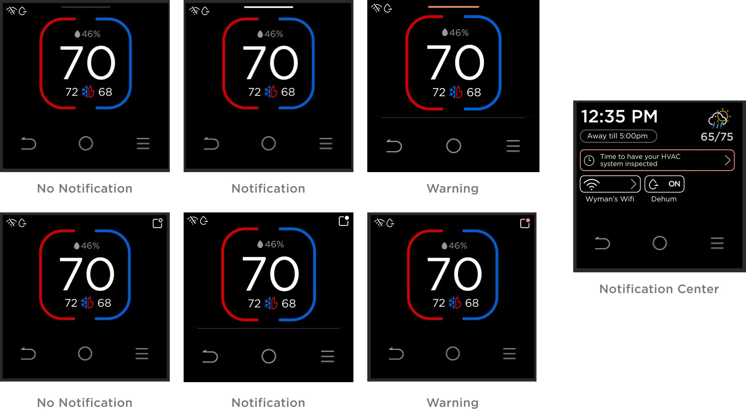
A Notification Center
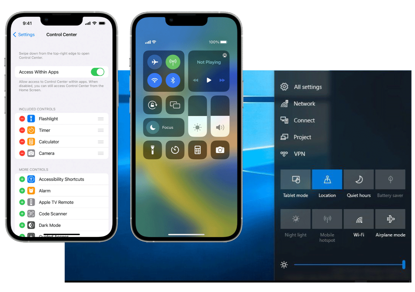
It is important to highlight notifications and warnings relative to its urgency. We wanted users to access notifications and warnings without overcrowding the home page. There is an opportunity for a quick access notification center that housed all warnings, key features activated, and maintenance reminders, a secondary page to the home page. The idea was inspired by the quick settings from phones and tablets.
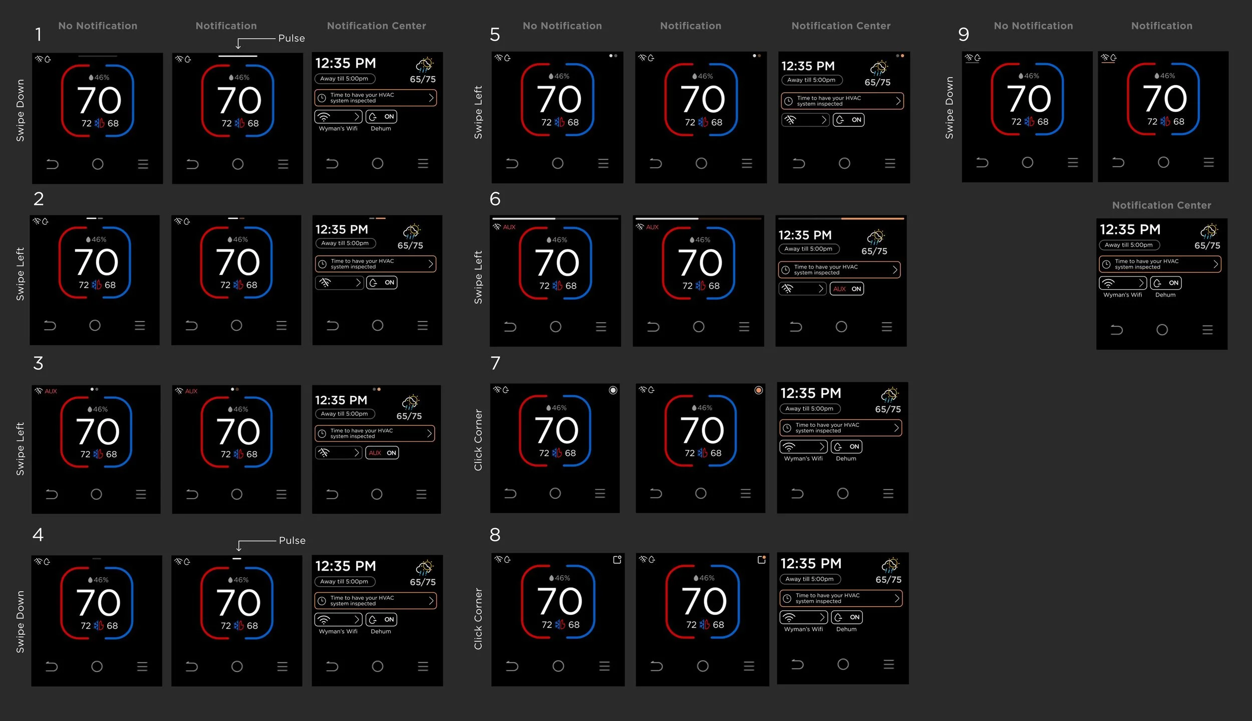
I went through a series of design experiments to understand the type of action that made most sense to the users. There should be clear indicator from home screen on how users access the notification center as well as the urgency of the notification.
Design 1 was favored for its familiarity with the top-down notification phones and therefore feels intuitive to users.
Design 2 was also well received for its recognizable app notification icon in the top-right corner that clearly signals interactivity.The pulsing feedback in Design 1 was seen as effective, though one participant suggested introducing clearer visual distinction between urgent and non-urgent alerts—such as a color shift from orange to red.
In contrast, left–right swipe interactions were less preferred, as side-based notifications felt less natural than top-down patterns, even though the navigation icons were easily understood.
One user also noted a preference for tapping over swiping, explaining that the shorter screen height made swipe gestures feel less comfortable compared to a phone.
Approach 3
Full Touch Screen
We also wanted to test the experience without capacitive buttons with the same touch screen specs. Overall, the fully touch screen interface was evidently more crowded for home screen and complex features such as schedule and vacation. It required the key content to compromise in proportion and size to make space for confirm and back buttons.
Full touchscreen of the same screen size presented significant space constraints.
Examples Of Space Limitations
Set Up Schedule
Home Page
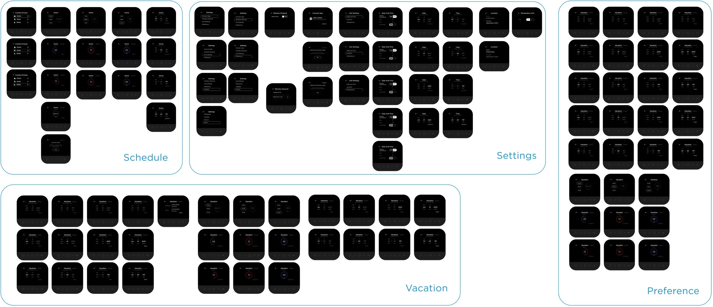
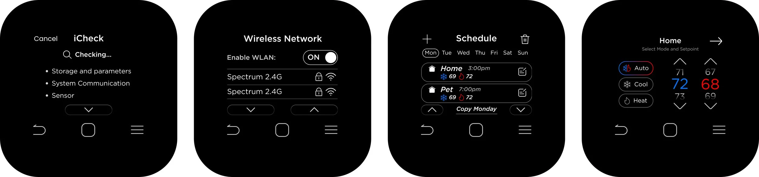
Final Design
Touch screen with CAP touch was used for the final design because of its simplicity and quick access to navigation controls.
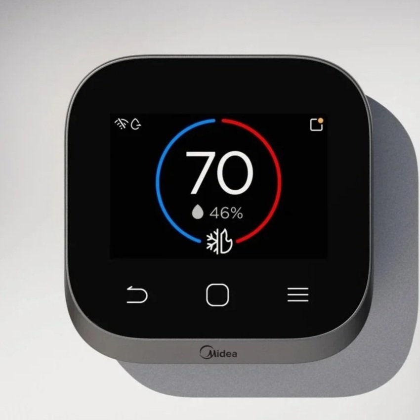
Home
Setpoint
Quick Access
Schedule: Create Event
Schedule: Copy Event
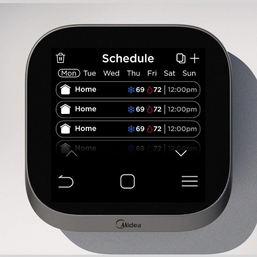
Schedule: Delete Event
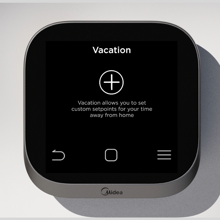
Vacation: Create Event

Vacation: Create Event
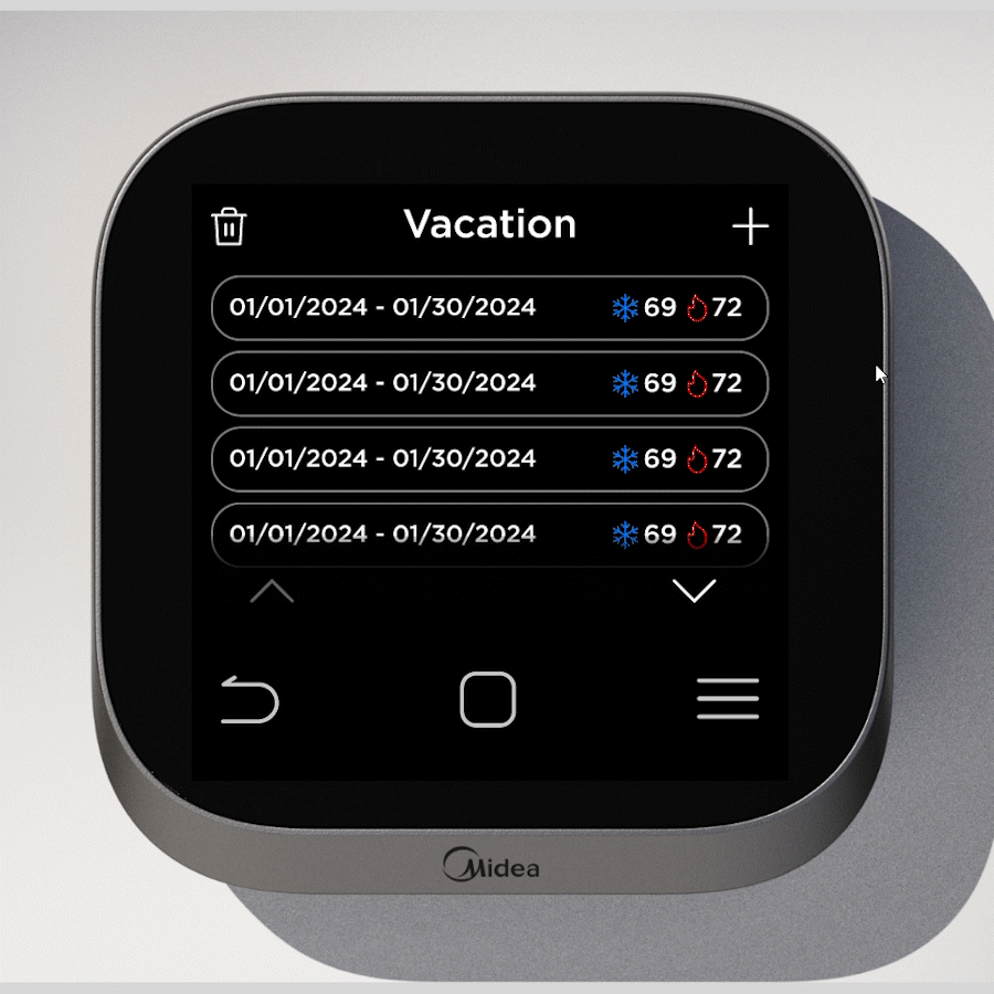
Vacation: Delete Event
Menu
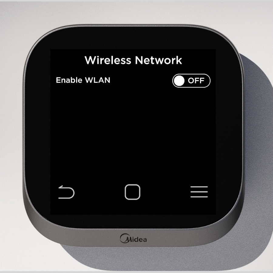
Wifi